Categories
Blog Posts

How Computers Transformed Animated Storytelling

Does Technique Influence Theme?

Here’s a really interesting look at the evolving themes in animated films from the Just Write YouTube channel.  Beyond the obvious technical differences that computer-based animation brought, this video looks at the ways those technical changes influenced the thematic elements of the films, moving from conservative fairy tales to progressive allegories.

Categories
Weekly Lessons

Week 6: Link Things Up

Making Connections

Last week, we went over some of the ways that layers can interact with each other in After Effects, using track mattes and transfer modes.  This week’s lesson has a similar theme, as we’ll be combining, affecting, and linking layers in new ways.  These techniques will be essential as we begin to work on actual character animation, but they are also extremely helpful when creating motion graphics and text animation.

Adjustment Layers

Adjustment layers are a very cool feature found in After Effects and some video and photo editing programs.  Basically, an adjustment layer is a blank layer in the timeline.  Any effects that you add to an adjustment layer will be applied to the layers beneath it.  Any layers above the adjustment layer will be unaffected.  This allows you to quickly apply effects to an entire scene.  If, for example, you decide you want your composition to be in black and white, you can add an adjustment layer and apply the “tint” effect to it.  Without the adjustment layer, you would have to go to each layer individually and apply the effect.

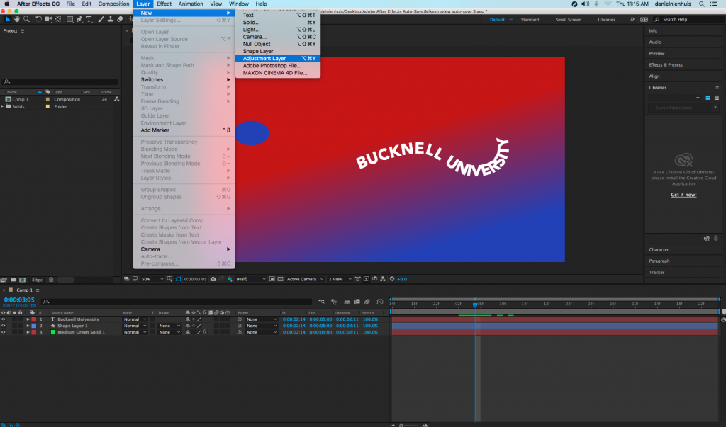
To create one, go the the Layer drop-down menu at the top of the page and go to New>Adjustment Layer.   An adjustment layer the size of your current composition will be created and placed in the timeline.  After Effects also lets you modify adjustment layers in interesting ways by using masks.  For example, you can use a circular subtract mask on an adjustment layer to create a simple vignette.  Note that while adjustment layers have transform properties, modifying those properties does not affect the layers below – only effects are applied.

If you do want to apply things like scale and rotation using an adjustment layer, it is possible, however.  In the “Distort” section of the effects, there is one called “Transform.”  This is a set of the usual transform properties – anchor point, position, scale, rotation, and opacity – that can be applied as an effect.  If you add the transform effect to an adjustment layer, that effect will be applied to the layers below.

Pre-composing

When you create a new composition in After Effects, it appears in the project panel along with the rest of your media – that’s because compositions essentially are pieces of media, just like stills and video files.  This means that you can drag one composition into another and then add effects, mask it, or manipulate its transform properties.  In fact, it’s quite common to have compositions within compositions within compositions for a complex project.

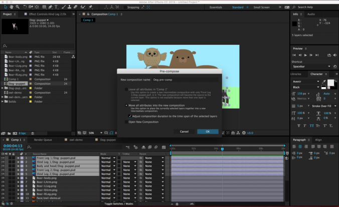
In addition to dragging one composition into another, you can choose certain layers within an open composition and make a new composition out of them – without ever leaving the timeline you are working in.  After Effects calls this “pre-composing.”

To pre-compose media in the timeline, select the desired layers (command-click to choose more than one layer), right-click and select Pre-Compose….  A menu will appear with options for re-naming the new composition (probably a good idea), leaving or moving the “attributes” of the layers (choose to move them), adjusting the length of the new composition (choose to do this), and opening the new composition (not necessary).

Once the layers have been pre-composed, the new composition will appear in the old composition as a single layer.  It will also show up as a new composition in the list of project media.  If you double-click on the pre-composition, it will open up in the timeline and preview windows.  Pre-composing media is a great way to clean up a chaotic composition (sometimes you just have way too many layers in there), as well as a simple method of applying effects and transformations to multiple layers at once.

Parenting

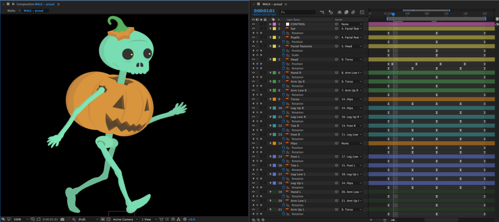
Parenting is a unique feature in After Effects and it’s incredibly powerful.  When you parent one layer to another, the “child” layer will be affected by the scale, position, and rotation of the “parent” layer.  Parenting does not affect opacity, effects, or masks.

To parent a layer, you use the Parent section of the composition panel.  You can either choose the parent layer from the drop-down menu or use the “pick whip” selector next to it (it looks like a little swirl).  A parent layer can have multiple child layers connected to it – and a child layer can have its own child layers – but a child layer cannot have multiple parent layers.  That probably sounds confusing, but it should quickly make sense once you start playing with it.

Parenting has some very basic and commonplace applications for things like lower thirds and title design.  For example, you could parent a text layer to a solid layer, then animate the solid layer sliding into the frame.  The text will keep its position relative to the solid and slide in with it.  This keeps your animation consistent and means that you only need to keyframe properties on one layer instead of two.

Under the Layer drop-down menu, you can also create a “Null” object (Layer>New>Null Object).  Null objects don’t appear to do anything at first, but they are very useful as parent layers.  You can parent several child layers to a null and then affect them all simultaneously.

Project 6: Lower Thirds

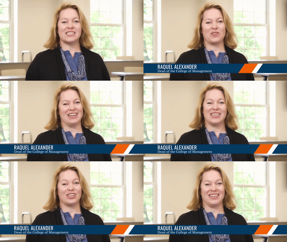
One thing that After Effects is often used for is the creation of “lower third” graphics.  A lower third is a graphic (usually located in the bottom third of the frame) that contains text information about the subject of the video.  Lower thirds are most often used in interview and documentary footage where the viewer needs to know the name and/or other information of whoever is on screen.

This week, you’ll be creating a lower third graphic.  Download one of the videos above and create a lower third for that person.  Here are the parameters:

  • The lower third should be on screen for between five and ten seconds.
  • The graphic should animate on to and off of the screen.  This can be done using opacity, movement, or anything else you like.
  • There should be two lines of text: one of your subject’s name and one of their job or title.  Make something up!

This is a good opportunity to practice and combine the various skills and techniques we’ve been going over – track mattes, effects, easing keyframes, etc..  If you would like some additional generic footage to use, here are some slow motion clips.  You are also free to find footage or still images on your own.  Render the video at 1920 x 1080 resolution using the H.264 codec and send me a download link!

Categories
Blog Posts

Creating Animation In Real-Time

The Future of Animation?

In 2016, The Simpsons used animation software from Adobe to incorporate a live segment into an episode.  During the segment, fans of the show called in and asked unscripted questions to Homer, who answered – while animated – in real-time.

This was done using a piece of still-in-development software called Adobe Character Animator.  Character Animator is included with current versions of After Effects, but launches as a standalone program.  It uses web-cam point tracking to map facial movements in real-time.  Mouth movements are translated to pre-built shapes, that change and move with the action of the actor.  Other gestures, such as blinking or body movements can either be tracked live or mapped to buttons.  When a button is pressed, the corresponding gesture is made.

For the segment on The Simpsons, Homer’s voice actor (Dan Castellaneta) responded to questions will being tracked by a camera monitoring his facial movements.  Other gestures were controlled by the episode director using a keyboard.

You can read more about the Simpsons live animation segment over at Cartoon Brew.

Categories
Projects

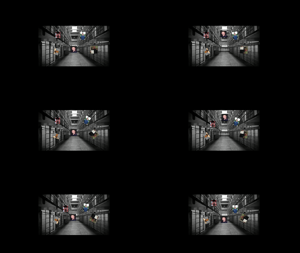
Project 5: Word Mark

Jen

Max

Brian

Dante

Brian

Categories
Blog Posts

Behind the Scenes with He-Man

…and the Masters of the Universe

Here’s a fascinating look at one of the most iconic cartoons of the 1980s.  Check out this behind-the-scenes video about the creation of a single shot from the classic action cartoon He-Man.

If you’re a fan, check out some of the other videos on the Official He-Man YouTube page.

Categories
Projects

Project 4: The Bouncing Ball

Max

Brian

Rebecca

Jen

Dante

Mike

Categories
Weekly Lessons

Week 5: Text, Effects, Masks, and More

M-E-T

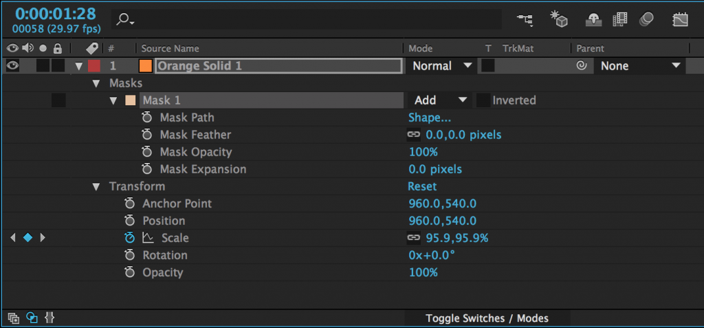
Most of the media you add to your composition can have three kinds of properties: masks, effects, and transform properties.  You should be familiar with transform properties by now; they are the most basic keyframe-able properties of a piece of media, such as scale, position, and rotation.  Masks allow you to cut unwanted areas out of a piece of media.  Effects are used to modify the media in countless different ways.  These three properties – masks, effects, and transform properties – are always applied in the same order: masks first, then effects, then transform properties.

You’ll find the mask tools up at the top of the screen in the tool bar.  There are preset mask shapes (hold-click to see the various options) and a pen tool for custom shapes.  Be sure to select the layer you want to mask in the timeline panel before clicking on a mask tool.

After you add a mask to an object (with either a shape tool or the pen tool), it will appear as a property of that layer in the timeline panel.  Next to the name of the mask, you’ll find a dropdown menu – the default value should be “Add.”  This means that the mask is “adding” that area and discarding everything else.  If you change this to “Subtract,” the area of the mask will be taken away and everything else will remain.  Choosing “None” will make the mask have no effect.  There are several other options as well, but add and subtract masks are what you will use most of the time.

There are a number of options for further modifying the mask, which are available by clicking the triangle to the left of the mask’s name.  Feather fades the edges; Opacity changes the transparency; and Expansion allows you to grow or shrink the mask.

Mask Path is the shape of the mask and by turning keyframes on for that property, you can animate that shape.  When the mask path keyframes are activated, you can move the points that define the mask or adjust their bezier curves.  If you click on the word “Shape…”, you can automatically change the mask to an ellipse or rectangle.

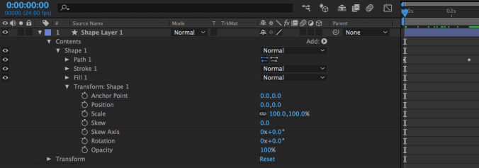
Shapes can be animated in a very similar way.  If look at the properties of a shape in the timeline, you’ll see a new category called “Contents.”  Under the shape’s name, you’ll find keyframe-able properties related to path, stroke, fill, and transform.  “Path” allows you to animate the shape of the shape, just like the shape of the mask can be animated. Stroke and fill control the color of the shape and the color and thickness of its border.  Transform is a second set of transform controls, applied before the regular transform properties.  There are a few extra properties in these new transform controls; they are related to the skew, or distortion, of the shape.

Effects

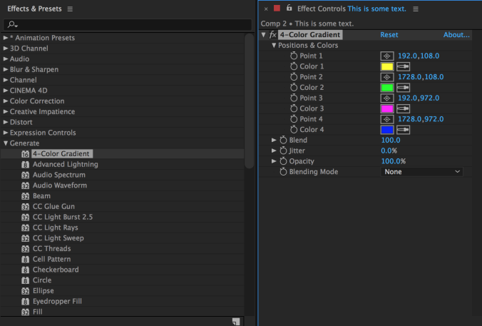
There are many effects built in to After Effects and countless more that can be added using plugins.  The effects are organized into categories under the Effects dropdown and in the Effects panel, which has a useful search bar.  Clicking on a piece of media in a composition and then choosing an effect in either location will add that effect and should bring up the Effect Controls panel.  The effect will also appear in the layer information of the composition in the timeline.

The list of effects can be found in two places.  The top dropdown menu has an Effects section with all the effects grouped into categories.  Simply go to the effect you want and click on it – it will be added to the selected layer.  There is also an “Effects & Presets” panel (you may need to find it using the Window menu).  This panel contains the same categories as the dropdown menu, but it also contains a search bar.  So if you know the name of the effect you want, just start typing it into the search bar and all the possible matches will appear.

When you add an effect, that effect will appear in the “Effects” section of the layer’s properties in the timeline (under “Masks” and before “Transform”) and in the Effect Controls panel.  The Effect Controls panel is best for getting your effect dialed in exactly like you want it – many effects have specialized controls and elaborate options.  The timeline window is best for refining and manipulating any keyframes that you add to your effects.  Remember that you can show all the keyframes that have been added to a layer by pressing the U key.

Text

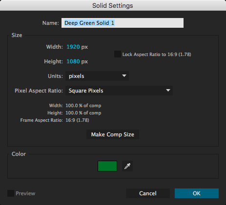
In addition to media that you import, you can create layers to add to your composition from within After Effects.  The most common are solids and text layers.  To create one, go to the Layers dropdown menu at the top of the screen, select New, and choose Solid or Text. When you create a new solid, you’ll see a menu with options for name, size, and color.

You can create text in a composition either by selecting the text tool (Cmd+T on Mac, Ctrl+T on PC) or choosing Layer>New>Text from the top dropdown menu.  You can either draw a box for the text in the composition window or just click somewhere and start typing.  You can also double-click on the layer in the timeline window to begin editing the text.

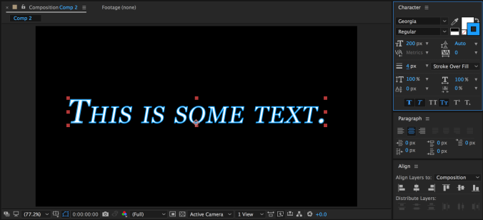
The “Character” panel in After Effects contains all the usual options for modifying text, as well as some unique controls.  You can change the typeface, size, fill color, stroke, and style; but you can also adjust the kerning and line spacing, add a faux bold or italics, switch to all-caps or small-caps, put text in sub- or super-script, and more.  You can highlight just part of your text and modify its properties separately.  There is a different “Paragraph” panel for adjusting the justification.

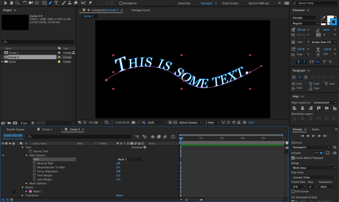
There are two text-related tools in the toolbar: one for horizontal text (this is what you’ll use most of the time) and one for vertical text.  What if you want your text to run along a specific path, however?  This can be achieved using the masking tools.  With your text layer highlighted, choose either the pen tool or a mask tool and draw a mask or path.  If you are using the pen tool (which is what I’d recommend), you do not need to close the path – you can simply create a line for the text to run across.

With your path drawn, click down to the “Text” section of the text layer in the timeline and find the “Path Options” section.  Next to “Path,” you should see a small dropdown menu – it will say “None” by default.  Open that menu and choose the path you’ve drawn – your text will snap to the path.  Some options for adjusting the position of the text on the path will also appear.

Transfer Modes and Track Mattes

Those of you with Photoshop experience may be familiar with transfer modes.  A layer’s transfer mode affects the way it interacts with the layers below it.  There is a “Mode” section of the timeline where this can be adjusted.  You may need to hit the “Toggle Switches/Modes” button at the bottom of the panel for it to become visible.

By default, the transfer mode should be set to “Normal.”  There are too many options to go through individually, but they are grouped together into sections.  The section with “Darken” at the top uses the dark areas of the layer to affect what is visible; the section with “Add” at the top uses the light areas.  You should experiment with the transfer modes to see how layers affect each other – you can get some really interesting results with them.

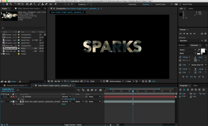
Next to the transfer modes are options for “Track Mattes.”  A track matte tells a layer to look at the layer above it for certain properties.  The “Alpha Matte” and “Alpha Inverted Matte” are particularly useful.  For example, if you put a text layer above a video layer and then set the track matte of the video to Alpha Matte, the video layer will have the shape of the text layer.  Alpha Inverted Matte will cut out the shape of the text.

Animate Text

As you can see, there are many ways of manipulating text in After Effects.  However, there is a whole other category that we haven’t yet discussed: animation presets.  There are actually animation presets for all sorts of things, but the text presets are particularly fun.  To use them, you’ll need to go to the Effects & Presets panel; *Animation Presets is the first option.

Within the Animation Presets category, you’ll see several subcategories.  Go down to Text and open it up.  There, you’ll see many more subcategories such as Animate In and Animate Out, Graphical, Mechanical, Organic, and lots more.  Animate In and Animate Out do just that – they automatically animate the text moving on or off of the screen.

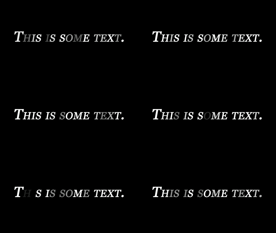
The other categories of animation presets add things like movement, graphical elements, or light effects to text.  For example, the Flicker Exposure effect in the Lights and Optical category makes each character in a text layer randomly flicker.  This is a fairly simple effect, but it would be very tedious to create it manually; the animation presets make it simple.

Many animation presets can be manually customized after they are applied.  To do this, go back to the “Text” section of the text layer in the timeline – there should be a new section called “Animator” followed by a brief description.  You can dig through the animator options to alter the animation preset, or highlight and delete it to remove it.

Project 5: Word Mark

By now, you should be able to add media to a composition, keyframe various properties with precision, use masks and transfer modes, and manipulate text.  I’d like you to combine these skills to create an animated “word mark” – essentially, an animated text-based logo.  Think about creating something that you’d like to use to identify your work, like the logos that play at the beginning of movies.

It can be your name, a brand name of your own creation, or any name you’d like to use as a personal identifier – but it must contain text.  If you’d like some media to use, here is some generic slow motion stock footage – although you are welcome to use any footage or other media you like.

Your finished graphic should be under 10 seconds long, feature some sort of text element, and be rendered as a QuickTime movie using the H.264 codec.  If the resulting file is small enough, email it to me directly – otherwise, upload it to your Google Drive and send me a download link.

Categories
Blog Posts

Art of the Title

Roll Credits

We don’t necessarily think of the design of a film’s title and credits as a crucial part of the production process, but it can completely set the tone for a film.  Many films have become inextricably linked to the design of their titles; think about Star Wars, Indiana Jones, or The Godfather and you immediately think about their iconic title design.

Here are a handful of videos from the excellent blog Art of the Title, where you can find essays, interviews, and videos about hundreds of television, movie, and game title sequences.

Categories
Blog Posts

Pixel Art

What’s Old Is New Again

Pixel art has had a sort of resurgence over the last several years, fueled by a combination of advancing technology and growing nostalgia.  Most often associated with video games, pixel art can also be used in short films for a unique aesthetic.  Here are a few videos that celebrate pixel art, including a tutorial on creating pixel artwork in Photoshop and the highly acclaimed short film Pixels (which inspired the critically reviled feature film Pixels.)

Categories
Weekly Lessons

Week 4: Manipulating Keyframes

Easy-Ease It

This week, we’re going to dig deeper into After Effects – specifically, keyframes.  In the previous lesson, we discussed how to add objects to a composition and keyframe their basic properties, such as position, scale, and rotation.  That lets us do a lot, but to make animation really seem alive, we need to move beyond the basics.  Before we get started, let’s review some of the principles of animation, as explained by Alan Becker.

Slow In, Slow Out

The ability to keyframe and animate properties is probably After Effects’ most powerful feature; however, that animation may look a little stiff and unnatural at first.  For example, if you use two “normal” keyframes to move a shape across a composition, the shape will begin moving abruptly, travel at a constant speed, and then stop abruptly.  Sometimes, this is the desired effect, but it’s not how things usually move in the real world.  Fortunately, After Effects makes it simple to make animation more natural and dynamic.

By default, keyframes in the timeline are diamond-shaped.  This is a standard “linear” keyframe.  If you right-click on a keyframe and move down to the “Keyframe Assistant,” you’ll see three “Easy Ease” options: Easy Ease, Easy Ease In, and Easy Ease Out.  Easy Ease Out “eases out” a property, meaning it will start slowly and then build up speed.  Easy Ease In “eases in” a property, meaning it starts fast and then slows down.  Easy Ease is used for keyframes where you want a property to start fast, slow down, then pick up speed again.  When you choose one of these options, the shape of the keyframe will change: Easy Ease Out is an arrow pointing left, Easy Ease In is an arrow pointing right, and Easy Ease is basically the other two icons combined.

Easy Ease sounds complicated, but it should quickly make sense once you start playing with it.  It’s really an essential tool in After Effects; it makes animated properties – especially movement – seem much more natural.  If you’re having a hard time with it, my general rule is this: use Easy Ease Out on the first keyframe in an animation, Easy Ease In on the last keyframe, and Easy Ease on the keyframes in between.  If you aren’t sure what to use, the regular Easy Ease is probably your best bet.

If you want to switch back to a standard linear keyframe, you can command click on it and its shape will change.  If it turns into a circular shape, command click on it again, until it is back to a diamond.

Here is the same piece of animation, first with regular keyframes, then with eased keyframes:

Changing the Position Path

As we discussed last week, many transform properties can be manipulated either in the timeline or within the composition window.  For example, if you animate an object’s position in the timeline, you should see those keyframes appear as a path in the composition window.  The keyframes themselves are little squares and the dots along the path represent individual frames.  You can get a sense of how fast or slow movement is happening based on how close together the dots on the path are.

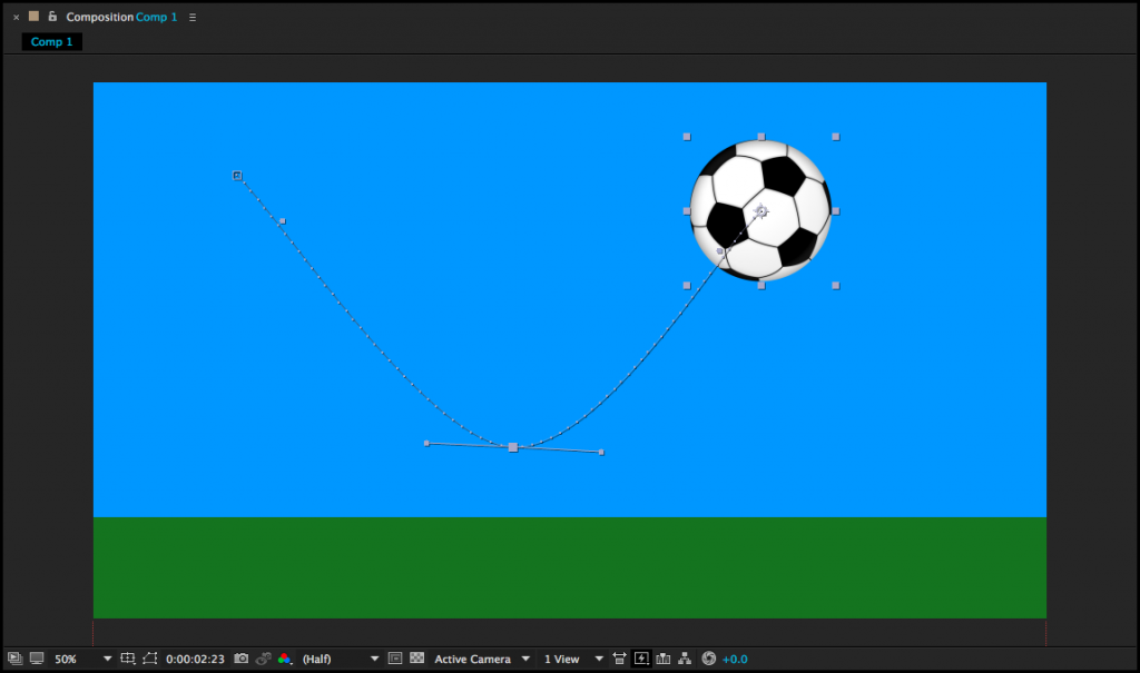
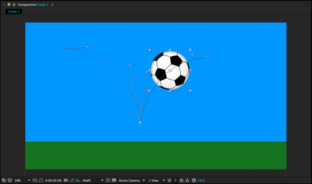
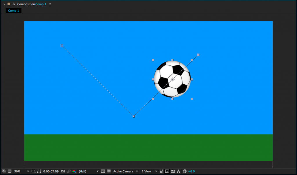
From within the composition window, position keyframes can be moved just by clicking and dragging.  If you click on a keyframe, you will also see curve controls.  These can also be clicked and dragged to change the position path of a moving object.  If you alt/option click, you can move the curve controls individually.  If you select the pen tool (G) and click on a keyframe, it will remove all curves from that part of the path.

Manipulating keyframes using Easy Ease and curves can help make your animations feel more natural and fluid.  Be sure to experiment with these techniques – and remember to consider the basic principles of animation.

Layer Trimming

One very basic action that we haven’t covered yet is the editing of a layer’s in and out-points.  By default, the entire length of a piece of media is dragged down into a composition and you may have noticed that there is no razor blade tool in the After Effects toolbar.  Instead, to trim the beginning of a layer, move the playhead to the desired in-point and hit option [.  Option ] will set the end point.   (Use alt on a PC.)  You can also click and drag on the ends of layers in a composition.

If you don’t hold down option, the [ and ] keys will move the layer without trimming it.  [ will move a layer so that its in-point is at the playhead location.  ] will move a layer so that it’s out-point is at the playhead.  These shortcuts allow you to adjust the length and position of layers in the timeline very quickly, once you’re accustomed to using them.

When you’re moving or trimming layers, it’s obviously important to have your playhead exactly where you want it in the timeline.  You can use the spacebar to play or move the playhead by clicking and dragging it with the mouse.  For precision, you can use page up and page down to move frame-by-frame forwards and backwards.  This is different from Premiere, which utilizes the arrow keys to move the playhead; in After Effects, the arrow keys adjust the position of the highlighted layer.  If you hold shift and press page up or page down, you will move the playhead ten frames instead of one.

You will also probably need to duplicate layers fairly often in After Effects.  This can be done by copy/pasting, but you can also use the  Cmd+D keyboard shortcut.  You can actually use  Cmd+D to duplicate all sorts of things in After Effects: shapes, text, entire compositions, and even effects.

One last note about layers: if you double click on a layer in the timeline, it will open that layer in a panel over the composition preview window.  This is actually not where you usually want to work, so if you accidentally double click on something, close the layer panel or click back to the composition preview window.

Timeline Length

When you create a new composition, you are asked to define its length.  If you need to change the length of the composition, you can do so by going to Composition>Composition Settings… or using the Cmd+K keyboard shortcut.  Changing the duration in the composition settings window that appears will either add or subtract time from the end of the composition.  However, you can also trim the composition down from within the timeline panel.

At the beginning and end of the timeline, you’ll find blue handles – these define the “work area.”  (There are actually two sets of blue handles – the smaller ones can be used to zoom the view of the timeline in and out.)  You can think of the work area handles as After Effects’ equivalent of an in and out point.  If you drag the work area handles to the section of the timeline you want to keep, then right-click on the lighter area directly between them, you’ll see a few options appear.  Select “Trim Comp to Work Area” to remove everything outside the handles and shorten the length of the composition.

Project 4: The Bouncing Ball

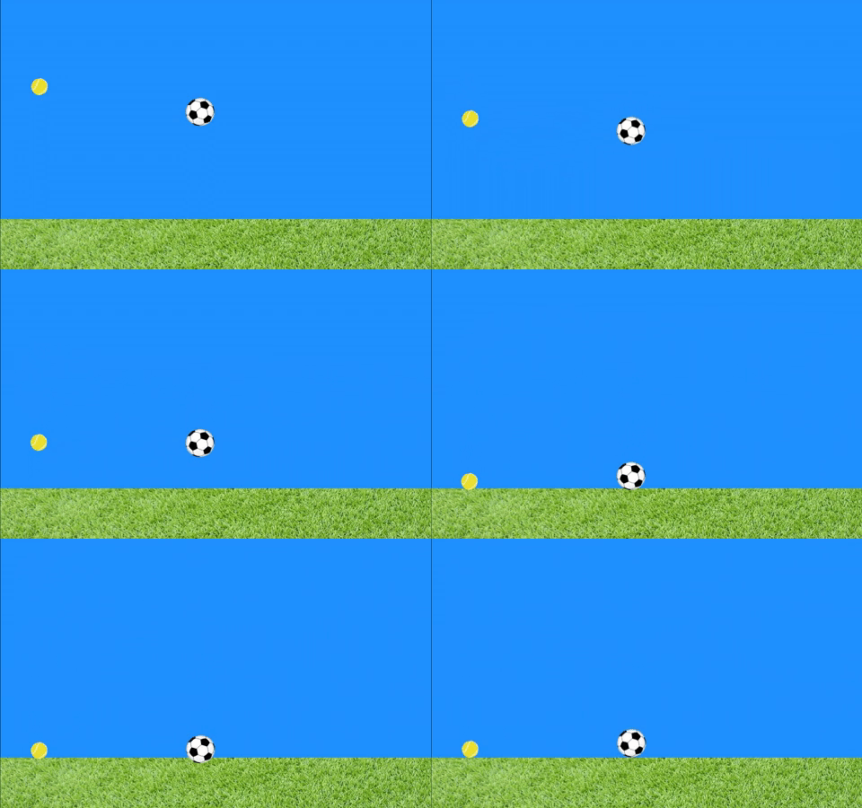
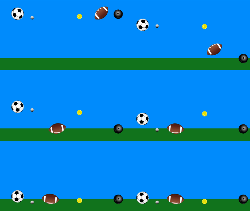
You may have noticed that a bouncing ball is used a lot in lessons about animation.  That’s because it’s  a simple action that clearly and concisely illustrates the basic principles of motion – and animation.

For your next project, download two or more of the graphics below.  Your goal is to create a short animation that shows the properties of the kinds of balls you choose.  A golf ball should bounce higher than a bowling ball; a football will ricochet differently than a tennis ball will; air resistance will affect a beach ball more than a soccer ball – you get the idea.  You can use solids or shape layers to create surfaces for the balls to interact with.

 Here are the specific parameters:

  • Create a composition using the HDTV 1080 24 preset.  It should be between three and five seconds long, although you may go longer if you want to get elaborate.
  • Animate at least two different kinds of balls.  They should interact with their environment in some way, such as bouncing off the floor.
  • Export your finished video as a Quicktime movie, using the H.264 codec.
  • If you finished video is small enough to email, send it to me directly.  Otherwise, you may need to upload it to your Google Drive and send me a download link.

Have fun!

Categories
Projects

Project 3: Transform Properties

Max

Jen

Jon

Brian

Rebecca

Dante

Categories
Blog Posts

Aamazing Aardman

Cheese, Gromit!

British animation studio Aardman Animations is one of the reasons stop-motion is still a valid cinematic technique today.  Their new film, Early Man is due out next year and is being directed by stop-motion auteur Nick Park.  Park directed all four Wallace and Gromit short films and Creature Comforts, as well as the features Chicken Run and The Curse of the Were-Rabbit.

Sadly, Peter Sallis – the voice actor who gave the character Wallace such personality and life – passed away this year.  Here’s a look back at some of Aardman’s early work, the trailer for the upcoming feature, and a behind-the-scenes chat with some of the studio’s model makers.

Categories
Projects

Project 2: Frame By Frame

Max

Jen

Jon

Brian

Veronica

Mike

Dante


Categories
Weekly Lessons

Week 3: Introducing After Effects

Moving Forward

It’s time to dive into After Effects.  As we explore the program, consider the things we’ve discussed so far – like cartoon representation and the twelve basic principles of animation – and try to incorporate them into your projects.

After Effects is designed around creating media, often using assets created in programs like Illustrator and Photoshop.  After Effects is the perfect application for building animated titles and lower thirds, is a powerful tool for character animation, and can be used for compositing and special effects work.  It is often used in concert with other programs to create sophisticated video content.

After Effects is also deeply customizable.  There are countless plugins and presets available for After Effects that can completely alter the capabilities of the program.  These run the gamut from manipulating 3D models to automated text animation to particle effects and everything in between.  Websites like aescripts and Video Copilot are fantastic resources for adding functionality to the application.  Larger companies like Red Giant and GenArts make more sophisticated  — and often expensive — add-ons for even more advanced professional-grade work.  However, even without external plugins, After Effects is an incredibly powerful platform for media creation.

Setting Up A Project

When you open up After Effects, you’ll likely see a splash graphic with the usual options for starting a new project or opening an existing one.  After Effects does not require you to set a project location or save before you start working.  I’d recommend keeping everything organized in a central folder, sorting your media by type, and saving frequently.

A quick word on the layout of the After Effects workspace: like all current Adobe software, After Effects has a flexible, adaptable layout that you can – and should – modify depending on your current needs.  There are a number of preset layouts, which are accessible under the Window>Workspace dropdown menu.  If you are moving panels around and lose something important, you can always reset the workspace by going to Window>Workspace>Reset to saved layout.  The Window dropdown also contains a list of every available panel, so if you can’t see or can’t find a specific area, you can choose it from that list.  The panels you will probably use the most include the Project, Composition, Timeline, Effect Controls, and Preview panes.  If you are editing text, you may want the Character, Paragraph, and Align panels open.  If you are working with lots of effects, having the searchable Effects & Presets panel up will be helpful.  If you find a layout you like, you can save it under the Window dropdown.  Don’t be afraid to move, resize, open, and close panels – you can always reset them later.
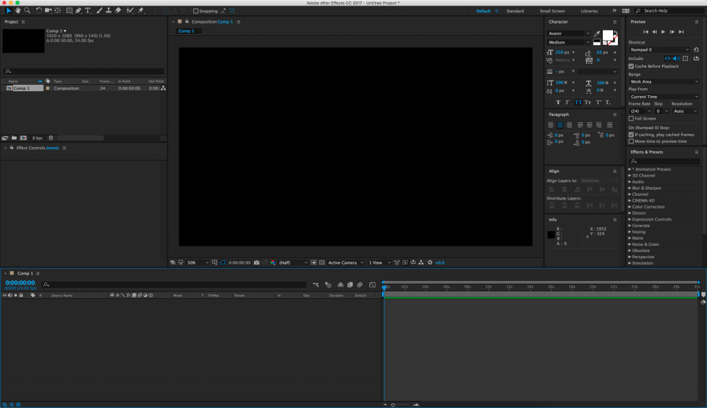
In After Effects, you’ll be working in compositions.  You can create a new composition by hitting Cmd+N, selecting “New Composition” from the Composition dropdown menu, or by clicking the icon that looks like a scene inside a filmstrip at the bottom of the Project panel.  You’ll be greeted with a menu that gives you options for resolution, frame rate, and the duration of the composition.  There are several presets to choose from and they are actually pretty helpful.  For this class, use the HDTV 1080 24 preset.
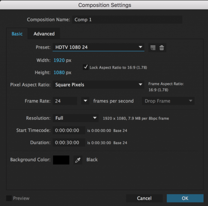
Hitting “OK” will open up a new blank composition.  You’ll be dragging media into the Timeline and your work will be visible in the Composition panel.  There are no pre-determined audio or video “tracks” in the Timeline window; pieces of media simply stack on top of each other.  Every video or audio clip, still, adjustment layer, text, and shape appears as its own layer in the Timeline.  You can also drag one composition into another or put footage into a “pre-composition”.  You can rename media in either the Timeline or the Project panel by highlighting something and hitting return.

To get media into After Effects, you’ll need to import it.  You can import all kinds of things – stills, video, music, 3D files, even other After Effects projects – by going to File>Import>File… in the top dropdown menu, hitting Cmd+I, or just dragging things from the Finder into the project window.

You can also create pieces of media such as solids and shapes to use within After Effects.  A solid is a simple block of color.  Go to Layer>New>Solid… or hit Cmd+Y to define the color and size of the solid, then hit “OK” to create it.  It will automatically appear in the timeline of whatever composition you are working on.  To create shapes, use the masking tools (discussed below) without selecting a layer in the timeline.  In other words, simply select a mask or pen tool and begin to draw in the composition window.  If do you have a layer selected, that layer will be masked instead of drawing a shape – we’ll go into this in greater detail later.
Tools

If you’re using the “standard” layout, you should see a bar of tools across the top left section of the screen.  These are what we’ll be using to interface with After Effects, so it’s essential to know what they do.

From the left, the first tool is the arrow selection tool.  This is what you’ll be using most of the time.  Its keyboard shortcut is V.

Next is the hand tool, which moves your view around in the composition window.  You can press H to select the hand tool or you can hold the space bar down to switch from your current tool to the hand tool.  This is the quickest way to move around your composition.

Next is the zoom tool, which looks like a magnifying glass.  The zoom tool is pretty self-explanatory: it zooms your view of the composition window in; hold alt/option to zoom out.  This is useful, but a faster way of zooming is by using the scroll wheel on your mouse: scrolling up zooms in and scrolling down zooms out.  There are also zoom controls in the bottom left corner of the composition window.

The circular arrow is the rotation tool, which can be selected using the W key.  This rotates media in the composition window.  Next to the rotation tool is a dropdown menu with several tools related to virtual cameras – we’ll discuss those later in the semester when we go over 3D compositions.

Next to the camera tools is an incredibly useful tool that looks like four arrows in a dashed-line box.  This is the pan behind tool and you can select it using Y.  The pan behind tool is used to change the anchor point of a piece of media without moving the object itself.  This will prove very helpful when we begin to do character animation.

Next to the pan behind tool is a dropdown menu with tools for either creating different kinds of masks or different shapes (Q).  Then there are the pen tools (G) which can also be used to create masks or shapes.  The horizontal and vertical text tools are next (Cmd+T).

We won’t be using the next few tools very often, but they are: the brush tool, the clone stamp tool, and the roto brush tool.  The last tool, which looks like a push pin, is the puppet pin tool (Cmd+P on a Mac, Ctrl+P on a PC), which we’ll use for character animation.

Transform Properties
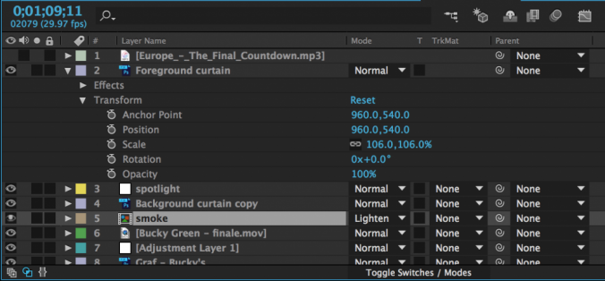
Let’s manipulate some media in After Effects.  The timeline is where you to modify properties like scale, opacity, and position.  On the left side of each piece of media (or layer) is an arrow that can be tipped down.  Clicking it will reveal three categories of properties that can be adjusted: masks (if any have been added), effects (if any have been added), and a section called “Transform.”  These categories always appear – and are applied – in this specific order: first, masks are applied, then effects, then transform properties.  If your media includes audio, that section will appear last.

Clicking “Transform” will reveal the following properties: anchor point, position, scale, rotation, and opacity.  Most of these are self-explanatory, although “anchor point” can be a little confusing.  The anchor point is basically the central point in an image or video and changing the anchor point changes the way an object rotates and scales.

You will be adjusting the transform properties a lot when using After Effects, so it’s helpful to know their keyboard shortcuts:

A – anchor point
P – position
S – scale
R – rotation
T – opacity

You’ll notice that next to every transform property – in fact, next to almost everything – is a stopwatch icon.  This icon turns keyframes on and off.  Setting keyframes allows you to animate a property over time.  By default, keyframes are switched off – you can tell because the stopwatch icon is greyed-out.  Clicking the icon will turn keyframes on and a new keyframe will be set every time an adjustment is made to that property.

Whenever you add a keyframe to an effect or transform property, that keyframe will appear as a diamond shape on the timeline.  Keyframes can be moved, copied and pasted, or deleted right on the timeline.  A group of keyframes can be scaled up or down by selecting them with the mouse, then holding alt while clicking and dragging a keyframe at the end of the group.  You may need to experiment to see just how this works, but After Effects is designed to make adding and modifying keyframes very easy.  As a result, you can animate properties with very precise control.

To see all the keyframes on a layer, highlight that layer in the timeline and press the U key.  I use this particular shortcut constantly.

Exporting Using the Render Queue

The best way to export in After Effects is using the Render Queue.  The Render Queue exists as a panel in After Effects – it may show up as a tab next to the compositions in the timeline (otherwise, you can always find it under the Window dropdown at the top of the screen).

To add a composition to the Render Queue, open the composition in the timeline, then go to Composition>Add to Render Queue.  The name of the composition should then appear in the Render Queue panel.  Before you hit the “Render” button, you’ll need to set a few parameters.  Unless something has been changed, everything in the Render Settings section should be fine at the default values.  The Output Module is where you actually make changes to the file type and codec, so click on that to bring up a window with lots of options.  For our purposes, just click on “Format Options…” and change the video codec to H.264.  Click OK to close each window.  Finally, set the file’s name and destination by clicking on the text next to “Output To:”.
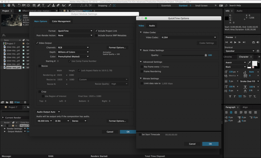
What’s great about the Render Queue is that, if you are working on multiple compositions, you can add them all, then render them together.  Just repeat the process of adding them to the queue and adjusting their settings, then hit Render.

Project 3: Transform Properties

For this week’s project, I’d like you to go through the process of creating a composition in After Effects, adding keyframes to the transform properties, and rendering the finished video.  Make a new composition using the HDTV 1080 24 preset; it should be between five and ten seconds in length.  Add at least three different pieces of media to the composition and keyframe at least one transform property on each piece of media.  The media you use can include solids, text, or photos and videos that you import into After Effects – if you want to find some images to use with Google, that’s completely fine.

Once you’ve created your short animation, export it using the instructions above.  Export using the QuickTime format and H.264 codec.  For the name of the exported file, use your name and “project 3.”  Email the finished project to me at dan014@bucknell.edu before class next week.

This project is all about getting used to working in After Effects, so don’t worry too much about creating an animated masterpiece.  However, it is important that you pay close attention to your composition and export settings – you’ll lose points if something is in the wrong format.  As always, be creative and have fun!
Categories
Blog Posts

Mysteries and Fan Theories

Digging Deeper

Hidden meanings and conspiracy theories abound in these videos that delve into cartoon mysteries.