Creating Characters
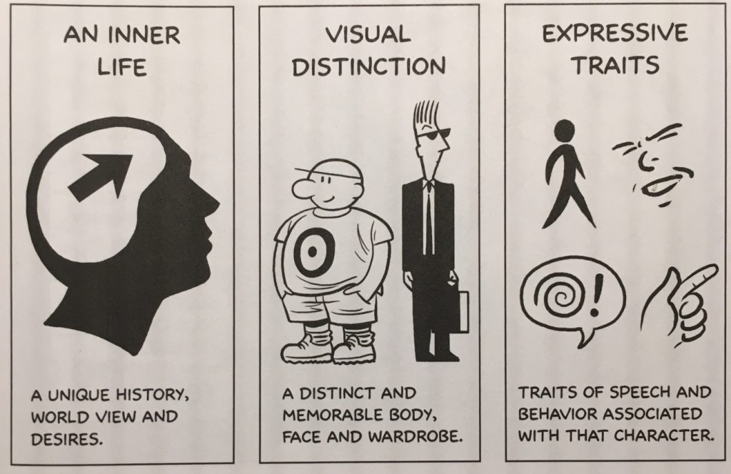
There isn’t really a right or wrong way to design a character; the kinds of characters you choose to make is ultimately a matter of artistic preference. We can, however, learn a lot by listening to the advice of other artists and animators. In his book Making Comics, Scott McCloud suggests that there are three qualities that a successful character must possess: an inner life, visual distinction, and expressive traits. Without these qualities, a character might be confusing, flat, or – worst of all – forgettable.
A character’s inner life relates to their “unique history, worldview and desires.” This includes a character’s backstory, personality, archetype, and more. Visual distinction means that a character has” a distinct and memorable body, face, and wardrobe.” This has to do with a character’s physical characteristics. Expressive traits are “traits of speech and behavior associated with that character.” A character’s expressive traits are what make them move and speak in a unique and interesting way – this could include posture, body language, facial expressions, and more.
Backstory
In order to be successful, even a very simple character should have a backstory. While you certainly don’t need to know every detail of a character’s life history – McCloud writes that “obsessing too much over such details is a classic beginner’s mistake” – you should certainly have a sense of a character’s personal identity.
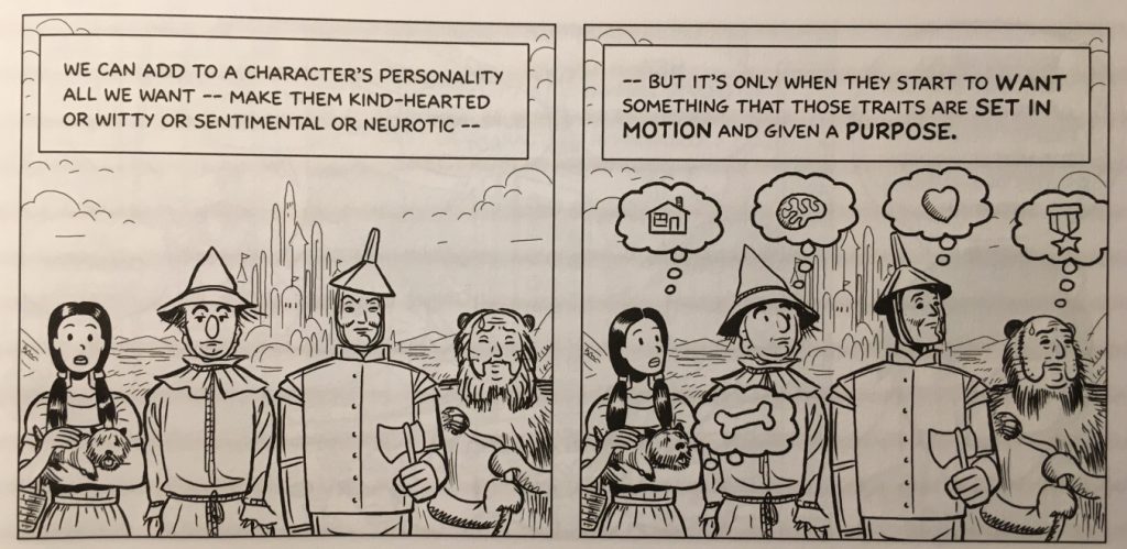
Some characters are defined by specific moments in their history. Superhero stories often utilize moments like this – think about the origin stories of Spiderman and Batman. Other characters are defined by their desires – something that motivates them and causes narrative conflict. Every character in The Wizard of Oz has a clear desire that motivates their actions. Still other characters fit into certain archetypes. Star Wars makes great use of archetypal characters: the naive hero beginning a quest, the lovable rogue, the princess, the wise old man, etc. Your characters can be defined by their history, their desires, their archetype, or some combination thereof – the important thing is that you know and understand them.
Shape and Silhouette
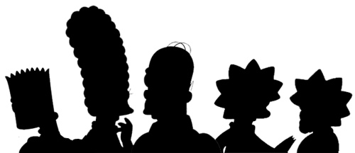
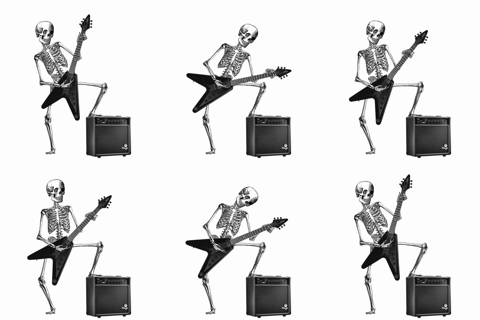
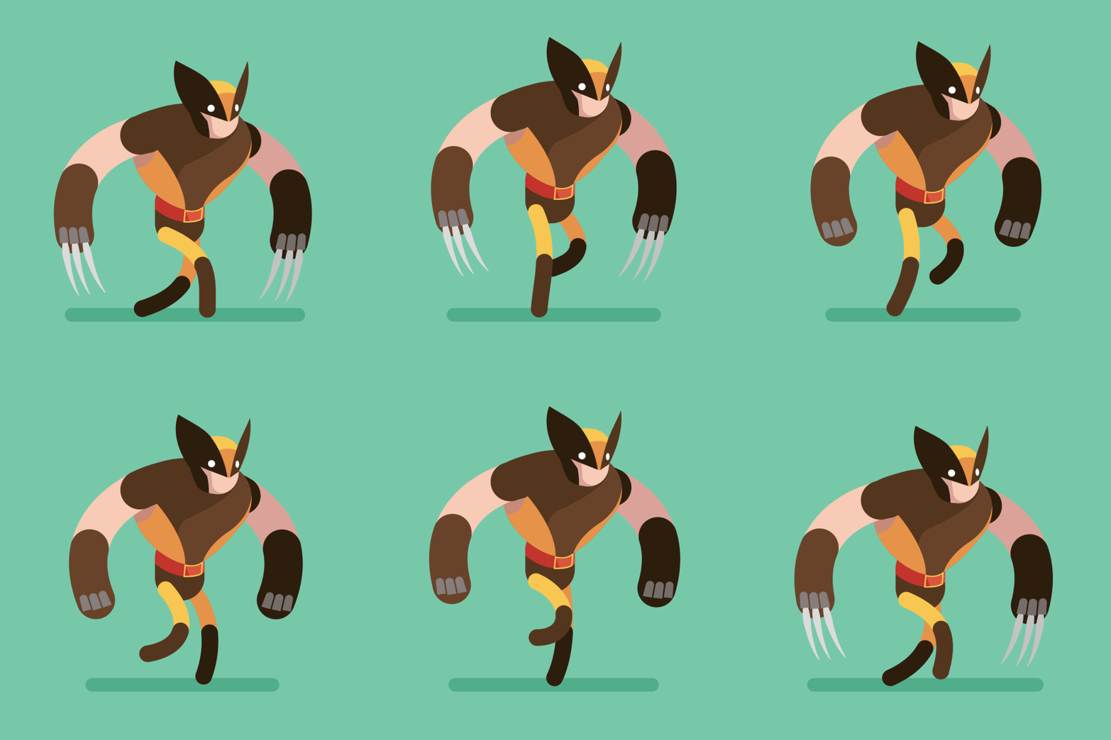
Matt Groening, the creator of The Simpsons and Futurama has a theory of good character design that has helped him create some of the most iconic characters in the history of animation. “The secret of designing cartoon characters — and I’m giving away this secret now to all of you out there — is: you make a character that you can tell who it is in silhouette. I learned this from watching Mickey Mouse as a kid. You can tell Mickey Mouse from a mile away…those two big ears. Same thing with Popeye, same thing with Batman. And so, if you look at the Simpsons, they’re all identifiable in silhouette. Bart with the picket fence hair, Marge with the beehive, and Homer with the two little hairs, and all the rest. So…I think about hair quite a lot.”
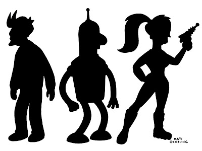
One way to give a character a distinctive silhouette is by using basic shapes as a starting point. By using a square, circle, or triangle as a starting point, you can give your character a unique look that is easily recognizable. Of course, you can – and should – elaborate on these basic shapes, but they can be a great starting point.
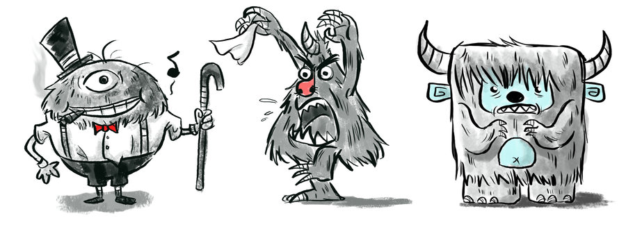
Shapes can also tell the audience a great deal about a character’s personality. Think about Ellie and Carl in the Pixar film Up – everything about Carl is square and blocky, which makes him seem gruff and serious. Ellie is made up of curved lines and circles, so she seems free-spirited and whimsical by comparison.
I’d also suggest using lots of reference images when you’re designing your characters. Don’t feel like you can only draw from your own imagination –there is absolutely nothing wrong with using other images, or even other artists’ characters, as a point of inspiration. Just be sure that you make the finished character your own.
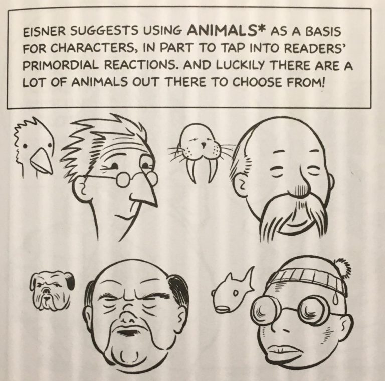
Body Language and Speech
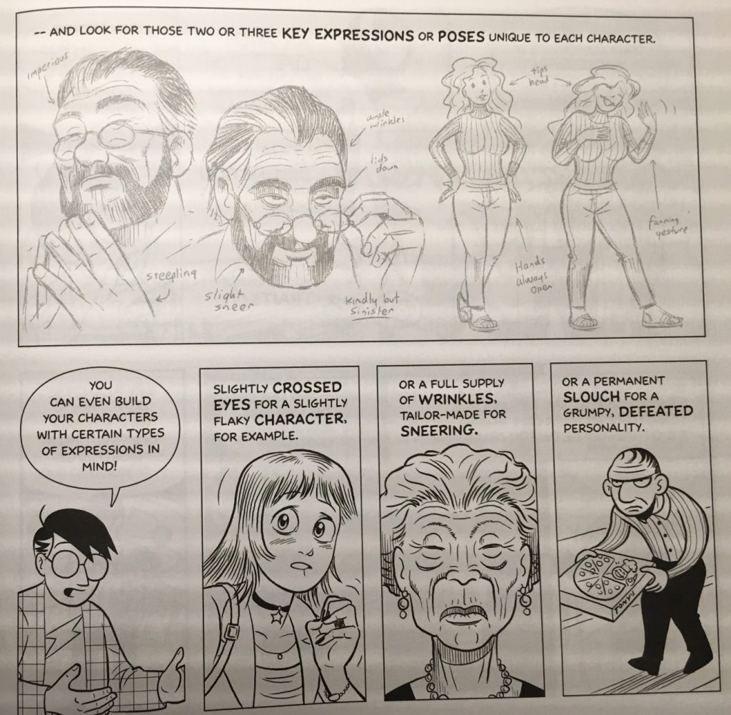
Does your character slouch or stand up straight? Do they fidget? Walk with a limp? Speak with an accent or use particular idioms? These are some of what McCloud calls “expressive traits.” Whereas visual distinction has to do with physical appearance, expressive traits are related to what your character does.
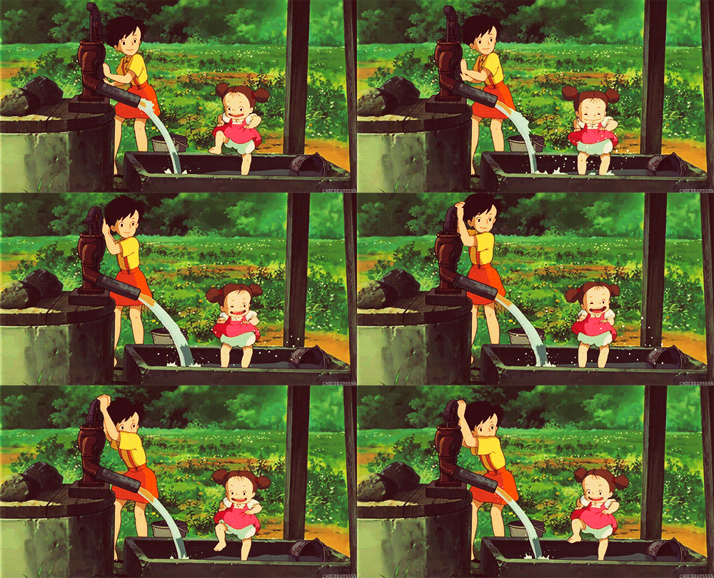
Japanese animation legend Hayao Miyazaki does a masterful job of using physicality to reveal aspects of a character to the audience. In My Neighbor Totoro, older sister Satsuki is graceful and precise while younger sister Mei is comparatively clumsy. The way each character moves tells the audience about their age, personality, and relationship to each other. Satsuki flits across the screen while Mei crashes after her.
McCloud suggests defining key poses or facial expressions for your characters. These are physical cues unique to each character. It could be the way someone cocks their head to the side, or leans against a doorframe, or looks over the tops of their glasses. As the audience gets to know your character, these key actions will become associated with their respective characters and help make them seem more rounded and alive.
You can also use expressive traits to play against a character’s physical appearance. A hulking, brutish looking character could tiptoe fearfully or a meek-looking character could pose heroically. There are endless options.
Designing for Animation
We’re not going to dive too deeply into how to use programs like Photoshop and Illustrator, but there are some things to keep in mind. First, remember the abilities and limitations of After Effects when you are creating your character. We’ll be animating using keyframed transform properties like rotation and position as well as puppet pin deformation. This gives us a lot of flexibility, but it also means that some things are more difficult to animate than others. Wild, elaborate hair, for example and flowing fabric will be challenging to animate in After Effects. That said, you can often find creative solutions to such problems, so don’t sacrifice your vision.
Second, remember to think in layers. When a Photoshop or Illustrator file is imported, we can retain the layer structure. If you want something to move independently, put it on its own layer. As a very general guideline, a good layer breakdown might include the head, facial features, torso, hips, upper and lower arms, hands, upper and lower legs, and feet. The more elaborate and detailed your character is, the more layers you’ll have to create (and eventually animate).
Finally, think about how your character is going to appear in the animation you will eventually be creating. If your character is only ever going to appear from the front, you might only need a frontal view – but if your character is going to be seen from the side, behind, or above, you’ll need to create those views as well. Also think about how closely you’ll be seeing your character on screen. While Illustrator files can be scaled up without distorting, Photoshop files will pixelate if you zoom in too far. If you’re creating your character in Photoshop, make them big enough to be usable, or create multiple versions at different resolutions.
Drawing Inside After Effects
After Effects does not have the same breadth of drawing tools that dedicated programs like Photoshop, Sketchbook, Gimp, or Illustrator do. However, its tools are robust enough to be used in certain situations and animation styles. After Effects’ shape tools allow you to control the path, fill, and stroke of shapes, so it’s fairly easy to create relatively simple characters directly within the program.
There are some distinct benefits to building your puppet within After Effects. For one, since shapes in After Effects are vector-based, they can be scaled up infinitely with no loss in quality. Creating your puppet within After Effects also means that you have one less file to keep track of and you don’t need to “round-trip” between After Effects and another program to make changes. Finally, creating a puppet within After Effects lets you keyframe and control aspects of the character in unique ways; for example, you could keyframe the path of a shape or the thickness of its stroke. That kind of direct control is only possible when creating characters directly within After Effects.
The biggest downside to drawing your puppet within After Effects is that you just don’t have as many options at your disposal. After Effects is not really a drawing program, so its interface and toolset aren’t designed around that purpose. That being said, there is still a lot of latitude within the program and you shouldn’t discount it as a possibility.
If you want to use this method, I’d suggest starting with a sketch and then importing it into After Effects. You can then use the pen and shape tools to trace the sketch in After Effects. Note that you can actually have multiple shapes – with different fills, strokes, and paths – on the same shape layer, which can help keep your composition a bit more manageable. However, every part of your puppet that needs to move independently should be on its own layer.
Talented (and profane) animator Ross Plaskow utilizes this method in some of his animation tutorials.
https://youtu.be/fXL9bVnX8fU
Using Photoshop
Photoshop’s biggest asset is probably its ability to modify and utilize other images. Images can be distorted, manipulated, and combined in very interesting ways. Photoshop also has very advanced drawing tools – if you are an artist with a traditional drawing background, using Photoshop and a pen tablet may be an easy transition for you.
Photoshop is very well suited for creating characters with texture, shading, and rough edges. If you want your character to have a hand-drawn look, Photoshop is probably your best choice. It’s also a great tool for collaging or importing your own artwork. If you aren’t comfortable drawing digitally, one option is to draw your character by hand, scan it, then separate the layers in Photoshop.
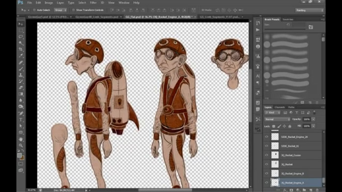
Layers are one thing you’ll need to be mindful of regardless of the method you choose to make your character. Think about how you want your character to move and let that dictate the structure of your character. If your character has a long flowing scarf, for instance, that scarf should probably be on its own layer. Other objects that don’t need to move independently (such as the buttons on a character’s jacket) can be combined with other layers.
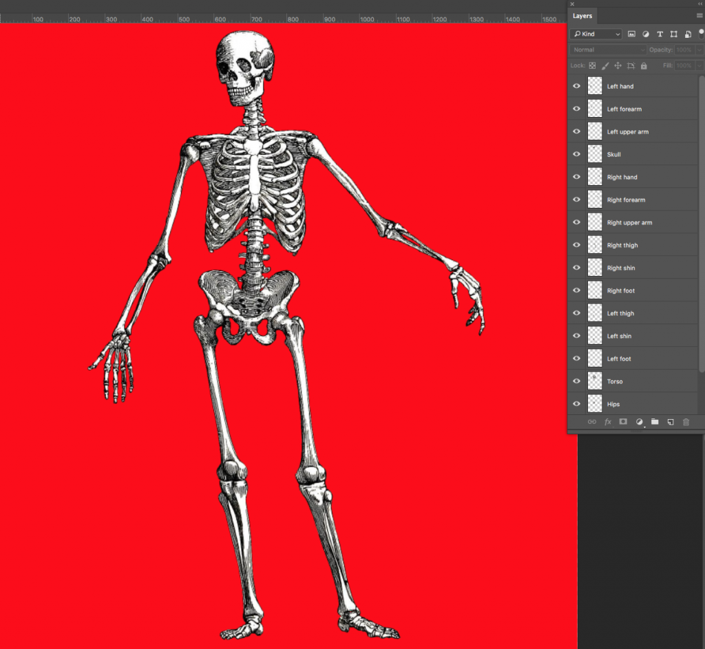
Another thing you’ll need to consider regardless of your method is the way that layers overlap and interact with each other. In Plaskow’s tutorial above, he mentions that overlapping body parts should have curved ends. This allows two layers – for example, the upper and lower arm, which meet at the elbow – to rotate around each other without creating strange blocky shapes. Of course, if you plan on animating parts of your character using puppet pins, they will be set up differently. Keep the way your character is supposed to move in mind as you draw them out.
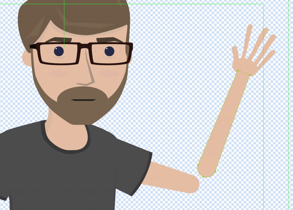
One thing you’ll want to be sure of when drawing in Photoshop is that the background behind your character is transparent. By default, Photoshop makes a white base layer, so you may need to delete this.
One nice feature about Photoshop and Illustrator files is that you can turn off the visibility for layers. The layer will still be there when you import the file into After Effects and you can re-enable its visibility. So, if you want to draw multiple mouths or eyes for your character, you can make them in the same Photoshop file and simply hide the layers.
Another nice feature of working in Adobe software is that you can continue to update your file even after it’s imported into After Effects. You need to be careful not to change the overall file structure, but you can continue to make alterations right up until you render your finished video.
Overall, Photoshop is a great tool for puppet creation. The major downside is that the files you create will eventually become pixelated and distorted as you zoom in on them. If you keep this limitation in mind, you can use it to make almost anything.
Using Illustrator
While Illustrator and Photoshop have similar toolsets and interfaces, they “feel” different in practice. You can import still images into Illustrator, just like in Photoshop, but the program is really designed around drawing with curves. You can create gradients and patterns, but you won’t get the same textural results that you do in Photoshop. Characters created in Illustrator tend to have clean lines, uniform colors, and be composed of relatively simple shapes.
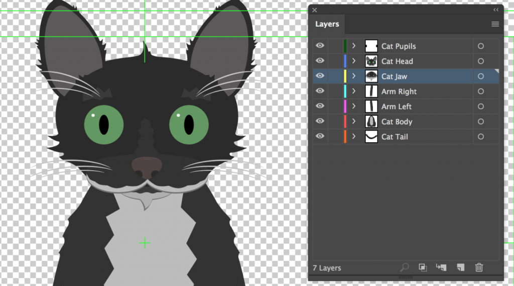
When working in Illustrator, you can actually have multiple groups of shapes within each layer. When you import the file in After Effects, only the top-level layers will be recognized, so group your shapes accordingly.
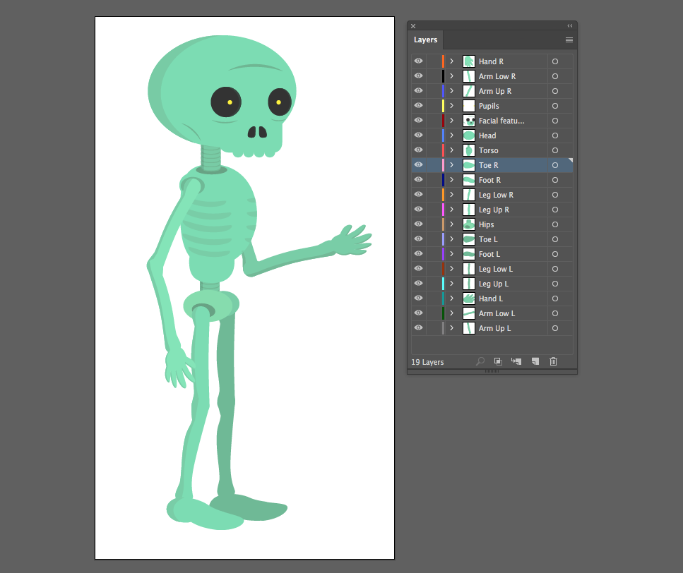
Remember to name your layers as you go. If your puppet has its right eye and left eye on separate layers, name them accordingly. It’s going to be a frustrating process if you import your character into After Effects and see “Layer 1, Layer 2, Layer 2 copy,” etc.
The benefit of using Illustrator is that you have access to a very full-featured tool for creating layered vector artwork – artwork that can be scaled up as much as you want without becoming pixelated. The downside is that most Illustrator art tends to be fairly simplistic in terms of color and shape. If you like a simple aesthetic, however, it’s probably a good choice.
Designing a memorable, well-realized character is challenging, but it can also be a lot of fun. If you find yourself getting stuck, pick a theme or point of inspiration and start elaborating on it. If you give your character a personal history, a unique look with a recognizable silhouette, and a style of movement and speech that fits their personality, your character will come to life in exciting ways.
Project 9: Make A Friend
Your assignment this week is to create the character you’re going to use for your final project. If you haven’t already done so, review the details of the final. Your character may change a bit by the time the final is actually due and that’s fine – but this should serve as your first pass at designing your lead character.
Your character may be human, animal, an inanimate object, or whatever you like. You can create it using Photoshop, Illustrator, directly within After Effects, or by hand. If you choose to draw or paint your character, you should scan it and separate the different layers in Photoshop.
If you aren’t comfortable drawing, you can also create a character by “collaging” in Photoshop – find images of the different parts of your character and assemble them together in the software. If you take this approach, you will probably have to do a lot of erasing and clone-stamping to get everything to fit together. I’d ask that you either heavily modify any source images that you use or use images that are “labeled for reuse” in the search tools of Google Images. You could also take photos yourself.
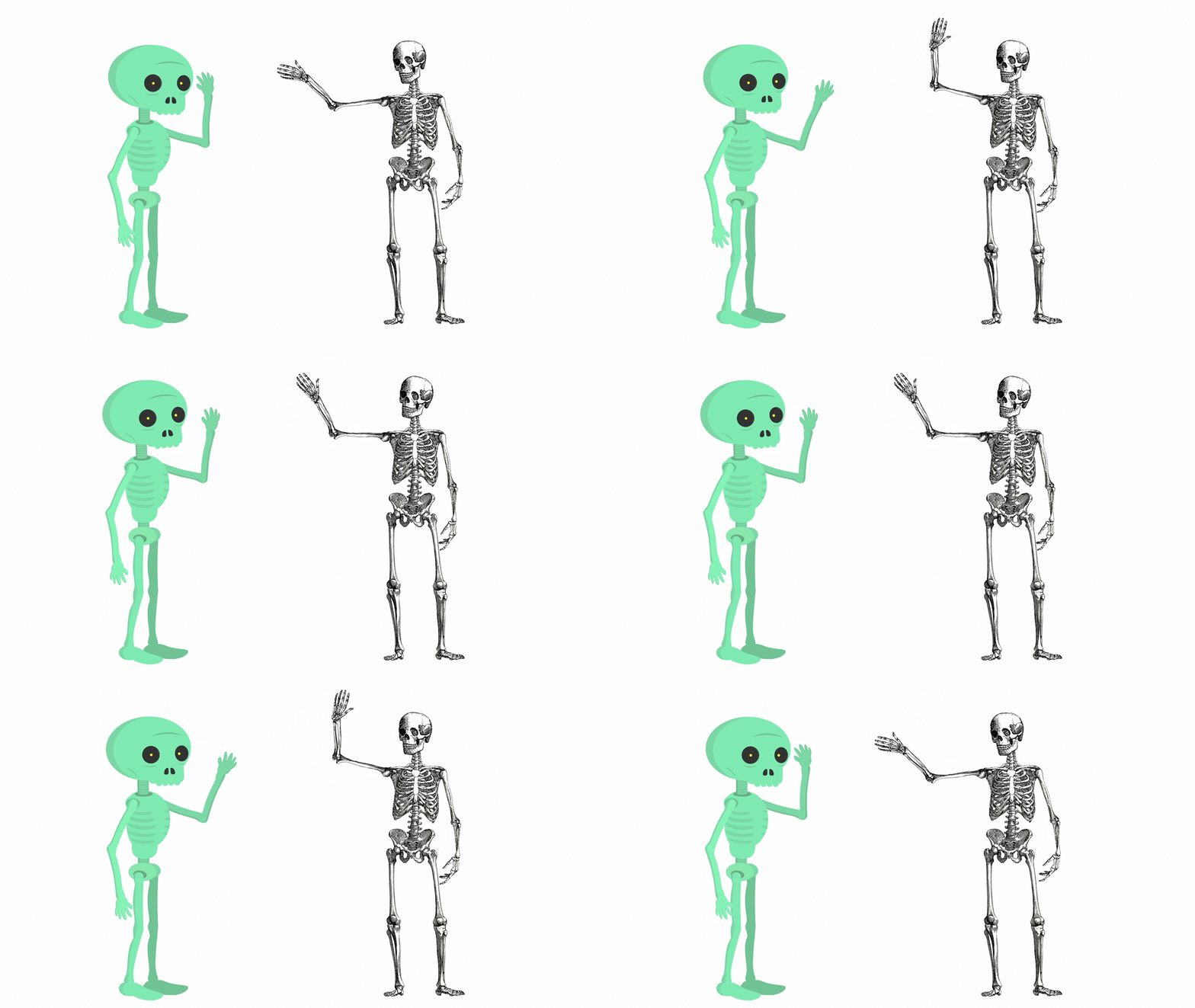
For some examples, you can either review the files from last week or check out these two skeletons: one created in Illustrator and one created in Photoshop. Your characters do not need to have as many layers and parts as these; again, think about what your character needs to do and how complex it should be.
However you choose to create it, make sure that it is ready to animate next week! Send me an image of your character before class.
