The Process
For the last several weeks, we’ve focused on the technical abilities of After Effects as an animation platform. Now, let’s take a step back and look at the animation process in general. Live-action films have a fairly straightforward workflow: a project is scripted and planned, then filmed, then edited. The editor has a large role in shaping the tone, pacing, and narrative qualities of a film – they choose the best takes and camera angles, define the length of shots, experiment with overall structure, and much more. However, animators don’t generally produce much, if any “extra” footage – there aren’t multiple takes or camera angles to choose from. So what is the role of an editor in animation?
As discussed in the following short documentary from The Royal Ocean Film Society, the editor on an animated project is actually a collaborator in the filmmaking process much earlier than a live-action editor is. Because animation is, by its very nature, tedious and time-consuming, you absolutely don’t want to waste time and money by creating shots that you aren’t going to use. On a live set, changing camera lenses, adjusting blocking, or trying something new with the lighting is relatively simple. When in doubt, you can film something multiple ways and then choose the best approach in post-production. Animators don’t usually have that luxury – they need to know the best approach before they start the animation process.
Even on short animated projects, planning is of the utmost importance. I generally start by writing a general outline, then some very crude sketches. From there, I draw more detailed storyboards, which I refine until I’m happy with the flow of the piece. Depending on the complexity of the sequence you’re working on, you may want to go a step further and create an animated version of your storyboards (known as an “animatic”). You should only begin animating once you have a clear plan and know that the shots will work together.
To illustrate the animation process, I decided to put together a 60-second short film. As you work on your own projects, think about what shots you need to animate, what puppets (and different versions of those puppets) will need to be created, and how to organize your workflow in general. There is room for improvisation and experimentation in animation – After Effects in particular makes it easy to move or alter keyframes, modify puppets, and much more. That being said, you need to be as organized and well-planned as possible. The more work you do at the beginning of the process, the easier the later stages will be.
Characters and Props
I had some characters already made up from an older project that I decided to reuse, which saved a lot of time. The characters were created in Adobe Illustrator. When I was creating these characters, my idea was to keep them simple and friendly-looking, with lots of rounded shapes and a limited color palette. In addition to the owl and bear, I knew I wanted my piece to include a firefly, but I planned on creating that directly within After Effects.
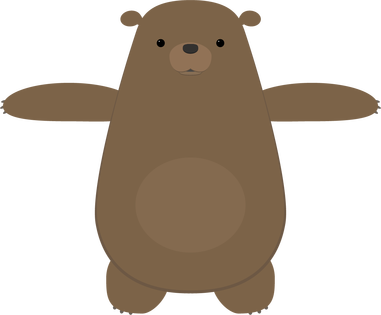
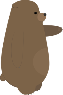
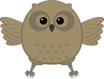
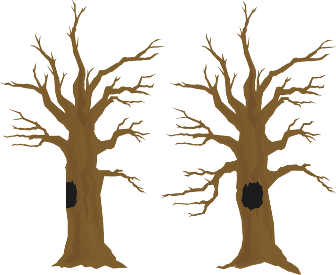
I also had a tree already created that I was able to use for this project. I modified it slightly, by adding a hollow, and made a side view by changing the shape of the trunk and deleting some branches.
I often find the process of creating characters, sets, and props to be the most time-consuming part of the an animated project — even more than the animation itself. For this reason, I’m always careful to keep anything I create so that I can potentially reuse it in the future. I actually have a folder in my Google Drive full of old Illustrator and Photoshop files, so that I can pull things up quickly wherever I am.
Storyboards
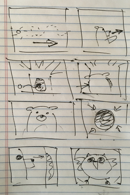
Before I sketched out my storyboards, I had the general idea of the piece figured out: a bear chases a firefly through the woods, the firefly goes into the hollow of a tree, and the bear is startled by an owl when he goes to investigate. The bear freaks out, but the owl is friendly and the fireflies follow him out. They all have a happy little moment together.
This is a very simple “story” – there is no dialog, the characters have very obvious motivations, and the actions are easy to understand. This is what I think of as a “one gag” film – a short film in which only one thing happens. In this case: a bear gets startled by a friendly owl. I like projects like these because they force you to focus on the basic essentials of animation and storytelling.
I did some very quick and sloppy storyboards for this project. This is such a helpful step, especially in terms of figuring out angles and perspectives. While the storyboards are a great tool, they do not necessarily dictate what everything will look like in the final version. The huge benefit of computer-based animation (like what we do in After Effects) is that it is still possible to make basic changes as you go. In hand-drawn animation and stop-motion, this is much more difficult.
Animation
I imported the tree and the owl and bear puppets, then got the puppets rigged for animation. For the firefly, I just created a little green circle and applied the Glow effect to it. I then began animating them against a plain black background.
For this project, I skipped around a little, but mostly animated in order – shot one first, then shot two, and so on. This is completely a personal preference, but working like this allows me to make sure that each shot flows nicely with the next one. As I did the rough animation for each shot, I placed that shot’s composition into a larger composition so that I could see how the piece was coming together as a whole. My general process is to start with basic movement, then add finer details, then refine the timing, and then to polish things up with final touches such as simulated camera movement or adding filters and effects. For a few shots, I added a blur to either the background or a pre-composed puppet, to give the illusion of depth-of-field.
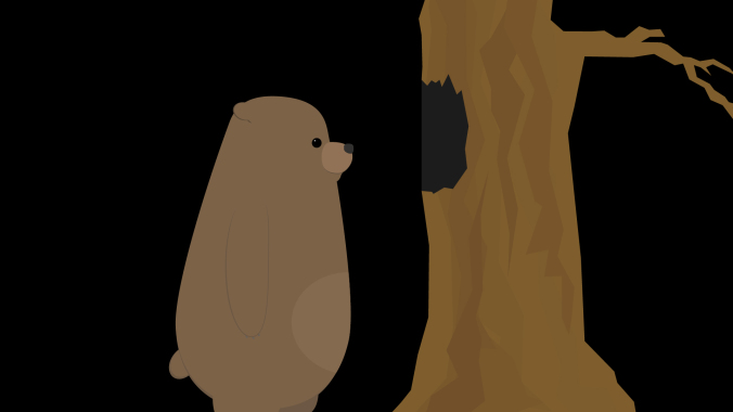
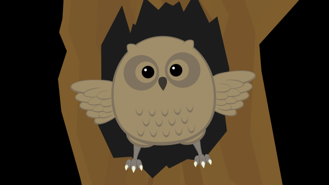
As I roughed out the animation, I made some alterations to places in the storyboard that I felt could be improved. One of the first changes I made was to add more fireflies. My storyboards only showed one, but adding a few more made the scenes they were in much more visually interesting. The fireflies were animated using the “wiggle” expression to make them move randomly.
By combining the wiggle with keyframed position animation, I was able to easily move the fireflies around the screen in a way that was organic and unpredictable. Also, because the wiggle expression generates random movement, I could copy and paste the same firefly layer over and over again and get a unique result every time.

Another simple change I made was to adjust the shot of the bear peering into the tree from the side (as seen in the screen shot above). In my original sketch, this was quite a close shot. Looking at everything together, though, I decided that a wide shot would be more interesting. Every shot prior to this one is fairly close, so going to a wider shot provided a some variety and allowed me to show the bear and the tree more fully.
There are a few shots in the piece in which either the bear or owl are seen from behind. I didn’t create specific “rear view” puppets; instead, I simply masked out areas of my existing puppets in After Effects. For example, to create the rear view of the bear, I just covered his face and “tummy patch” with a solid the same color as his fur. If I were working on a longer project with several shots of a character from behind, it would probably be worth it to create a specific puppet. I knew that these shots would be quick and simple to adjust for, however, so making the alterations inside After Effects was the easiest option.
Unexpected Challenges
Random problems arise all the time in animation – with luck, you are able to figure them out as you go. On this project, I had occasional issues using the Puppet Pins tool to deform my bear character. I wanted to bear to have a slightly “squishy” quality, but adding pins sometimes caused the puppet to deform in unexpected ways. I did some experimentation and determined that this was likely caused by either the upscaling of the vector art, the parenting, or the order in which I was applying the pins. In some cases, I reworked the animation to avoid these issues. For others, I decided that the pins were simply causing more trouble than they were worth and decided not to use them. After Effects is a complex program and it doesn’t always behave in the exact way we expect it to. Being flexible enough to work through this is an important skill.
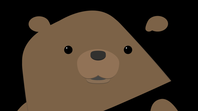
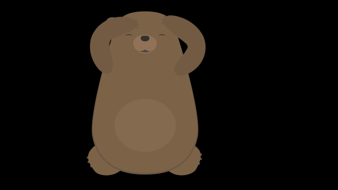
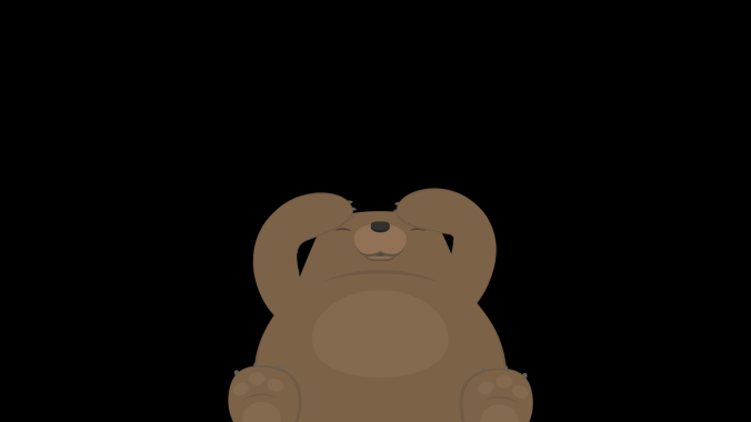
I mentioned previously that I was able to modify the owl and bear puppets directly within After Effects for shots in which they were seen from behind. In the last two shots, I wanted the bear to be cowering down on the ground. I had first planned to use my front view puppet of the bear for these shots, but I just couldn’t get a result that I was happy with. I ultimately decided that it was worth creating an additional puppet of the bear on the ground. This took some extra time, but gave me a result I liked much better.
Backgrounds
Since I was putting this project together quickly, I knew I didn’t have a lot of time to spend creating background images. My initial plan was to create a sort of “greenish blur” that would suggest a woodsy backdrop. It looked too abstract to me, though, so I decided I needed something with more detail.
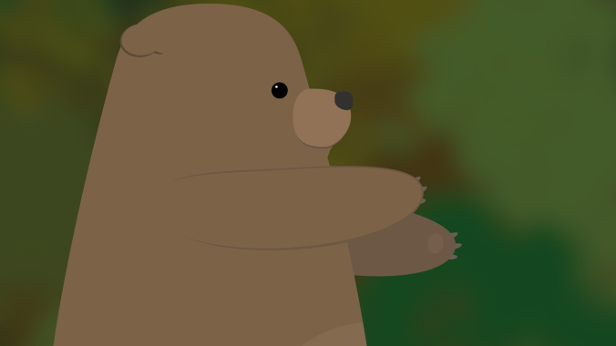
Next, I found a nice photo online using a Google search. In the search tools are options for finding images that can be reused without violating copyright restrictions. When I tried this image, I had the opposite problem – the background was too detailed for the simple character design. I tried some blurs and filters to soften it a bit, but still wasn’t happy with the result.
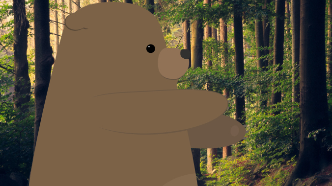
To make the image fit in better with the cartoon aesthetic I wanted, I imported it into Illustrator and created a vector image from it. To do this, import the image and go to Object>Image Trace>Make. There are several presets you can choose from, as well as more detailed options in the Image Trace panel. Using Image Trace can time consuming (it may take a few minutes per image), but the result is a vector image with a sort of “posterized” look. Once the image has been converted, it can be scaled up infinitely like other vector art. This scaling gave me the flexibility to get all the background coverage I needed from this single image; I simply zoomed in to different parts of it for different shots.
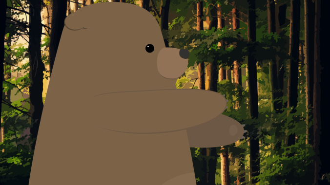
I think that the vector background fits in much better with the rest of the artwork. If I had more time, however, I would probably create my background from scratch using simpler shapes. This would give me the most flexibility and allow me to layer things in interesting ways.
Audio
The audio tools in After Effects are pretty basic, but they are enough to do a fairly simple audio mix with. You can add keyframes to the levels on any layer with audio, which lets you fade sounds in and out or adjust the overall volume. There are also a handful of audio effects that can be applied. These can be used to do things like add reverb or tweak the bass and treble of a track. Adding the “Stereo Mixer” effect to a layer will allow you to pan audio to the left or right channels. Remember that you can mute tracks by unchecking the box with a speaker icon in the timeline.

For the projects we are working on in this class, these tools should be more than sufficient. If you want to do more advanced audio work, however, I would recommend using a different program. Audacity is free to download and can be used to create sophisticated multi-track mixes. If you subscribe to Adobe’s Creative Cloud service, you have access to Audition, which has powerful tools for filtering, modifying, and repairing audio. Many video editing tools also have solid audio capabilities, so if you are familiar with Premiere Pro or Final Cut Pro, those are good options as well. On the really advanced end of the spectrum are dedicated and complex programs such as Avid’s Pro Tools.
Whatever software you end up using, the most important aspect of sound design is to be conscious of the ways that it alters your film. If you want to create a sense of unease or dread in your short film, try using some dark, droning ambient noise. If you want to make a scene bright and happy, reflect that with your music choices. To make your film seem more exaggerated and “cartoony,” you can add obvious sound effects to your character’s movements – such as a “whoosh” when they turn their head. For a more realistic approach, be more subtle. The options are endless.
Remember that there is a section called RESOURCES linked in the top menu of this website. It contains links to pages where you can download royalty-free music, ambience, and sound effects. I found ambient sounds, effects, and music on the YouTube Audio Library, findsounds.com, and Audio Blocks. I had to do a little hunting around to get sound effects that I liked – for example, the first owl sound I downloaded was a pretty scratchy recording and it sounded out of place with the rest of the piece.
I tried several different sounds for the startled bear. I actually found a few different recordings of bears, but the emotion wasn’t quite right. The sound I eventually ended up using is actually a deer. I went through a few different ambient noises as well – one was too windy, one had too many birds in the background, one had a stream in the background that sounded odd because we never see water in the short.
For music, I initially tried a few classical tracks, since that was my first idea of what might fit well. Classical music felt too “serious,” though, so I kept trying new things. Many music sites organize their tracks by genre and feel, so you can search for something like “humorous rock music” or “eerie classical.” This makes wading through hundreds of pieces of music much easier. In the end, I clicked on the track I used almost by chance. I thought the title – “Root Bear” – sounded funny, like it might be a typo. I gave it a listen and thought it would give the piece some silly charm, so I tried it out.
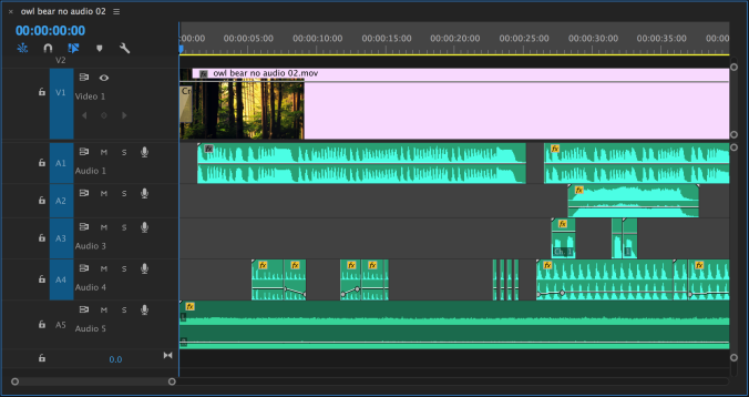
I actually added audio using Premiere Pro instead of After Effects, since I like that interface better for sound mixing. Everything I did could have been done easily in After Effects, though. In the image below, you can see that I edited the music track (A1) just a bit to make it fit the length of the piece. The ambient sound (A5) goes underneath everything. Tracks A2, A3, and A4 are all for different sound effects.
Putting It All Together
Here’s the finished piece! All together, I spent about a week putting it together, from storyboard to finished animation. If I were going to spend more time on it, I would probably do more work on the backgrounds and further refine the character animation – but every project has aspects that you won’t be completely satisfied with and eventually you need to just move on to something new.
Here are some tips for working on your final projects. Remember, these are due December 7! We’ll do a brief check-in on everyone’s progress next week.
- Make a storyboard, even if it’s just stick figures and scribbles. It will help you visualize your project and figure out what puppets, props, and backgrounds you need.
- Use lots of compositions in After Effects, rather than trying to create everything in the same composition. I recommend making each shot its own composition, but you may have several pre-composed elements within each larger composition.
- Rig your puppet with parenting, anchor points, and/or puppet pins once and save that composition as a reference. You can copy and paste the layers into other compositions – rigging is a tedious process and you don’t want to have to do it more than you need to.
- Animate your characters before you worry about the backgrounds too much – if you run out of time, you can always go for a minimalist look with the environment, but you need to have the character animation in place.
- Think about ways to animate efficiently. Use cuts, reaction shots, and framing wisely. If something is difficult or problematic to animate, you may be able to work around it.
- Add audio last. You may need to make some tweaks to the animation to fit the music or sound effects you choose, but those are generally minor adjustments. It can be fun to experiment with different soundtracks to see how it changes the overall feel of the piece.
Fake It
As I mentioned above, it’s smart to consider how you use framing and editing to streamline the animation process. For example, if animating a full walk or run cycle is feeling overwhelming, you might want to consider some creative ways of “cutting around” those kinds of movements. The fact that your character is moving from one location to another doesn’t necessarily mean that you need to show a full-body walk cycle in all its complexity. Instead, feel free to use editing to hide movements that are too complicated, time-consuming, or confusing to animate.
Here are two shots of a character walking. In the first, the entire body is animated doing a full walk cycle. Note the number of layers that have keyframed animation in the timeline – this character has seventeen body parts all moving in tandem with either their position or rotation (or both) keyframed.
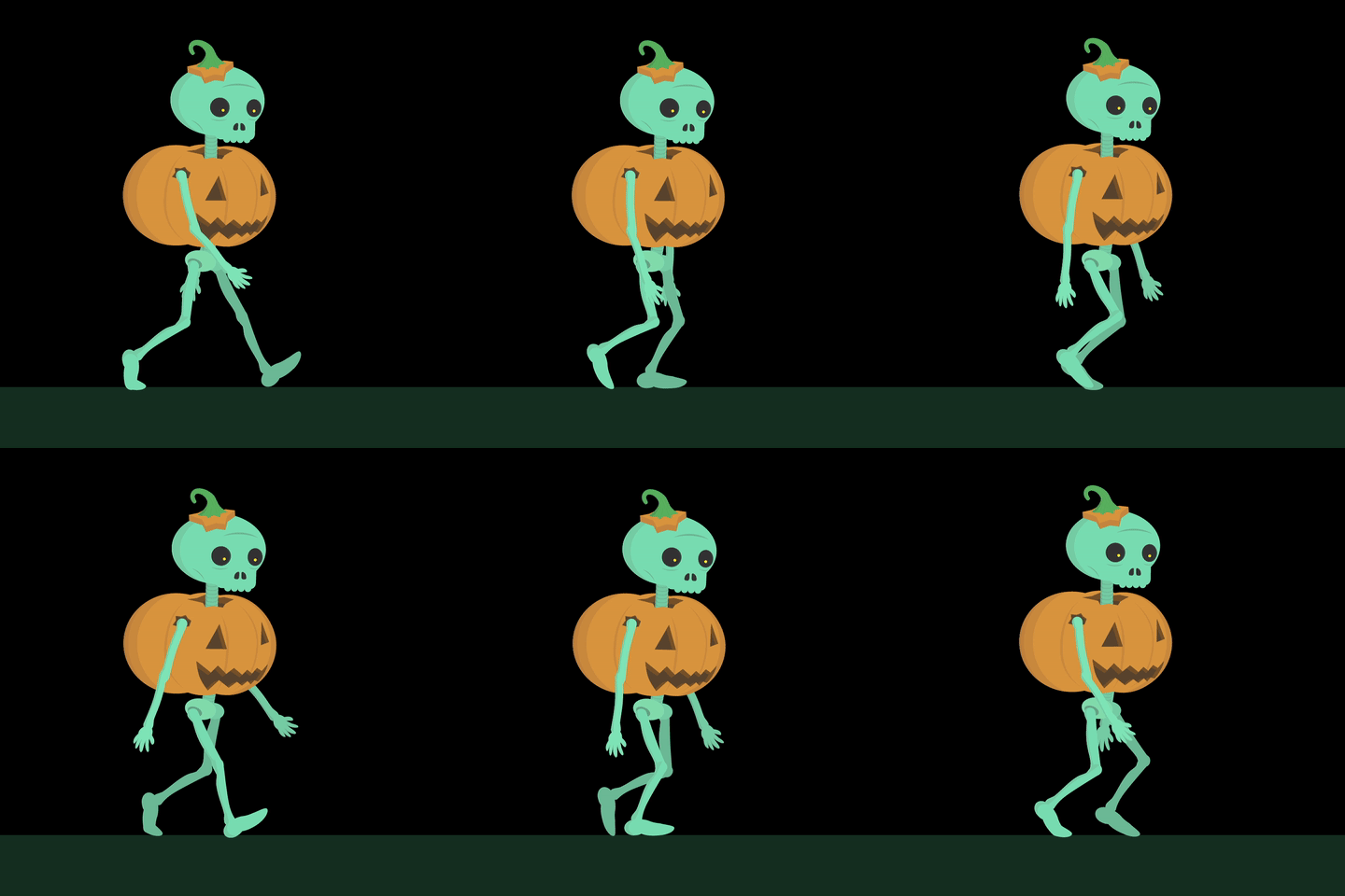
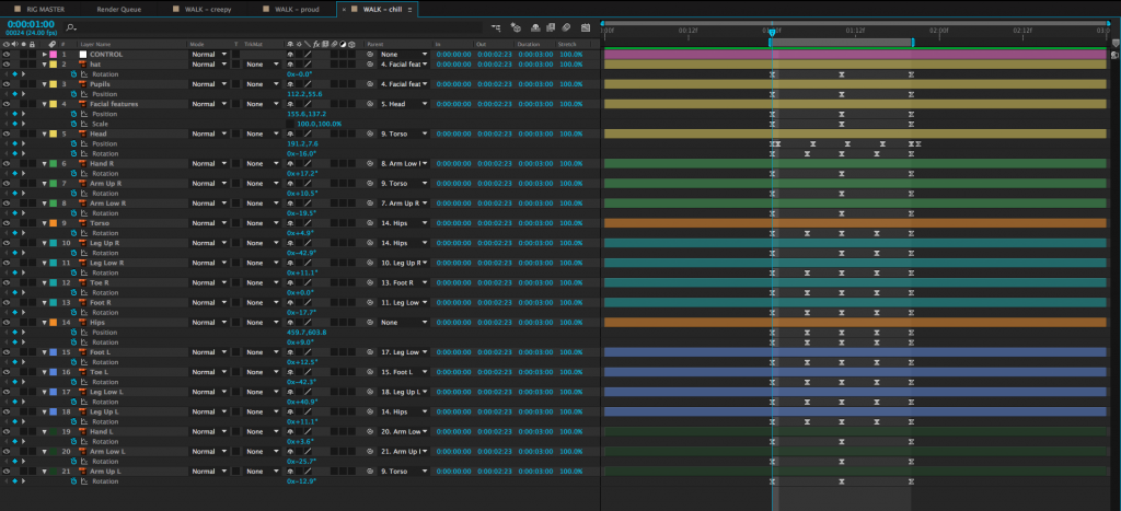
To simplify this walk, we can zoom in on the character so that the legs are no longer visible and animate their position from one side of the screen to the other. This achieves the same basic effect – we see the character walking – but it can be done by animating only three layers. The changing position along with the swinging arms are enough to suggest that the character is walking.


Let’s look at another example. Here is a short film created by Sawyer Owens during the Spring 2017 semester.
You’ll notice that the “fight scene” in this piece is actually just a series of slashes on the screen accompanied by sound effects. Combined with the shots immediately before and after it, it’s clear to the audience what has taken place. Using this kind of stylized approach accomplishes a few things: first, it allowed Sawyer to avoid animating a very complex sequence, which would have been time-consuming and possibly difficult to pull off. However, the greater accomplishment is that this approach really works for the style and tone of animation here. It adds an element of humor (and pays homage to the pieces that inspired it) by having the action take place off-screen.
I want to make it clear that I am not suggesting that you should always take the easy way out when it comes to animation. Animation is always a time-consuming process, though, and the finished piece is more important that its components. If you can achieve the same effect using a quick and simple method or a slow and complex method, why not give yourself a break? Stay true to your vision, but don’t make the process harder than it needs to be.