Mike
https://youtu.be/74XDRacJk5E
Max
Dante
Brian
Mike
https://youtu.be/74XDRacJk5E
Max
Dante
Brian
Nomination Nominees
The Academy of Motion Picture Arts and Sciences – the folks behind the Oscars – have just released their shortlist picks for 2018’s best animated short film. There are ten films, five of which will be nominated for the award. The films explore a variety of styles and themes and include Fox And The Whale, which we discussed earlier in the semester. Check them out below!
https://youtu.be/6RQ9LOBw0vg
https://vimeo.com/244591451
We’ve Come a Long Way…
Thank you all for your hard work and creativity throughout the semester! I hope you’ve found the class to be enjoyable and informative – I know that it has been for me. Here’s a highlight reel that I cut together of work done throughout the semester. It will screen during the student work showcase at the Campus Theatre on Tuesday, December 5 at 7pm. I hope to see you all there!
Four Kinds of Light
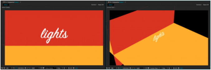
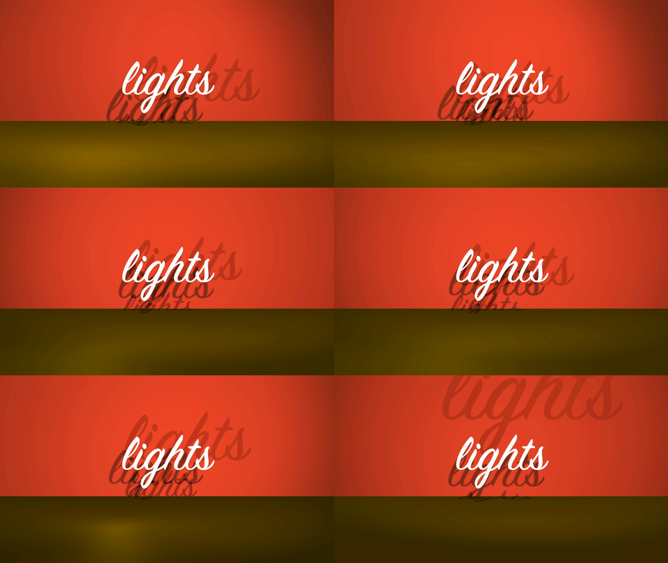
As we previously discussed, adding a virtual camera to a 3D scene in After Effects can give an entirely new dynamic quality to your compositions. Virtual lights can have a similar effect. The following simple scene is composed of four 3D layers: a red background “wall” layer, a yellow “floor” layer, a text layer, and a camera. If you were to just glance at the composition, though, you wouldn’t know the scene was 3D at all – you have to switch to one of the “Custom Views” to see how things are arranged.
We can make this scene more interesting by adding lights. Lights are created in the same way as virtual cameras and other kinds of layers: from the top menu, choose Layer>New> and then choose Light…. A menu will appear with several options, the most important of which is “Light Type.” The kind of light you create will completely change how it affects the scene. For each type of light, you can define the color and intensity. Additional parameters will be available depending on which kind of light is selected.
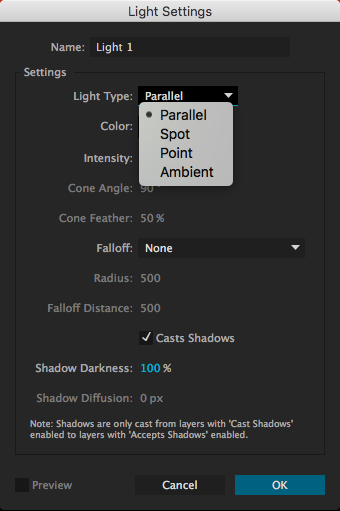
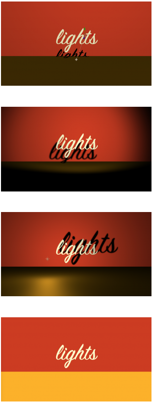 Parallel: These are rays of light cast in a certain direction. Parallel lights behave similarly to outdoor sunlight and can cast shadows. By default, parallel lights do not “fall off”, so it does not matter how close or far they are from the things they illuminate. Changing the Point of Interest on a parallel light will change the direction it casts light in.
Spot: This is a cone of light that is brightest in the center, then fades to darkness. You can adjust the angle and “feather” of the cone and spot lights can cast shadows. Spot lights have the most potential parameters to adjust – in addition to the light’s position, you can change its point of interest, orientation, and rotation on the X, Y, and Z axis.
Point: This is light emanating in all directions from a point in space. Like all light types, the point light itself is invisible – there is no glowing orb where the light is located, only its effects are visible. Point lights can cast shadows and are brightest close to the location of the light. Position is probably the most important property for point lights.
Ambient: This is light emanating from everywhere at equal intensity. Because light is coming from all directions, ambient lights cannot be used to cast shadows. Ambient lights are helpful when used in addition to other types of light, since they can change the illumination level and color of a composition uniformly.
Casting Shadows and Material Options
When you create a new parallel, spot, or point light, you will have the option to check a box that says “Casts Shadows.” However, you will also need to tell After Effects which layers in the composition are affected by the light’s ability to cast shadows. By default, every 3D layer can receive shadows (a shadow will show up on that layer when it is cast by another layer) but not cast shadows.
To change this and make your layers actually cast shadows, you’ll need to look at the “Material Options” for the layer. These are found below the “Transform” properties in the timeline window. The first option is “Casts Shadows.” In the same category are options for “Accepts Shadows” and “Accepts Lights,” both of which are “On” by default and both of which you can probably leave that way – unless you specifically want a layer to not be affected by the lights in your scene.
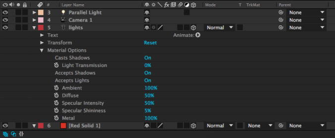
There are other areas you can adjust in the Material Options – shininess, diffusion, and more. While these parameters can be fun to play with, don’t be surprised if they don’t make a dramatic difference; many of these properties (like “Specular Intensity”) are most apparent on curved surfaces – and 3D layers in After Effects are flat. I generally don’t do much with the Material Options besides enable or disable shadows.
Illuminate Things!
Now that you know what the different kinds of lights can do, use them creatively to add an extra layer of interest to your compositions. Remember that almost every parameter – color, intensity, position, point of interest, etc. – can be keyframed. Also remember that lights, like cameras, only affect 3D layers in After Effects; nothing will show up until you click on that little 3D box icon for the layer in the timeline window. Have fun!
Cartoons Deconstructed
Video essayist kaptainkristian dives into the finer points of all kinds of media (music, comics, children’s books, movies, and more), but I find his pieces on cartoons particularly insightful. Check out his analyses of four very different animated series – Futurama, South Park, Batman: The Animated Series, and FLCL – and be sure to explore the other videos on his YouTube page if you like them.
Lost in Z-Space
So far, we’ve used After Effects for 2D motion graphics and animation work. After Effects can also be used for 3D work – although there are some caveats. After Effects is not designed to do 3D graphics work in the same way that programs like Maya, Cinema4D, and Blender are. You can’t create detailed 3D models or complex environments in After Effects. However, you can move 2D assets into the third dimension – and create some unique and dynamic results.
This week, we’ll be creating a simple 3D scene. Download the images at this link if you’d like some media to play with.
From 2D to 3D
You may have noticed a series of symbols at the top of the timeline window, next to the Layer Name column. If you can’t see them, toggle the view options at the bottom-left of the timeline window. These symbols represent different properties that can be turned on or off for each layer. For example, the symbol that looks like a strip of film toggles frame interpolation, which is only applicable to video layers. The box we want to use looks like a little wireframe cube. This switches layers from 2D to 3D.

Clicking on this box will probably not make an immediate change to the way your composition looks. However, if you look at the Transform options for that layer in the timeline, you’ll see that the possibilities have expanded greatly.
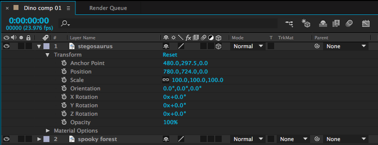
Position, for example, was formerly defined by two numbers – a value on the X (horizontal) and Y (vertical) axis. In other words, that layer could formerly move up-and-down and side-to-side. With the 3D box checked, a third number has been added – we can now move forwards and backwards on the Z (depth) axis. The anchor point value has also gone from two variables to three. Rotation was previously described by a single number, but now objects can be rotated three ways. There is also a new “Orientation” value, which provides another set of rotation values. Scale has gained a third number as well, although the new Z-scale value won’t generally affect 2D layers.
3D Rotation
Let’s look at the rotation values first. X Rotation spins an object around a horizontal axis, Y Rotation spins around the vertical axis, and Z Rotation spins around the depth axis (2D layers can only spin around the Z axis, so X and Y are the new options). The best way to understand how these work is just to take some time playing with the values. Remember that layers rotate around their anchor points. So, if you want an object to swing open like a door, you’ll need to move the anchor point to the side of the object and keyframe the Y Rotation. If you don’t change the anchor point, the object will spin around its own midpoint.
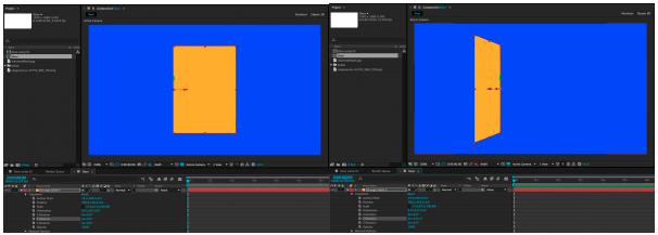
X, Y, and Z Rotation each have their own section under the Transform properties. The Orientation section combines all three into a single keyframe-able value with three numbers. I tend to use the individual Rotation values more than Orientation, but they both do the same thing.
It is possible to work with both 2D and 3D layers in the same composition, but they don’t really “interact” with each other. If you rotate a 3D object so that it intersects with another 3D object, one will be “clipped” by the other. A 2D object will simply float in front of or behind a 3D object, depending on its layer position in the timeline.
3D Position
When you click on a 3D layer, you will probably notice a new icon appear in the composition window. This icon is comprised of a green, red, and blue arrow, centered on the anchor point of the layer. You can click and drag on the green, red, and blue arrows to move an object along the X, Y, and Z axis, respectively. You can also change these values using the three numbers that now appear next to “Position” in the layer’s transform properties in the timeline window.
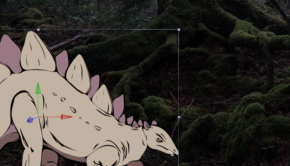
Entering a positive value for the Z position (the third number) will push the layer further away; entering a negative value will pull the layer forward in 3D space. This may be somewhat counter-intuitive, so take some time to familiarize yourself with it. To create a very simple 3D scene, you might enter a positive Z position value for the background layer, a negative Z position value for the foreground layer, and 0.0 for the Z position value of the middle layer. As these layers get moved along the Z axis, their size will appear to change. You can compensate for this by adjusting the scale.
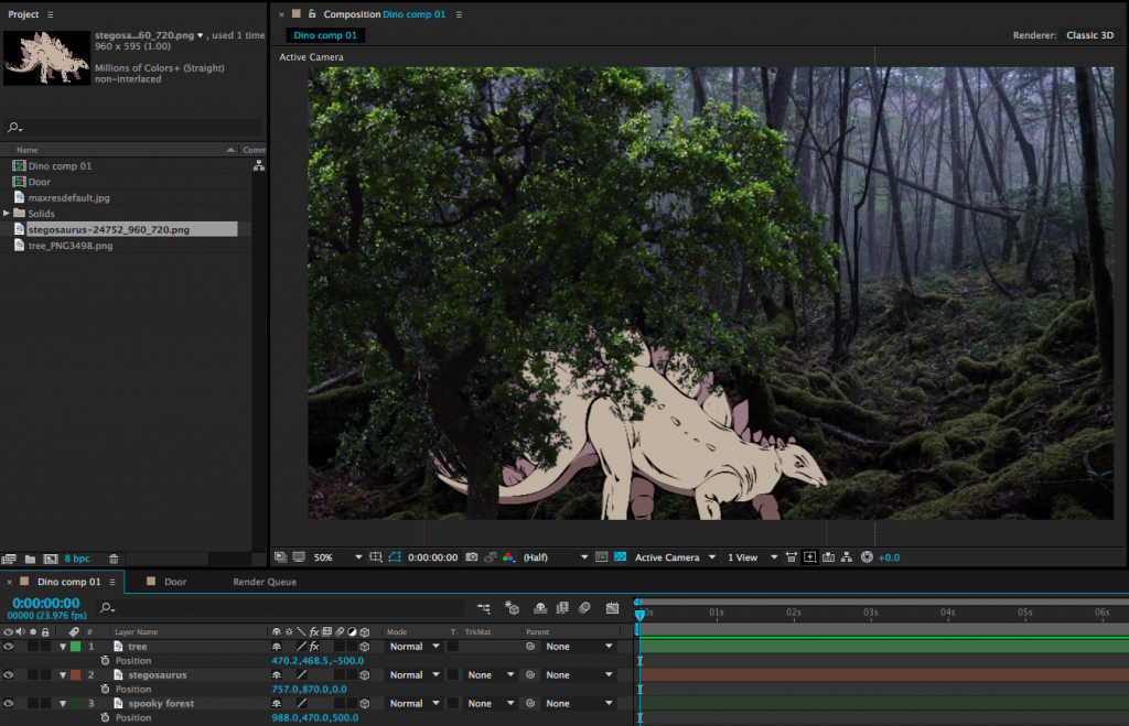
This can give us a nicely layered composition, but so far, we haven’t done anything we couldn’t do by adjusting the scale and position of 2D layers. For example, you can make an object appear to move closer by increasing its scale. So why use 3D position? One reason is that it can be difficult to estimate the way that scale and position should correspond. The other reason has to do with perspective and an effect that we can achieve only by using 3D layers – but for that technique, we’ll need a virtual camera.
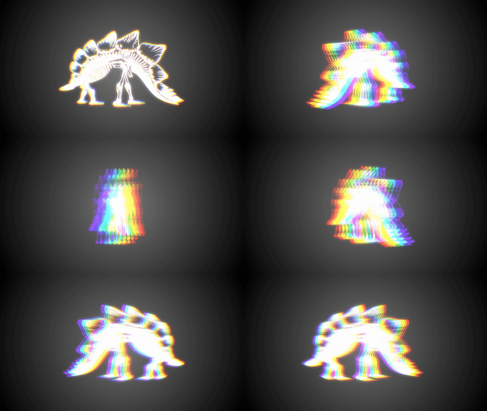
A Virtual 3D Space
In our 2D work, we used the After Effects composition window sort of like a collage board; flat layers were placed on top of each other, rearranged, and adjusted. When we switch layers from 2D to 3D, that collage board becomes more like a shadow box; objects can move forward and backward in space. Our perspective on the shadow box hasn’t really changed, though – our view is fixed. By adding a camera to the scene, we can change our perspective and even move into the scene itself, going from a shadow box to a complete virtual environment.
To create a camera, go the the Layer dropdown menu at the top of the screen and choose New>Camera…. This will bring up a dialog box with lots of options. You can dig into these values and customize your virtual camera as much as you like, but I’d recommend leaving most settings at their defaults, at least to get started. The one thing you may want to adjust is the Preset, which has a handful of simulated lens options. These act just like lenses on real cameras: wider lenses (lower numbers) have a larger field of view and Z axis movement will be exaggerated. Longer lenses (higher numbers) have a narrower field of view and Z axis movement will be compressed. If you aren’t sure what to use, either the 35mm or 50mm presets are generally safe, middle-of-the-road options.
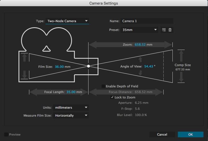
After you create your camera, you may notice an immediate difference in the scale of the objects in your composition. This is because of the aforementioned properties of the lens on your virtual camera. If you tip down the triangle next to the name of your camera layer in the timeline, you will see Transform properties and Camera Options. The Camera Options section contains a ton of variables to play with – you can define the virtual depth-of-field, the shape of the simulated iris, the size of the aperture, and much more.
Turning Depth of Field “on” is probably the setting that will give you the most interesting results. Depth of field describes how much of an image is in focus. If a scene has a deep depth of field, lots of things at various distances from the camera will be in focus. If a scene has a shallow depth of field, only a narrow sliver of the scene will be in focus.
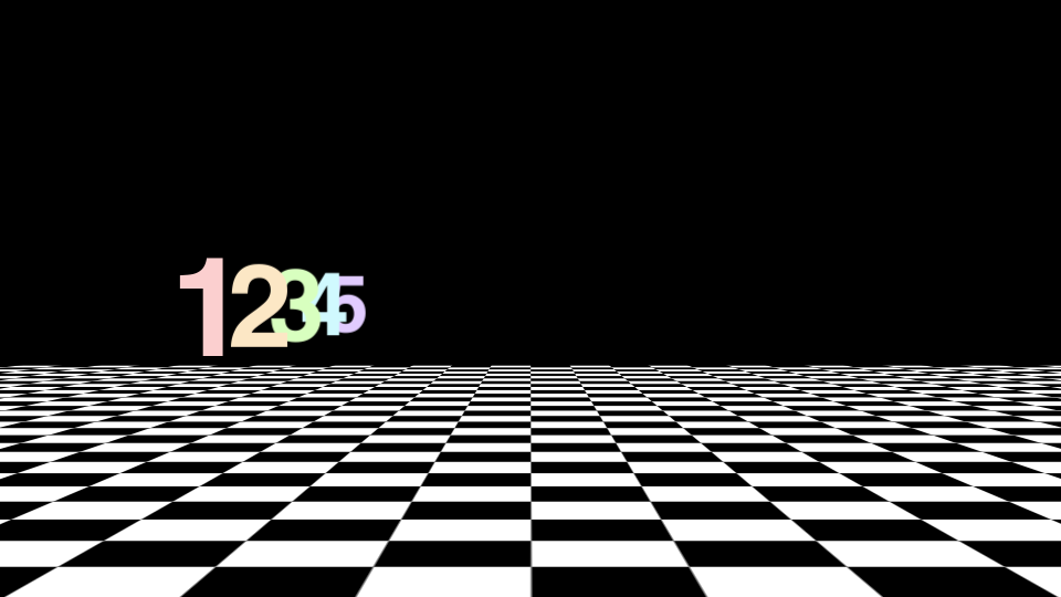
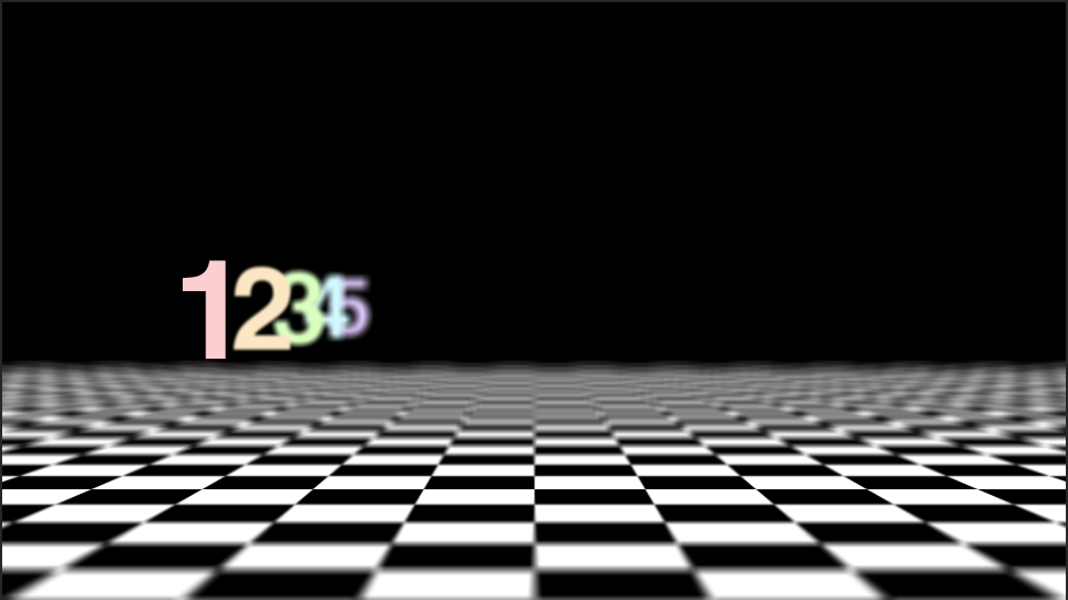
If you have some experience with photography, those basic principles will help you as you define things like focal length and depth of field in the virtual cameras that After Effects uses. For example, you may be aware that a lens with a large aperture produces images with a shallower depth of field than a lens with a small aperture. Increasing the Aperture value in After Effects (which is measured in pixels) will therefore give you a more blurred out background when the Depth of Field toggle is enabled. For reference, the Aperture in the image above is around 400 pixels and the lens is 50mm. If this is unfamiliar to you, you may just have to experiment with the controls a bit to get the results you are looking for.
Moving the Camera
The Transform options control camera movement. You can keyframe the rotation along all three axis, either individually or using the Orientation. The position works the same as other 3D layers, but there is also a keyframe-able Point of Interest property. This is the point that the camera is aimed at; so, for example, if you keyframe the camera’s position along the X axis, but don’t adjust the Point of Interest, the camera will move from one side to the other while remaining aimed at the center of the screen. You can get some cool results this way, so take some time to play around.
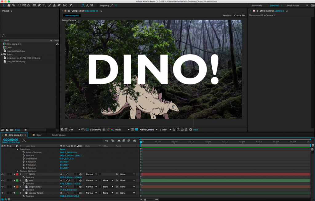
In addition to the control options in the timeline window, you can adjust your camera using a section of tools in the toolbar at the top of the screen. The default option is the “Unified Camera Tool” (which looks vaguely like a movie camera), but there are several to try out if you prefer more “hands-on” control.

If you’re having a hard time visualizing how exactly your camera is moving, it can be helpful to change the view setting of your composition window. At the bottom of the window is a dropdown menu that, by default, reads “Active Camera.” Clicking this will give you different options for viewing your composition in 3D space. In particular, Custom Views 1, 2, and 3 are helpful for seeing how your camera is positioned and where it is pointed. Note that you may need to toggle the background visibility on or off (the checkerboard icon next to the view setting) and/or zoom out your view to see what’s going on clearly. Just switch back to “Active Camera” when you’re done.
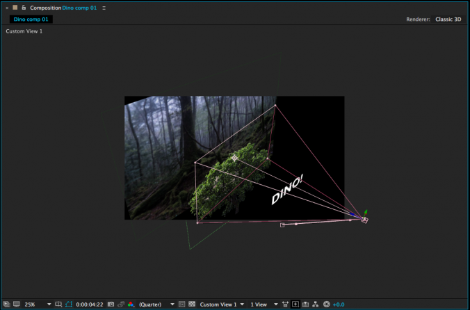
There are many more things to explore when it comes to 3D work in After Effects. You can create different kinds of virtual lights, control the way simulated shadows are cast, affect how shiny or matte objects are, and so on. For now, though, just get used to moving objects in 3D space and operating a virtual camera – it will open up a whole new world of creative possibilities.
Crafting Stories and Myths
Courtesy of TED-Ed, here are a few animated videos that examine world building and the heroes – or anti-heroes – that inhabit those worlds.
Max
Dante
Rebecca
Mike
The Process
For the last several weeks, we’ve focused on the technical abilities of After Effects as an animation platform. Now, let’s take a step back and look at the animation process in general. Live-action films have a fairly straightforward workflow: a project is scripted and planned, then filmed, then edited. The editor has a large role in shaping the tone, pacing, and narrative qualities of a film – they choose the best takes and camera angles, define the length of shots, experiment with overall structure, and much more. However, animators don’t generally produce much, if any “extra” footage – there aren’t multiple takes or camera angles to choose from. So what is the role of an editor in animation?
As discussed in the following short documentary from The Royal Ocean Film Society, the editor on an animated project is actually a collaborator in the filmmaking process much earlier than a live-action editor is. Because animation is, by its very nature, tedious and time-consuming, you absolutely don’t want to waste time and money by creating shots that you aren’t going to use. On a live set, changing camera lenses, adjusting blocking, or trying something new with the lighting is relatively simple. When in doubt, you can film something multiple ways and then choose the best approach in post-production. Animators don’t usually have that luxury – they need to know the best approach before they start the animation process.
Even on short animated projects, planning is of the utmost importance. I generally start by writing a general outline, then some very crude sketches. From there, I draw more detailed storyboards, which I refine until I’m happy with the flow of the piece. Depending on the complexity of the sequence you’re working on, you may want to go a step further and create an animated version of your storyboards (known as an “animatic”). You should only begin animating once you have a clear plan and know that the shots will work together.
To illustrate the animation process, I decided to put together a 60-second short film. As you work on your own projects, think about what shots you need to animate, what puppets (and different versions of those puppets) will need to be created, and how to organize your workflow in general. There is room for improvisation and experimentation in animation – After Effects in particular makes it easy to move or alter keyframes, modify puppets, and much more. That being said, you need to be as organized and well-planned as possible. The more work you do at the beginning of the process, the easier the later stages will be.
Characters and Props
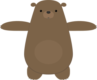
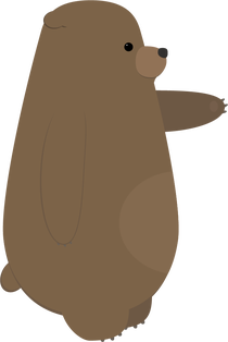
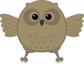
I had some characters already made up from an older project that I decided to reuse, which saved a lot of time. The characters were created in Adobe Illustrator. When I was creating these characters, my idea was to keep them simple and friendly-looking, with lots of rounded shapes and a limited color palette. In addition to the owl and bear, I knew I wanted my piece to include a firefly, but I planned on creating that directly within After Effects.
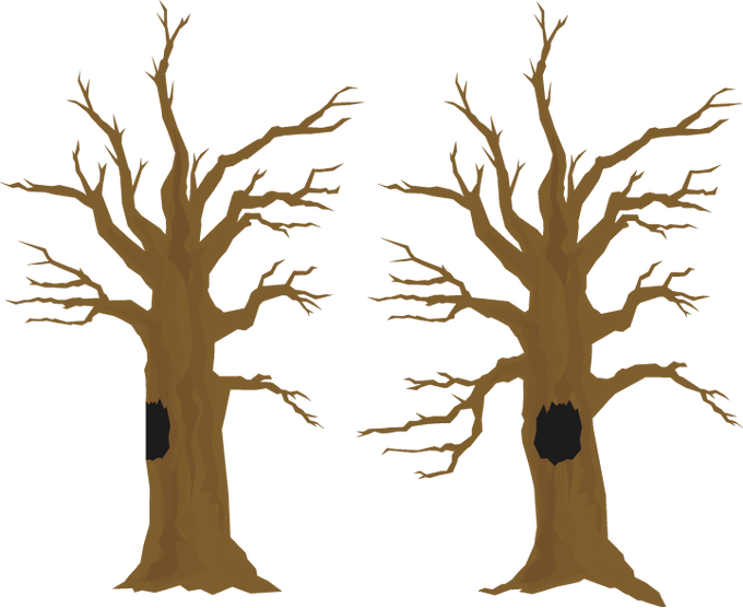
I also had a tree already created that I was able to use for this project. I modified it slightly, by adding a hollow, and made a side view by changing the shape of the trunk and deleting some branches.
I often find the process of creating characters, sets, and props to be the most time-consuming part of the an animated project — even more than the animation itself. For this reason, I’m always careful to keep anything I create so that I can potentially reuse it in the future. I actually have a folder in my Google Drive full of old Illustrator and Photoshop files, so that I can pull things up quickly wherever I am.
Storyboards
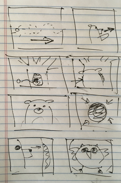
Before I sketched out my storyboards, I had the general idea of the piece figured out: a bear chases a firefly through the woods, the firefly goes into the hollow of a tree, and the bear is startled by an owl when he goes to investigate. The bear freaks out, but the owl is friendly and the fireflies follow him out. They all have a happy little moment together.
This is a very simple “story” – there is no dialog, the characters have very obvious motivations, and the actions are easy to understand. This is what I think of as a “one gag” film – a short film in which only one thing happens. In this case: a bear gets startled by a friendly owl. I like projects like these because they force you to focus on the basic essentials of animation and storytelling.
I did some very quick and sloppy storyboards for this project. This is such a helpful step, especially in terms of figuring out angles and perspectives. While the storyboards are a great tool, they do not necessarily dictate what everything will look like in the final version. The huge benefit of computer-based animation (like what we do in After Effects) is that it is still possible to make basic changes as you go. In hand-drawn animation and stop-motion, this is much more difficult.
Animation
I imported the tree and the owl and bear puppets, then got the puppets rigged for animation. For the firefly, I just created a little green circle and applied the Glow effect to it. I then began animating them against a plain black background.
For this project, I skipped around a little, but mostly animated in order – shot one first, then shot two, and so on. This is completely a personal preference, but working like this allows me to make sure that each shot flows nicely with the next one. As I did the rough animation for each shot, I placed that shot’s composition into a larger composition so that I could see how the piece was coming together as a whole. My general process is to start with basic movement, then add finer details, then refine the timing, and then to polish things up with final touches such as simulated camera movement or adding filters and effects. For a few shots, I added a blur to either the background or a pre-composed puppet, to give the illusion of depth-of-field.
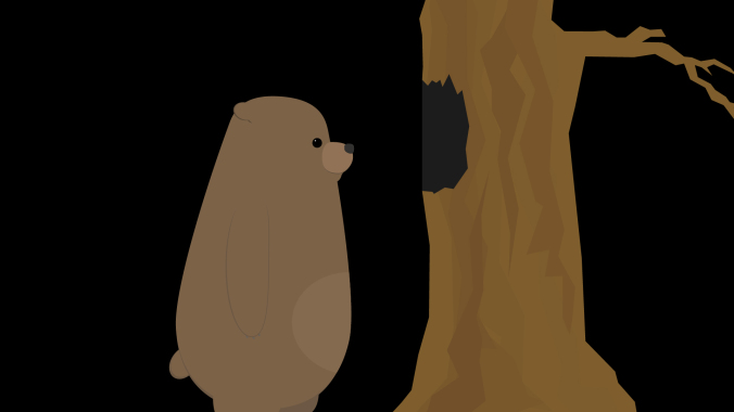
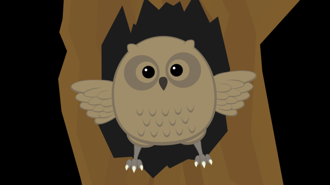
As I roughed out the animation, I made some alterations to places in the storyboard that I felt could be improved. One of the first changes I made was to add more fireflies. My storyboards only showed one, but adding a few more made the scenes they were in much more visually interesting. The fireflies were animated using the “wiggle” expression to make them move randomly.
By combining the wiggle with keyframed position animation, I was able to easily move the fireflies around the screen in a way that was organic and unpredictable. Also, because the wiggle expression generates random movement, I could copy and paste the same firefly layer over and over again and get a unique result every time.

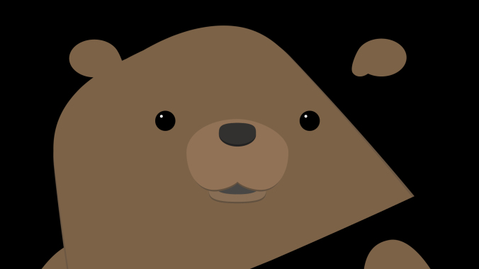
Another simple change I made was to adjust the shot of the bear peering into the tree from the side (as seen in the screen shot above). In my original sketch, this was quite a close shot. Looking at everything together, though, I decided that a wide shot would be more interesting. Every shot prior to this one is fairly close, so going to a wider shot provided a some variety and allowed me to show the bear and the tree more fully.
There are a few shots in the piece in which either the bear or owl are seen from behind. I didn’t create specific “rear view” puppets; instead, I simply masked out areas of my existing puppets in After Effects. For example, to create the rear view of the bear, I just covered his face and “tummy patch” with a solid the same color as his fur. If I were working on a longer project with several shots of a character from behind, it would probably be worth it to create a specific puppet. I knew that these shots would be quick and simple to adjust for, however, so making the alterations inside After Effects was the easiest option.
Unexpected Challenges
Random problems arise all the time in animation – with luck, you are able to figure them out as you go. On this project, I had occasional issues using the Puppet Pins tool to deform my bear character. I wanted to bear to have a slightly “squishy” quality, but adding pins sometimes caused the puppet to deform in unexpected ways. I did some experimentation and determined that this was likely caused by either the upscaling of the vector art, the parenting, or the order in which I was applying the pins. In some cases, I reworked the animation to avoid these issues. For others, I decided that the pins were simply causing more trouble than they were worth and decided not to use them. After Effects is a complex program and it doesn’t always behave in the exact way we expect it to. Being flexible enough to work through this is an important skill.
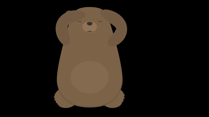
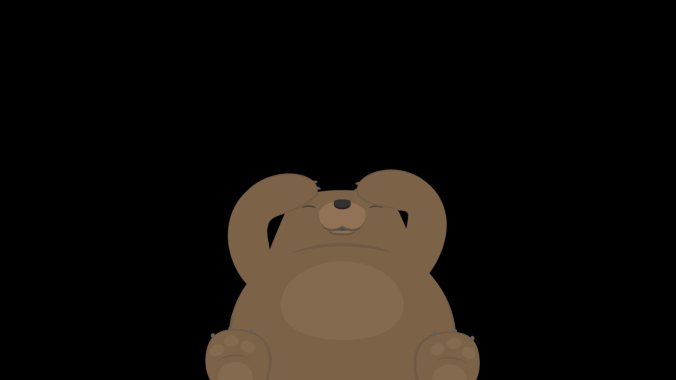
I mentioned previously that I was able to modify the owl and bear puppets directly within After Effects for shots in which they were seen from behind. In the last two shots, I wanted the bear to be cowering down on the ground. I had first planned to use my front view puppet of the bear for these shots, but I just couldn’t get a result that I was happy with. I ultimately decided that it was worth creating an additional puppet of the bear on the ground. This took some extra time, but gave me a result I liked much better.
Backgrounds
Since I was putting this project together quickly, I knew I didn’t have a lot of time to spend creating background images. My initial plan was to create a sort of “greenish blur” that would suggest a woodsy backdrop. It looked too abstract to me, though, so I decided I needed something with more detail.
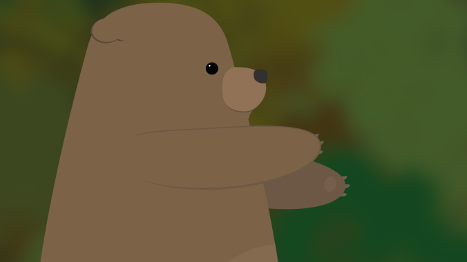
Next, I found a nice photo online using a Google search. In the search tools are options for finding images that can be reused without violating copyright restrictions. When I tried this image, I had the opposite problem – the background was too detailed for the simple character design. I tried some blurs and filters to soften it a bit, but still wasn’t happy with the result.
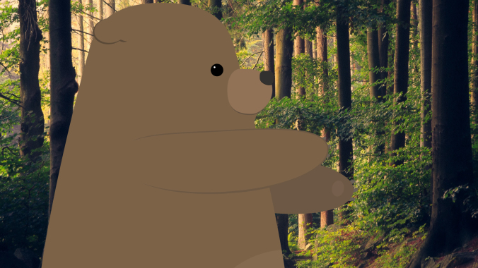
To make the image fit in better with the cartoon aesthetic I wanted, I imported it into Illustrator and created a vector image from it. To do this, import the image and go to Object>Image Trace>Make. There are several presets you can choose from, as well as more detailed options in the Image Trace panel. Using Image Trace can time consuming (it may take a few minutes per image), but the result is a vector image with a sort of “posterized” look. Once the image has been converted, it can be scaled up infinitely like other vector art. This scaling gave me the flexibility to get all the background coverage I needed from this single image; I simply zoomed in to different parts of it for different shots.
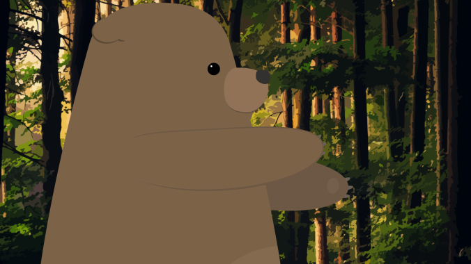
I think that the vector background fits in much better with the rest of the artwork. If I had more time, however, I would probably create my background from scratch using simpler shapes. This would give me the most flexibility and allow me to layer things in interesting ways.
Audio
The audio tools in After Effects are pretty basic, but they are enough to do a fairly simple audio mix with. You can add keyframes to the levels on any layer with audio, which lets you fade sounds in and out or adjust the overall volume. There are also a handful of audio effects that can be applied. These can be used to do things like add reverb or tweak the bass and treble of a track. Adding the “Stereo Mixer” effect to a layer will allow you to pan audio to the left or right channels. Remember that you can mute tracks by unchecking the box with a speaker icon in the timeline.

For the projects we are working on in this class, these tools should be more than sufficient. If you want to do more advanced audio work, however, I would recommend using a different program. Audacity is free to download and can be used to create sophisticated multi-track mixes. If you subscribe to Adobe’s Creative Cloud service, you have access to Audition, which has powerful tools for filtering, modifying, and repairing audio. Many video editing tools also have solid audio capabilities, so if you are familiar with Premiere Pro or Final Cut Pro, those are good options as well. On the really advanced end of the spectrum are dedicated and complex programs such as Avid’s Pro Tools.
Whatever software you end up using, the most important aspect of sound design is to be conscious of the ways that it alters your film. If you want to create a sense of unease or dread in your short film, try using some dark, droning ambient noise. If you want to make a scene bright and happy, reflect that with your music choices. To make your film seem more exaggerated and “cartoony,” you can add obvious sound effects to your character’s movements – such as a “whoosh” when they turn their head. For a more realistic approach, be more subtle. The options are endless.
Remember that there is a section called RESOURCES linked in the top menu of this website. It contains links to pages where you can download royalty-free music, ambience, and sound effects. I found ambient sounds, effects, and music on the YouTube Audio Library, findsounds.com, and Audio Blocks. I had to do a little hunting around to get sound effects that I liked – for example, the first owl sound I downloaded was a pretty scratchy recording and it sounded out of place with the rest of the piece.
I tried several different sounds for the startled bear. I actually found a few different recordings of bears, but the emotion wasn’t quite right. The sound I eventually ended up using is actually a deer. I went through a few different ambient noises as well – one was too windy, one had too many birds in the background, one had a stream in the background that sounded odd because we never see water in the short.
For music, I initially tried a few classical tracks, since that was my first idea of what might fit well. Classical music felt too “serious,” though, so I kept trying new things. Many music sites organize their tracks by genre and feel, so you can search for something like “humorous rock music” or “eerie classical.” This makes wading through hundreds of pieces of music much easier. In the end, I clicked on the track I used almost by chance. I thought the title – “Root Bear” – sounded funny, like it might be a typo. I gave it a listen and thought it would give the piece some silly charm, so I tried it out.
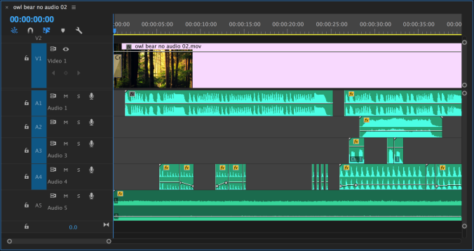
I actually added audio using Premiere Pro instead of After Effects, since I like that interface better for sound mixing. Everything I did could have been done easily in After Effects, though. In the image below, you can see that I edited the music track (A1) just a bit to make it fit the length of the piece. The ambient sound (A5) goes underneath everything. Tracks A2, A3, and A4 are all for different sound effects.
Putting It All Together
Here’s the finished piece! All together, I spent about a week putting it together, from storyboard to finished animation. If I were going to spend more time on it, I would probably do more work on the backgrounds and further refine the character animation – but every project has aspects that you won’t be completely satisfied with and eventually you need to just move on to something new.
Here are some tips for working on your final projects. Remember, these are due December 7! We’ll do a brief check-in on everyone’s progress next week.
Fake It
As I mentioned above, it’s smart to consider how you use framing and editing to streamline the animation process. For example, if animating a full walk or run cycle is feeling overwhelming, you might want to consider some creative ways of “cutting around” those kinds of movements. The fact that your character is moving from one location to another doesn’t necessarily mean that you need to show a full-body walk cycle in all its complexity. Instead, feel free to use editing to hide movements that are too complicated, time-consuming, or confusing to animate.
Here are two shots of a character walking. In the first, the entire body is animated doing a full walk cycle. Note the number of layers that have keyframed animation in the timeline – this character has seventeen body parts all moving in tandem with either their position or rotation (or both) keyframed.
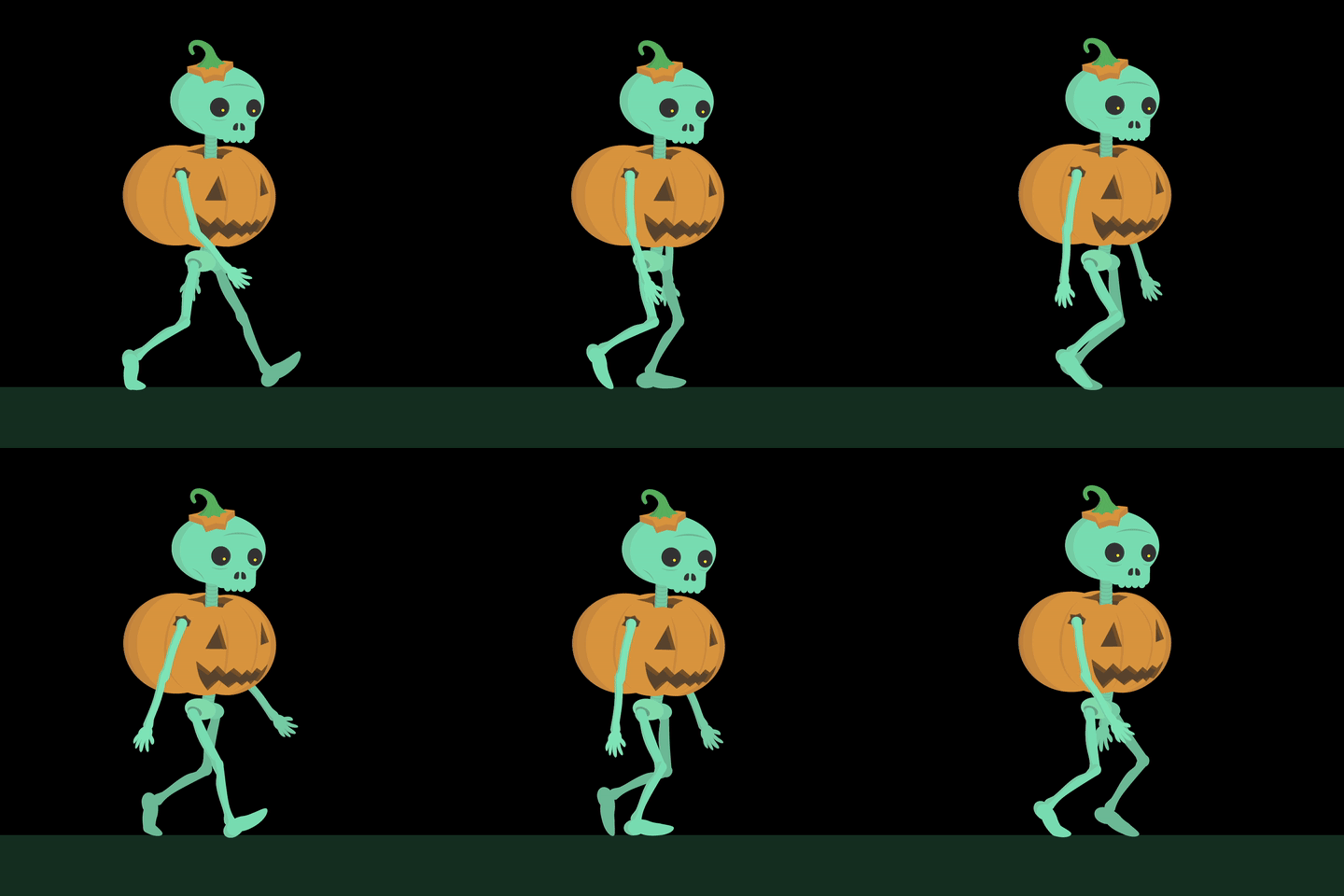
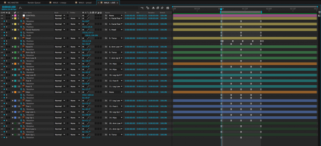
To simplify this walk, we can zoom in on the character so that the legs are no longer visible and animate their position from one side of the screen to the other. This achieves the same basic effect – we see the character walking – but it can be done by animating only three layers. The changing position along with the swinging arms are enough to suggest that the character is walking.


Let’s look at another example. Here is a short film created by Sawyer Owens during the Spring 2017 semester.
You’ll notice that the “fight scene” in this piece is actually just a series of slashes on the screen accompanied by sound effects. Combined with the shots immediately before and after it, it’s clear to the audience what has taken place. Using this kind of stylized approach accomplishes a few things: first, it allowed Sawyer to avoid animating a very complex sequence, which would have been time-consuming and possibly difficult to pull off. However, the greater accomplishment is that this approach really works for the style and tone of animation here. It adds an element of humor (and pays homage to the pieces that inspired it) by having the action take place off-screen.
I want to make it clear that I am not suggesting that you should always take the easy way out when it comes to animation. Animation is always a time-consuming process, though, and the finished piece is more important that its components. If you can achieve the same effect using a quick and simple method or a slow and complex method, why not give yourself a break? Stay true to your vision, but don’t make the process harder than it needs to be.
Aerobatic
Here’s a very short, but very effective, animated film by Léo Brunel. The excellent character animation and physical comedy are highlighted by the minimalist setting and lack of music and dialogue.
Still Loading…
High tech meets low tech in this stop-motion short film from Raphael Vangelis. Vangelis combined computer modeling, 3D printing, and hand-crafted creations to show these omnipresent markers of frustration in a fun new way.
Crawl Before You Walk
You can download some files at this link to follow along with the lesson today. For a “classic” walk cycle, I’ve provided a realistically-proportioned puppet in a side view. Depending on your character’s design, you may need to modify the poses used – or your character may not walk at all. A robot character might roll on wheels or a ghost character might float. Regardless, walk cycles are a fundamental skill for character animators, so it’s important to learn the basics.
Walk cycles are also notoriously challenging, so try not to feel discouraged if things don’t look right at first.
Import and Rig Your Character
Now that you (hopefully) have your main character designed and created, you should be ready to import it into After Effects and get it rigged and ready for animation. Remember that you can continue to tweak your character as you go by opening the Illustrator or Photoshop file and making adjustments. However, making major changes that alter the overall shape of your character or modify the layer structure will cause problems for the imported file. In other words, don’t import your puppet until you are generally happy with their design and layout.
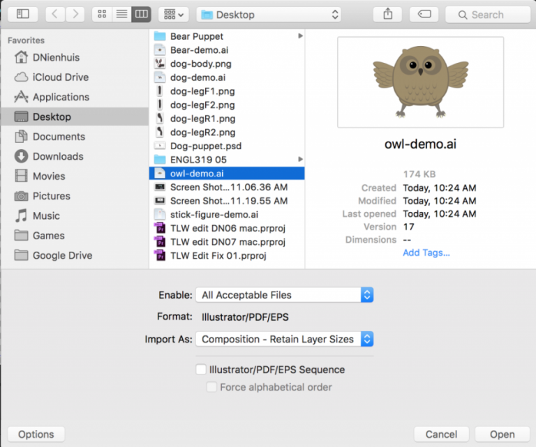
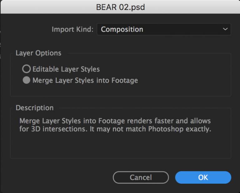
If you’ve created your character in Photoshop or Illustrator, remember that you need to change the import settings when you bring in your file. Under “Import As:” select “Composition – Retain Layer Sizes.” Also make sure that the “Sequence” setting (below “Import As:”) is not checked. If you have everything set up correctly, your file will be imported as a new composition with the different layers separated.
We’ve already covered the basics of setting anchor points and parenting for puppets, but let’s quickly review the process. First, use the Pan Behind tool (Y) to move the anchor points to their appropriate locations. If you have a simple puppet, you might just have layers for the arms, legs, body, and head. If you have a more complex puppet, you might have layers for the individual fingers, hands, forearms, upper arms, upper and lower legs, feet, toes, torso, hips, neck, head, facial features, articles of clothing, and more. In either case, remember that the anchor points should be placed at the point around which you want the layer to rotate. The hands rotate at the wrist, the forearms rotate around the elbow, the upper arms rotate at the shoulder, and so on. If you have separate layers for the torso and hips, set their anchor points near the waist of your character.
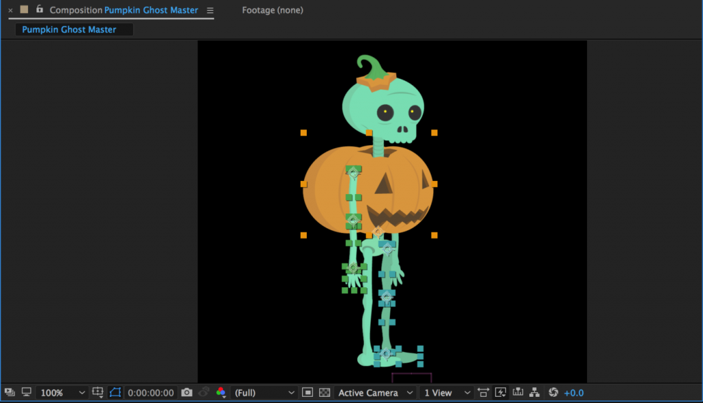
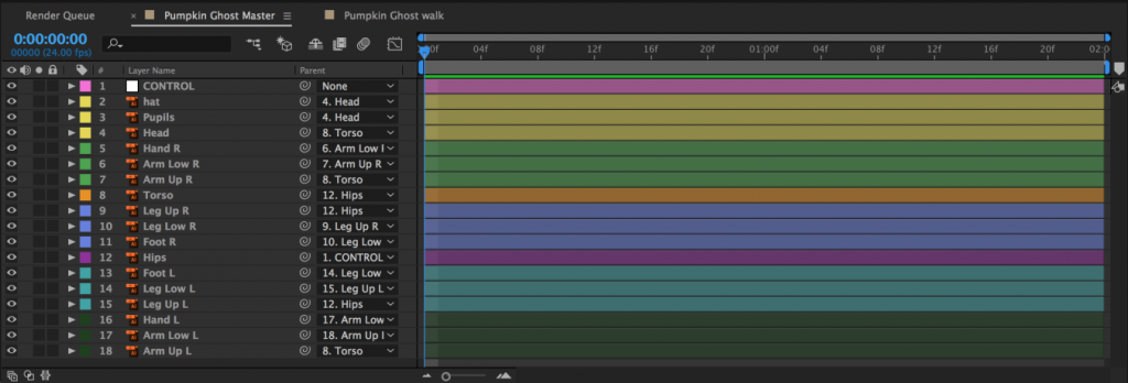
Once everything has its anchor point placed appropriately, it’s time to parent the layers. Fingers are parented to the hand, hands are parented to forearms, forearms are parented to upper arms, upper arms are parented to the torso, etc. If you have separate torso and hips layers, you can parent the torso to the hips to allow your character to bend at the waist. This will most likely make your hips layer the top parent layer – the “root” layer that everything is ultimately connected to. You could also parent either the hips or both the hips and torso to a null object (Layer>New>Null Object). This will act as a sort of “master control” layer. Null objects can be useful for other layers as well – they can be used to control parts of your puppet that are difficult to select because they are small or are covered by other layers. I often find it helpful to create a null object to control the eyes of a puppet.
As you parent the layers to each other, test them out by rotating them with the rotate tool (W). If something looks wrong, check the location of the anchor point, the overall position of the layer, and the parenting order.
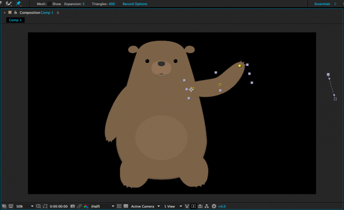
If you planning on animating your character using the puppet pins tool, use it to place deformation pins on the layers of your puppet. The more pins you add, the less each one does, so for very exaggerated elastic movement, only use a few pins – three is a good bet for the “rubber hose” effect on arms and legs. If this is the style of animation you want, place a pin at the shoulder, elbow, and wrist. Adding more pins will create subtler deformation and if you want to limit the influence of a certain pin, you can place additional pins in the areas you want to hold down.
When you have everything anchored, parented, and pinned, take a moment to ensure that your layers are named appropriately. You may also want to color code the various layers by clicking on the small colored square next to the layer name in the timeline panel. Use whatever system makes sense to you – you could make the left leg and left arm layers the same color, for example, or you could give everything a unique color. I like to make whatever the “top” or “master” layer happens to be a nice bright color so that I can find and select it quickly.
Once your puppet is rigged and organized, do not start animating directly within the composition you have imported. Instead, name the layer something like “Character Rig Master” and keep it as a reference. You can duplicate the composition or copy and paste the layers within it into other compositions to actually do your animation. Getting your puppet correctly rigged takes time and you don’t want to have to do it more than once. Since you will probably be using several copies of your puppet throughout your project, it makes sense to keep one composition as a reference that you can copy from.
Creating A Walk Cycle
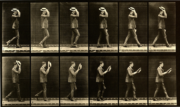
Now it’s time to tackle one of the most challenging things in character animation – walking. Walking is one of those actions that’s both ubiquitous and surprisingly complicated. When a walk looks wrong, it sticks out noticeably – good walk cycles appear effortless. The way a character walks also tells the audience a lot about their personality, mood, age, and more. It’s an important skill for any character animator to work on. Mastering it takes a lot of practice.
We’ll be creating a walk cycle that can be looped in After Effects. Because it loops, we only need to animate a short section – probably a second or two – but a lot needs to happen in that time and the cycle needs to end exactly where it begins. This is what allows the animation to be played over and over seamlessly.
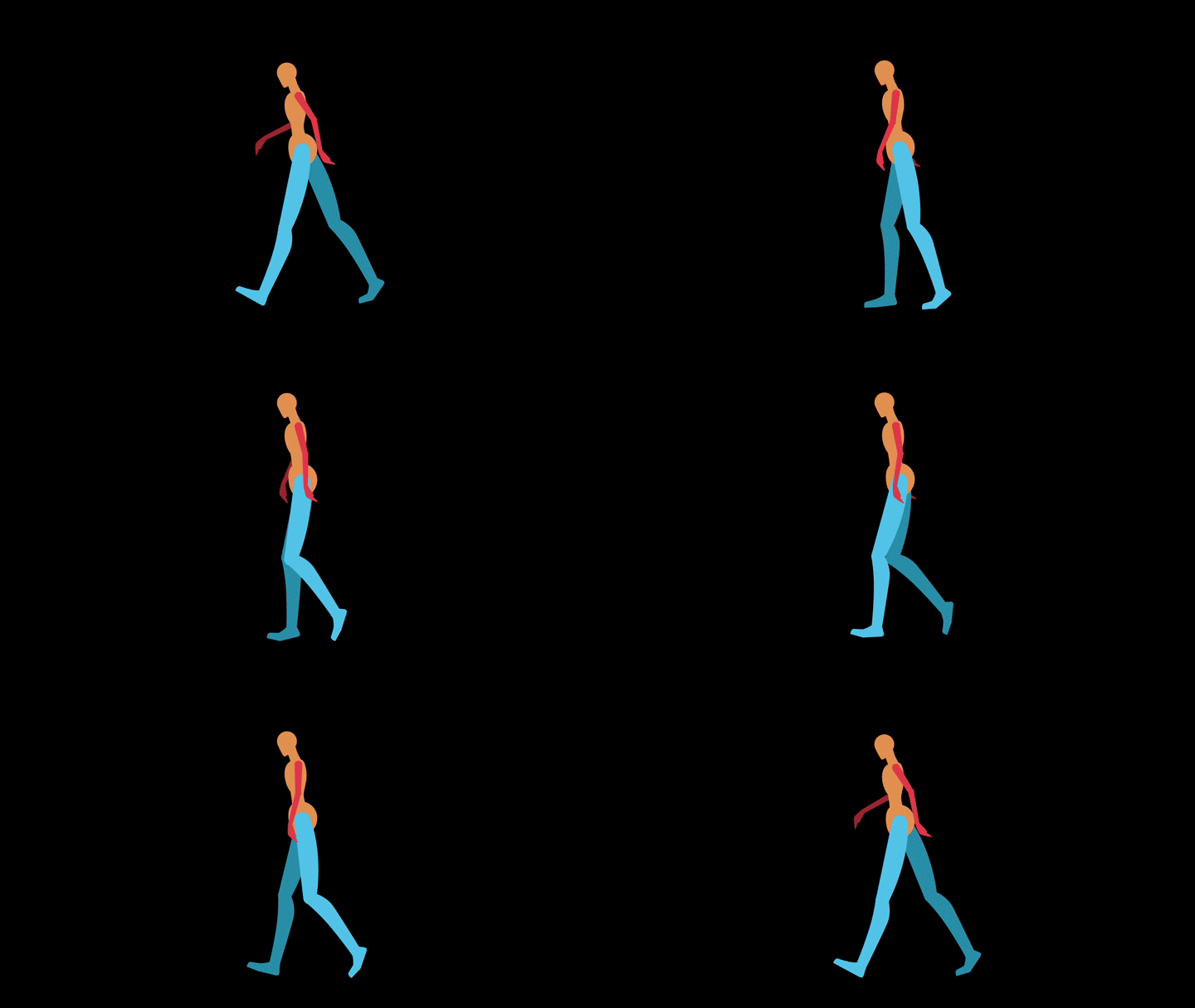
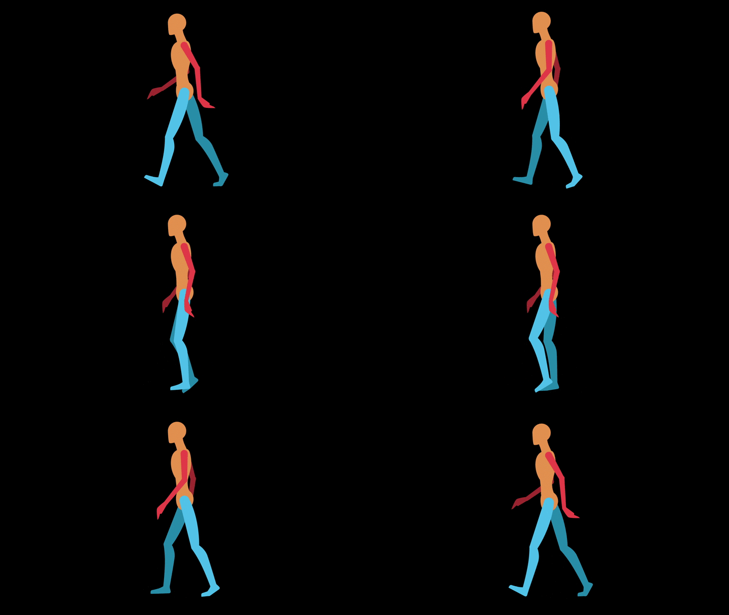
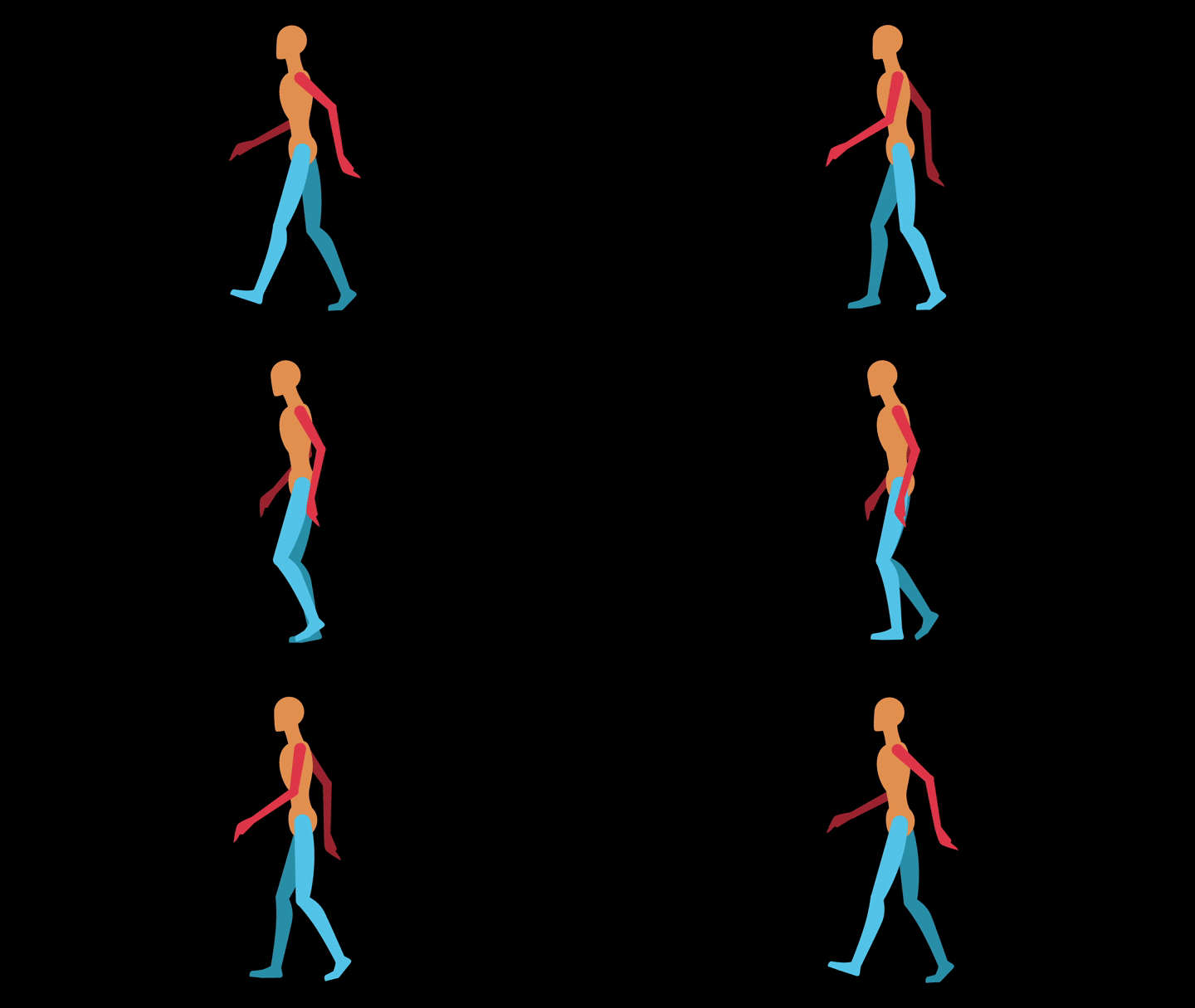
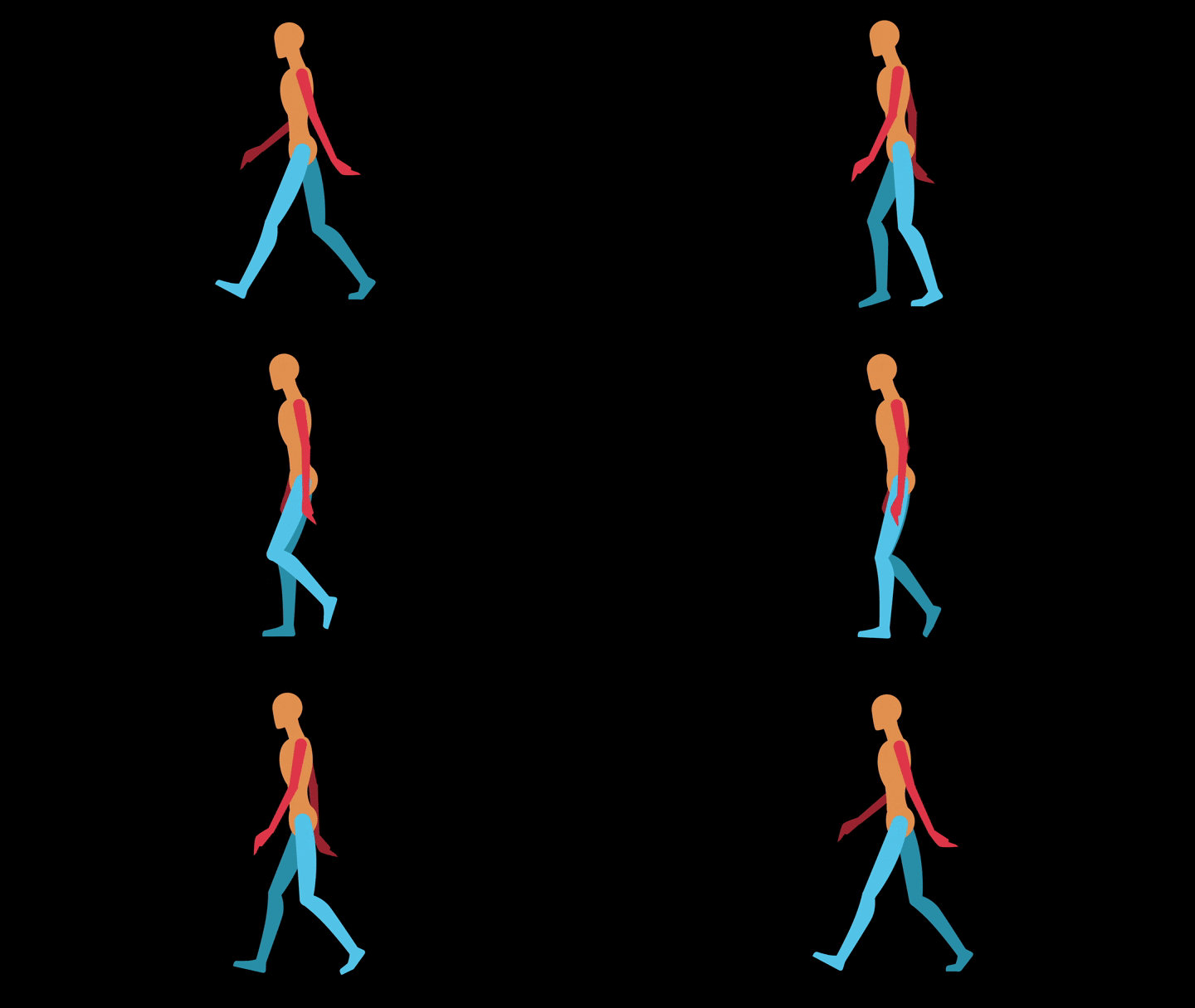
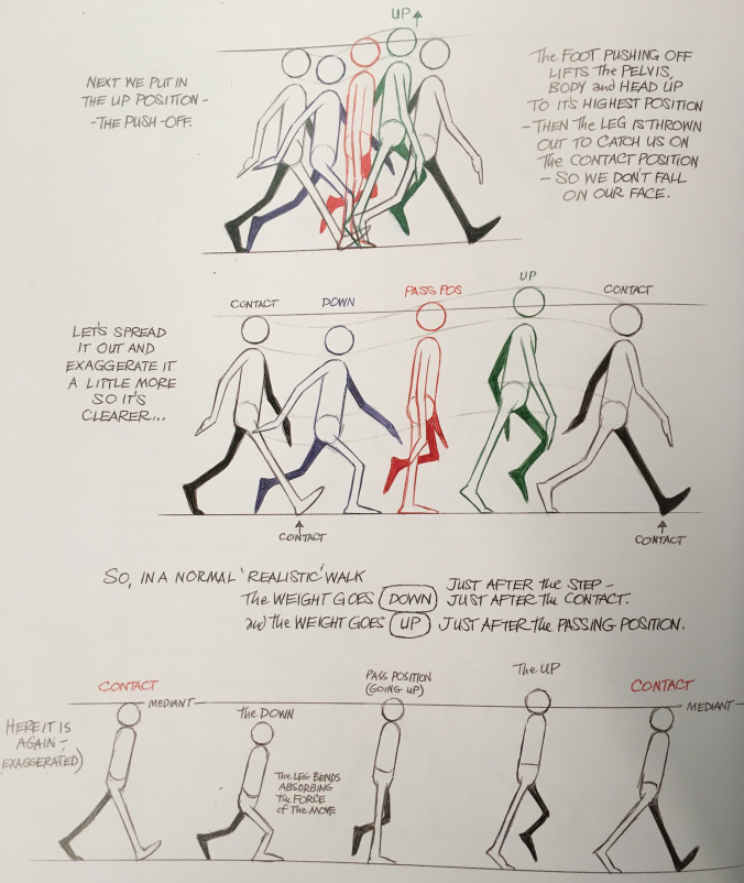
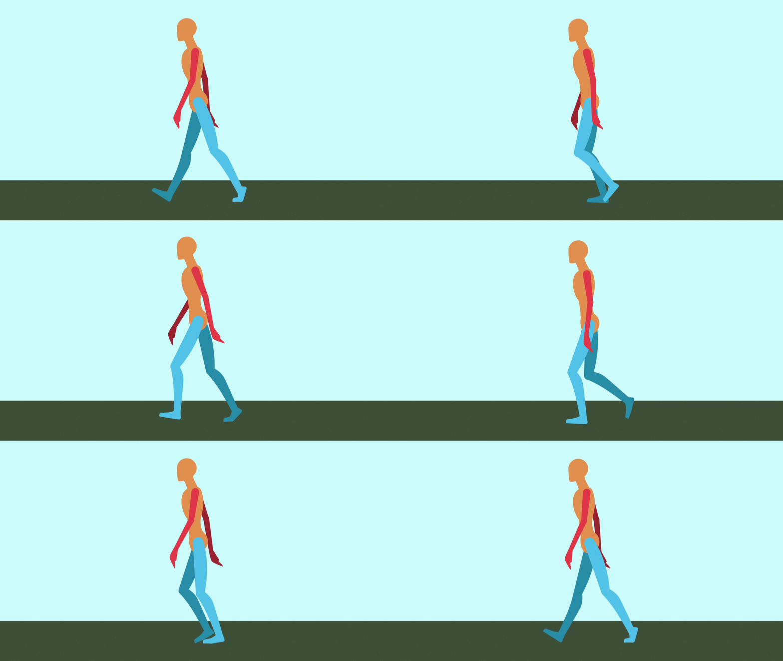
Animator Alan Becker, whom you may remember from his animated explanations of the twelve basic principles of animation, breaks walk cycles down into four key poses. The two most important poses are “contact” and “passing.” During the contact post, one foot is extended forward and just touching the ground. During passing, that leg goes back and the opposite leg passes it, moving forward. The cycle then repeats with the opposite legs contacting and passing. The other two poses are “down” and “up”, which correspond with the body raising and lowering slightly during the walk. The head is at its lowest point after contact and its highest point after passing. The arms generally swing opposite the legs, so the left arm is forward when the right leg is making contact. However, there is a fair amount of flexibility in how the arms can be animated – for example, they can hang forward listlessly to make the character seem downtrodden.

Using Becker’s technique, you end up with a total of nine poses in a loop: the four poses for the first step (leg A moving in one direction, leg B moving the opposite direction), the four poses for the second step (with the directions of legs A and B reversed), and the final pose which is the same as the first. This will result in a very realistic walk.

This technique can be simplified, however. If we remove the “up” and “down” poses, you end up with a five pose loop: contact and passing for the first step, contact and passing for the second step, and back to the original contact pose. When you animate a walk cycle this way, you may find that you need to raise the puppet a bit on the passing pose – the up and down poses help the feet raise and lower appropriately and removing them can cause the legs to arc downwards. The result is a walk cycle that is less realistic than the nine pose loop, but simpler to animate.

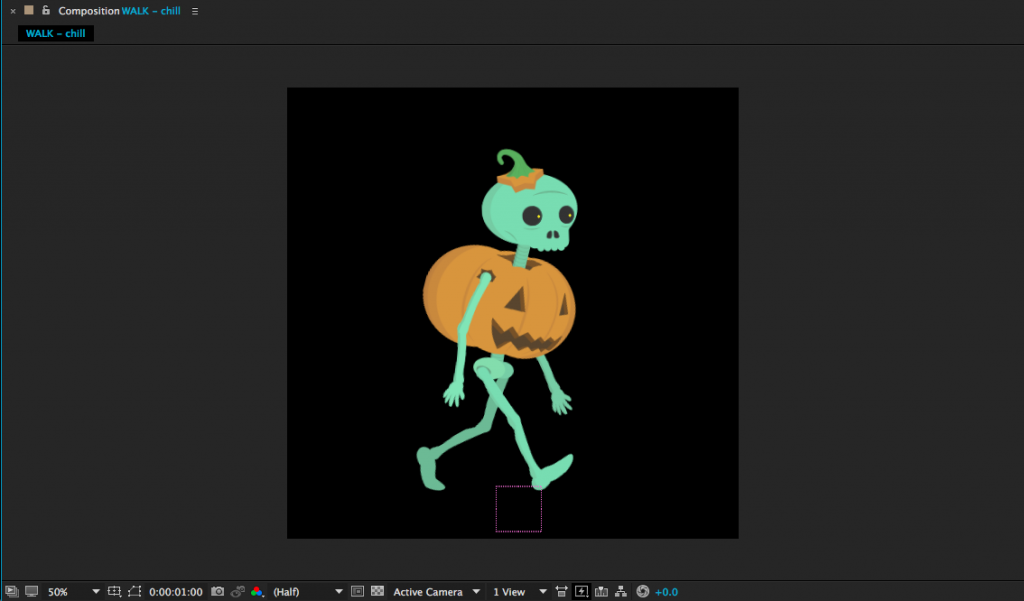
Contact: Right leg forward, heel just hitting the ground. Left leg back, toe about to lift.
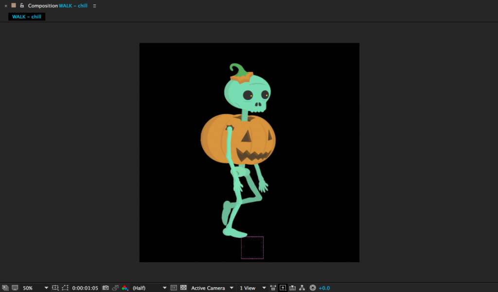
Passing: Right leg center, planted. Left leg bent and lifting forward, passing the right.
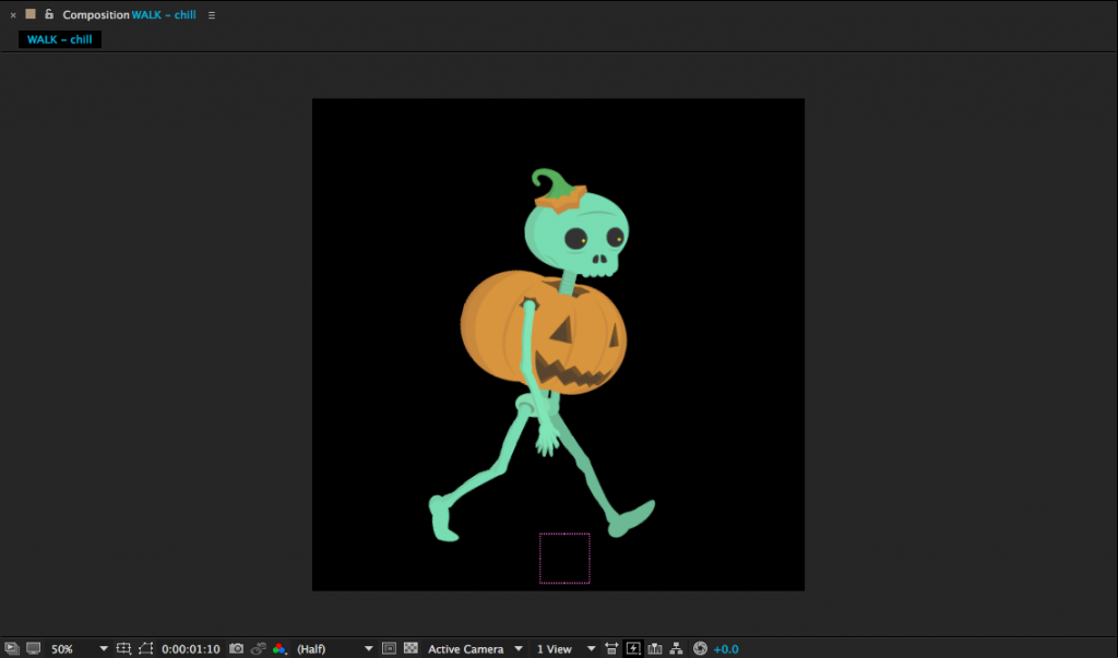
Contact: Right leg back, toe about to lift. Left leg forward, heel just hitting ground.
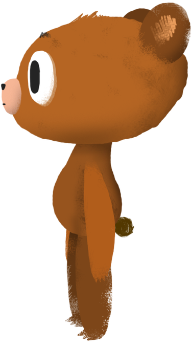
Here’s another take on walk cycle animation, by the talented and snarky Ross Plaskow. Plaskow animates using puppet pins, but you should be able to adapt his technique to characters that are animated only using rotation and position keyframes. Plaskow’s walk cycle takes only 16 frames to complete and loops seamlessly. If you would like to download the bear puppet that he uses in the tutorial, you can find a slightly simplified version of it here.
Here are a few tips, if you find yourself feeling frustrated:


Making a Loop
A walk cycle is just that – a cycle. That means that it can be looped over and over as much as needed. As long as the first frame of the cycle and the last frame of the cycle are identical, the loop should be seamless. You can loop animation in a few different ways. You could, for example, copy and paste the keyframes over and over again. You could also bring the entire walk cycle composition into another comp and duplicate it. However, there is a much more efficient way of looping animations in After Effects – using expressions.
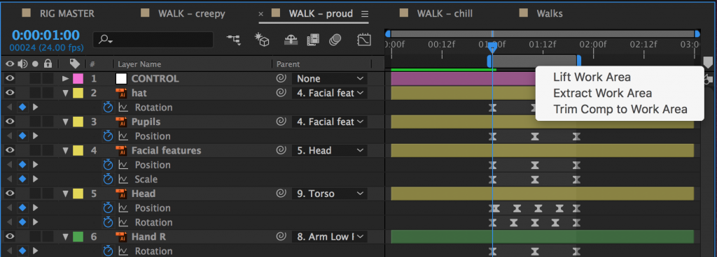
The first step in creating a looping walk is to isolate the walk cycle itself. In your walk cycle comp, position your work area handles around the walk cycle, if they aren’t already. Right-click on the lighter grey area between the handles and choose “Trim Comp to Work Area.” The composition will shrink down to only the area in the work area, which will probably be less than a second for a walk cycle.
To create a loop of the walk cycle, you’ll need to be working in a different composition. So create a new one (longer than the walk cycle composition) and drag the walk cycle comp into it. Right-click on the walk cycle comp in the timeline and go to Time>Enable Time Remapping. Click it.
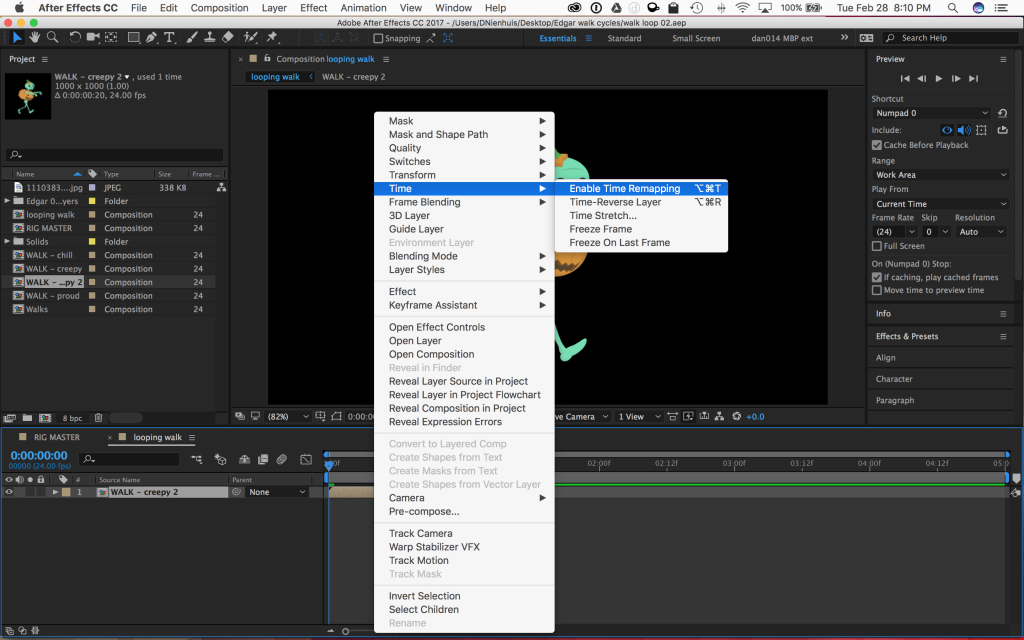
A new property called “Time Remap” should appear under the layer name. You should also see a keyframe appear at the beginning and end of the composition. Time Remapping is actually a very powerful property in After Effects – it allows us to speed up or slow down footage, or freeze it completely. It also allows us to create an animation loop using an expression.
The expression we’ll be using loops all of the keyframes for a given property. We’ll be looping the Time Remap property to create an endless walk cycle. However, because of the way that After Effects creates compositions, the last keyframe in a time-remapped composition is actually blank – if you go to the last frame of your walk cycle comp in the timeline, you’ll probably see a blank screen. So, go to the last frame, then go back a frame and press the “create keyframe” button in the timeline (it looks like a blank keyframe and can be found to the left of the layer name in the timeline). Then delete the keyframe at the very end of the comp.
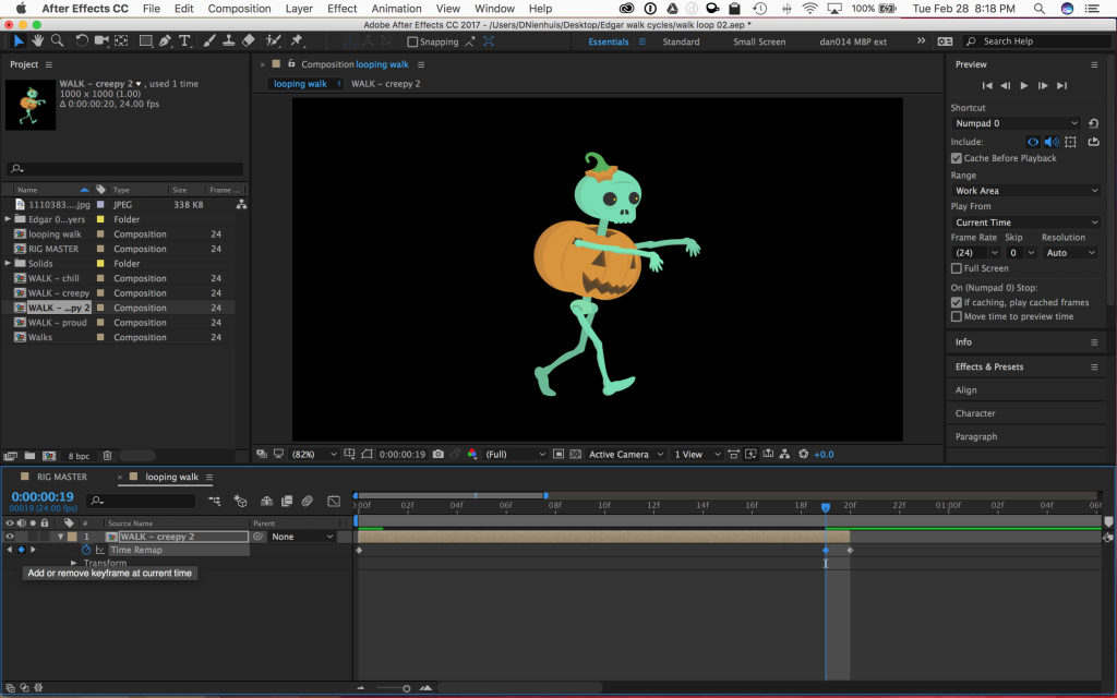
With keyframes at the beginning and end of the walk cycle animation, it’s time to add the expression. We’re going to be adding this expression to the Time Remap property, so alt-click on the stopwatch icon next to “Time Remap.” The expression text window should appear in the timeline, along with the expression controls.
On the left of the timeline, you should see a series of icons next to the words “Expression: Time Remap.” One looks like an equals sign, one looks like a graph, one is the pick whip, and the last one looks like a little “play” symbol – an arrow in a circle. Clicking on this last one brings up a menu with different expressions that can be inserted. Go to Property and select loopOut(type = “cycle”, numKeyframes = 0). It’s about halfway down the list. Click on it and it should be added to the expression in the timeline. Click out of the text window or hit “enter” on the keyboard to exit the text editing mode.
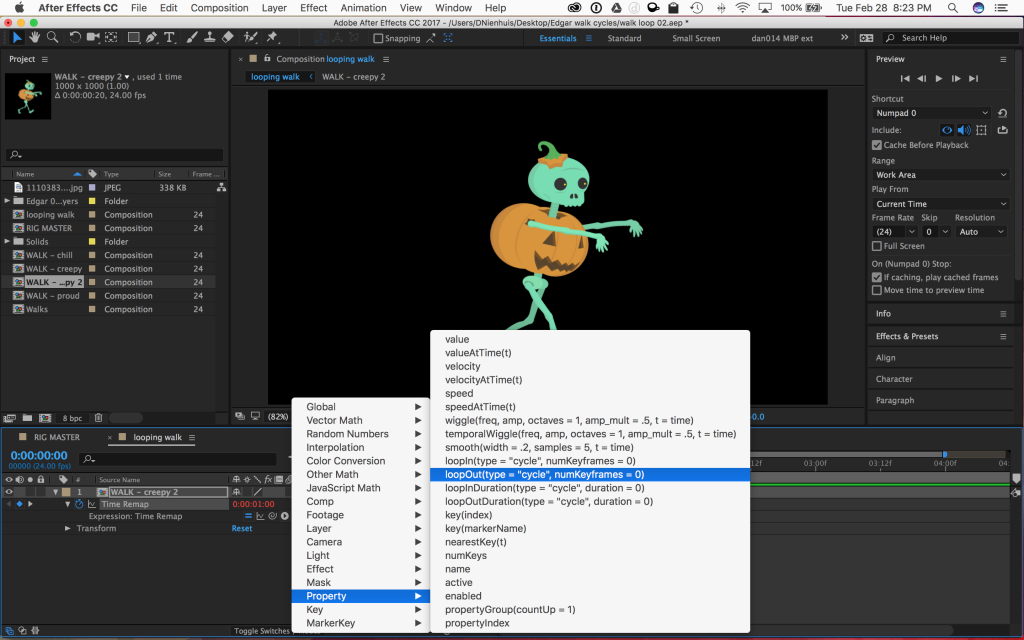
Any keyframes for that property – and there should only be two, one at the beginning and one at the end – should now loop for the length of the layer. Click and drag the end of the layer to make it longer. If you preview the composition, you should see the walk cycle animation looping and the character walking continuously.
Here’s a quick recap of the steps:
That may seem like a lot of steps, but it goes quite quickly once you are used to the process. Once you have the expression set up correctly, you can copy the looping walk cycle from one layer to another easily – and make the walk cycle as long as you want. The loop out expression works with other properties as well, so feel free to experiment; if things start to look strange, you can always remove the expression by alt-clicking on the stopwatch icon.

Project 11: Walk This Way
You may not need to use a walk cycle in your final project, but it’s still something you should practice making. For this week’s assignment, finish the walk cycle we worked on together in class and send me a video clip of it looping for five to ten seconds. If you’d like to modify the puppet or add a background, feel free!
Max
Mike
Max
Brian
Dante
Animating with Light at Night
Here’s one last Halloween treat – an animated short by Darren Pearson (also known as Darius Twin), created using long-exposure light painting. Pearson “drew” thousands of individual frames in the air using small flashlights to create this fun, energetic night out for a skateboarding skeleton.
Want to learn more about this kind of photography? Here’s another video by Pearson, describing his process for creating a single skeleton.
Animating the Dark Side
One of the most distinct voices in animation during the 1970s and 1980s was Ralph Bakshi. Bakshi’s subjects ranged from petty gangsters and street life to wizards locked in mystical combat. He brought a unique – and decidedly adult – perspective to animation and his unconventional style (along with his frequent use of rotoscoping) makes his work immediately recognizable. Check out a fun video essay and some trailers for his work below.
https://youtu.be/qnIhJwhBeqY
Work Smarter
Keyboard shortcuts can be the difference between muddling through a program and mastering it. Courtesy of No Film School and School of Motion, here are some extremely useful shortcuts to help you work faster in After Effects.
Precompose Your Layers
Move Playhead to Beginning or End of Composition
Toggle Guides On/Off
Split Layers
Maximize Any Panel
Hide or Show Layer Controls
Kern Your Type
Save the Current Frame
Center Shape Layer Anchor Points
Show And Hide the Grid
Out of the Uncanny Valley
Motion capture technology has been around for a while, but it was Andy Serkis’s performance as Gollum in Peter Jackson’s The Lord of the Rings films that really cemented its place as a viable cinematic tool. In the following video, Serkis discusses the history of the technique – and just how far it has evolved in the last several years.
Coding Animation
Adding keyframes is one way of animating properties in After Effects, but there is another method as well – using expressions. An expression is essentially a line of simple code that is applied to an animatable property. It’s not the same as writing computer code – you don’t need to know any specific programming language, or anything like that – but the idea is similar. To add an expression to a property, alt-click on the stopwatch icon that you usually use to turn keyframes on and off. The value associated with that property will turn red and a box of text will open in the timeline window. That window is where you add the expression.
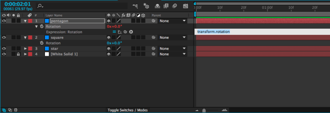
Probably the simplest kind of expression – and one of the most useful – adopts the value of a property on another layer. For example, you could take the rotation value of one shape and apply it to the rotation of another shape. When you create an expression, four small icons will appear, one of which is the swirly “pick-whip” icon that we previously used to parent layers. If you use the pick-whip to select the rotation property on a different layer and then hit “enter” (or click outside the text box), whatever value is entered for that layer will be used for the layer with the expression.
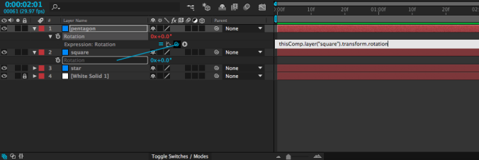
I realize that may sound confusing, but it’s fairly simple in practice. It means that you can animate a single layer and use it to affect other layers. Simply animate the first layer, then use an expression on the others. Try it out – once you get used to the process, you might find yourself using this particular expression a lot.
One small thing to keep in mind as you are entering expressions: the “enter” and “return” keys do different things. One (enter) closes the text box, the other (return) adds a line to the current expression. You can also close the text box by clicking outside of it in the timeline. If you want to remove an expression, alt-click on the stopwatch icon again and it will return to normal. Expressions can also be used in conjunction with keyframes.

Math
One thing that’s neat about expressions is that they can be easily combined or modified. If, for example, you wanted to use the rotation expression above, but make the layer with the expression rotate the opposite way of the layer it gets linked to, that’s very simple. Just use the pick-whip to select the layer with animation, then type *-1 (multiply by negative one) after the expression in the text box and hit “enter.”

This technique can be very helpful for things like animating a bird flap its wings, since you can animate both wings with one set of keyframes. Furthermore, any changes you make to that set of keyframes will automatically affect both layers.
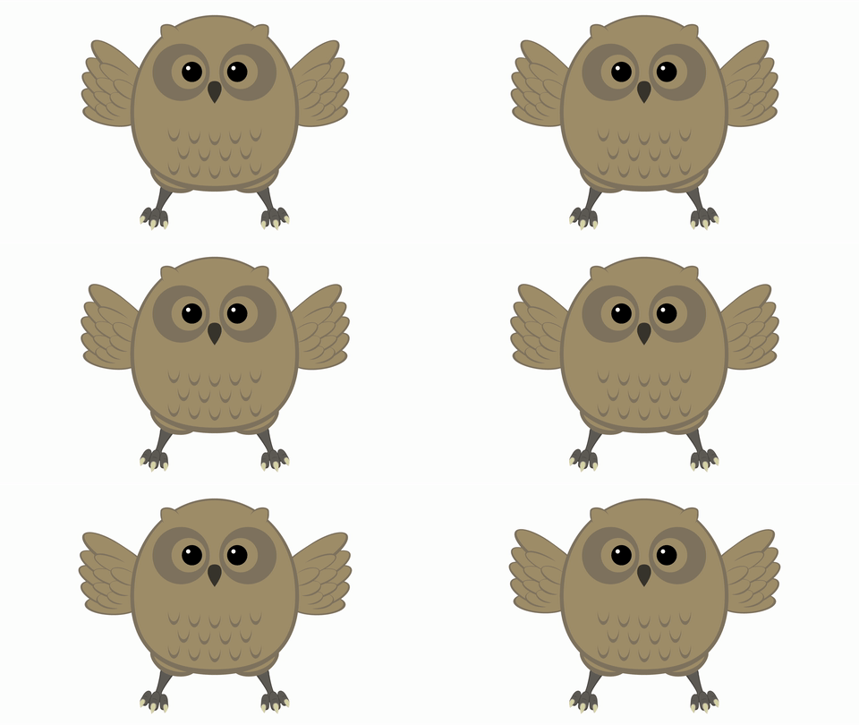
There are a lot more expressions that you can use to automate all sorts of properties in many different ways. One that you might come across uses the timecode of the composition, often multiplied by a number. If you add an expression to the rotation property of a layer and type time, the layer will rotate to one degree at the one second mark, two degrees at the two second mark, etc.. If you type time*100, it will rotate to 100 degrees at the one second mark, 200 degrees at the two second mark, etc.. This is a simple way to add continuous animation to a property, regardless of the length of the composition.
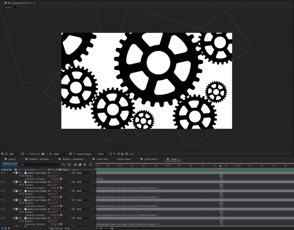
![]() I animated the gears in the example below without using any keyframes at all. The rotation of the first gear was set using the expression time*20. Every other gear’s rotation was pick-whipped to that first gear, with a multiplier, if necessary. By using some very simple math, I was able to animate the entire scene in such a way that changing the rotation of the first gear accurately changes every other gear.
I animated the gears in the example below without using any keyframes at all. The rotation of the first gear was set using the expression time*20. Every other gear’s rotation was pick-whipped to that first gear, with a multiplier, if necessary. By using some very simple math, I was able to animate the entire scene in such a way that changing the rotation of the first gear accurately changes every other gear.

Get Random
I’ve been using rotation in my examples so far, because it’s an easy property to visualize. Anything that can be keyframed can be affected by an expression, though – opacity, position, scale, and even the individual parameters of effects. One of my favorite expressions, wiggle, applies random values within certain limits. It can be used, among other things, to create unpredictable, organic-seeming movement when applied to the position of a layer.
To add wiggle to the position of a layer, alt-click on the Position keyframe icon in the Transform properties. A text box will open in the timeline – in it, type wiggle, then two numbers in parentheses, separated by a comma. For example: wiggle(2,150). The first number in this expression is the frequency: 2 equates to two times per second. Entering a 3 would be three times per second, and entering .5 would be half a time per second (or once every two seconds). The second number is the amount to move. So, our position expression “wiggle(2,150)” will move an object up to 150 pixels along the X and Y axis, twice per second. If our layer were 3D, it would move on the Z axis as well.

Of course, you don’t always want random movement, but it’s occasionally extremely helpful. I’ve used the wiggle expression to animate everything from fireflies to dials on a car dashboard. You can even apply a wiggle to a virtual camera to simulate the look of handheld footage. Randomness is more powerful than you might initially realize.
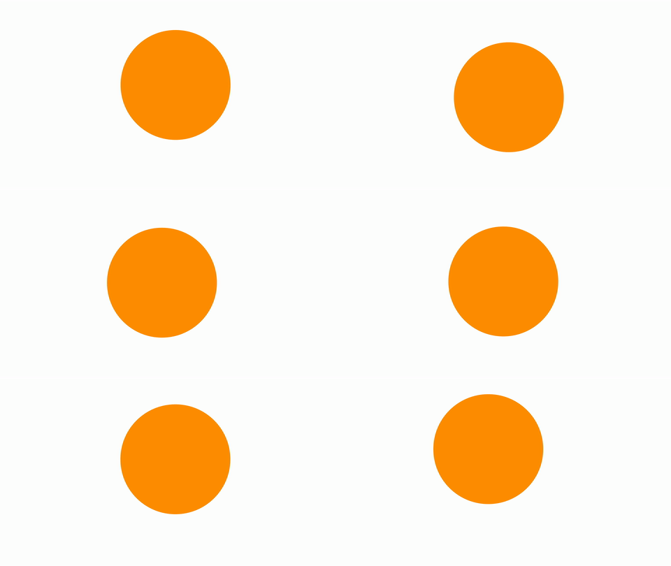
Wiggle can also be applied using an animation preset. These are found in the Effects & Presets panel (the same place we found the text animation presets earlier in the semester). If you type “wiggle” into the search bar, you’ll see a few different options there. The wiggle animation presets still use expressions, but they sort of do the coding for you. The presets work in conjunction with the Transform effect (in the Distort category), as opposed to the transform properties in the timeline panel.

Expressions open up a vast new world of possibilities in After Effects. The icon to the right of the pick-whip opens a window that contains dozens of “building blocks” – presets and pieces of expressions that can be combined to make very complex automated effects. Don’t feel like you need to understand what each of these does – instead, just get comfortable applying expressions. Often, online tutorials and trainings will provide expressions for you to copy and past into your own compositions. Like so much of After Effects, once you are familiar with the process, you can figure out the specifics as you go.
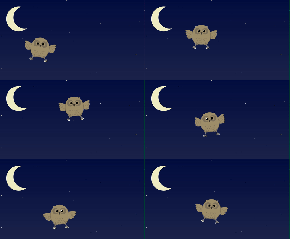
Project 10: Expressions of Terror
It’s almost Halloween, so let’s have some spooky fun! I’d like you to use expressions to create a spooky animated scene. You can create the media you use yourself, find some online, or use materials from previous lessons. Whatever you choose, you must use expressions at least three times in your animation. It doesn’t need to be long – maybe ten seconds or so – but make it scary and experiment with expressions!
