Categories
Weekly Lessons

Week 5: Text, Effects, Masks, and More

M-E-T

Most of the media you add to your composition can have three kinds of properties: masks, effects, and transform properties.  You should be familiar with transform properties by now; they are the most basic keyframe-able properties of a piece of media, such as scale, position, and rotation.  Masks allow you to cut unwanted areas out of a piece of media.  Effects are used to modify the media in countless different ways.  These three properties – masks, effects, and transform properties – are always applied in the same order: masks first, then effects, then transform properties.

You’ll find the mask tools up at the top of the screen in the tool bar.  There are preset mask shapes (hold-click to see the various options) and a pen tool for custom shapes.  Be sure to select the layer you want to mask in the timeline panel before clicking on a mask tool.
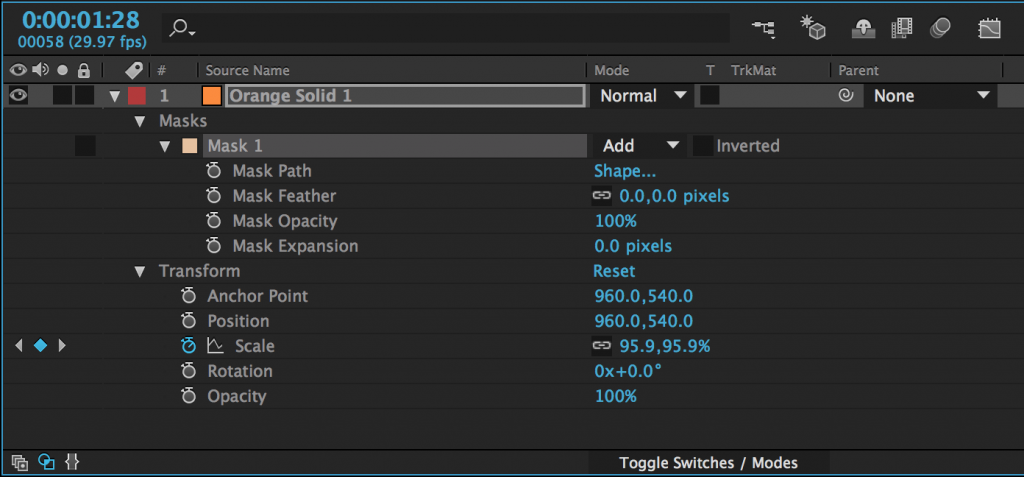
After you add a mask to an object (with either a shape tool or the pen tool), it will appear as a property of that layer in the timeline panel.  Next to the name of the mask, you’ll find a dropdown menu – the default value should be “Add.”  This means that the mask is “adding” that area and discarding everything else.  If you change this to “Subtract,” the area of the mask will be taken away and everything else will remain.  Choosing “None” will make the mask have no effect.  There are several other options as well, but add and subtract masks are what you will use most of the time.

There are a number of options for further modifying the mask, which are available by clicking the triangle to the left of the mask’s name.  Feather fades the edges; Opacity changes the transparency; and Expansion allows you to grow or shrink the mask.

Mask Path is the shape of the mask and by turning keyframes on for that property, you can animate that shape.  When the mask path keyframes are activated, you can move the points that define the mask or adjust their bezier curves.  If you click on the word “Shape…”, you can automatically change the mask to an ellipse or rectangle.

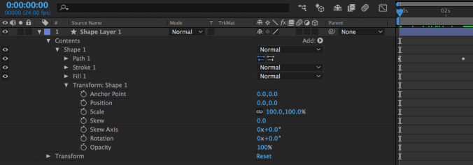
Shapes can be animated in a very similar way.  If look at the properties of a shape in the timeline, you’ll see a new category called “Contents.”  Under the shape’s name, you’ll find keyframe-able properties related to path, stroke, fill, and transform.  “Path” allows you to animate the shape of the shape, just like the shape of the mask can be animated. Stroke and fill control the color of the shape and the color and thickness of its border.  Transform is a second set of transform controls, applied before the regular transform properties.  There are a few extra properties in these new transform controls; they are related to the skew, or distortion, of the shape.
Effects

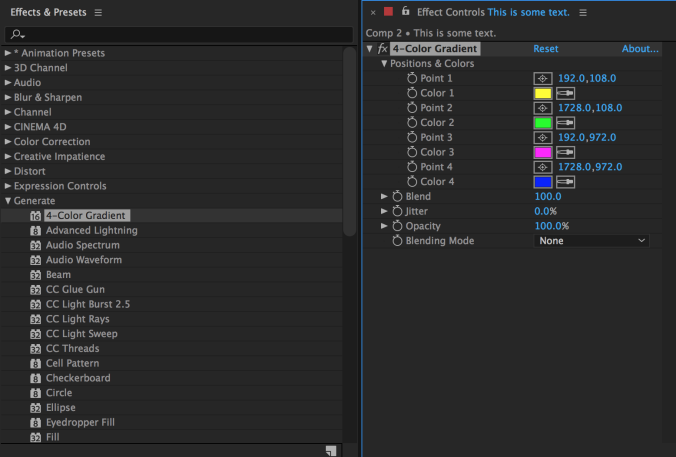
There are many effects built in to After Effects and countless more that can be added using plugins.  The effects are organized into categories under the Effects dropdown and in the Effects panel, which has a useful search bar.  Clicking on a piece of media in a composition and then choosing an effect in either location will add that effect and should bring up the Effect Controls panel.  The effect will also appear in the layer information of the composition in the timeline.

The list of effects can be found in two places.  The top dropdown menu has an Effects section with all the effects grouped into categories.  Simply go to the effect you want and click on it – it will be added to the selected layer.  There is also an “Effects & Presets” panel (you may need to find it using the Window menu).  This panel contains the same categories as the dropdown menu, but it also contains a search bar.  So if you know the name of the effect you want, just start typing it into the search bar and all the possible matches will appear.

When you add an effect, that effect will appear in the “Effects” section of the layer’s properties in the timeline (under “Masks” and before “Transform”) and in the Effect Controls panel.  The Effect Controls panel is best for getting your effect dialed in exactly like you want it – many effects have specialized controls and elaborate options.  The timeline window is best for refining and manipulating any keyframes that you add to your effects.  Remember that you can show all the keyframes that have been added to a layer by pressing the U key.
Text

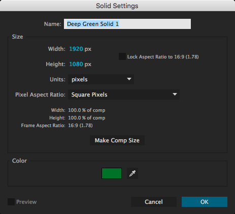
In addition to media that you import, you can create layers to add to your composition from within After Effects.  The most common are solids and text layers.  To create one, go to the Layers dropdown menu at the top of the screen, select New, and choose Solid or Text. When you create a new solid, you’ll see a menu with options for name, size, and color.

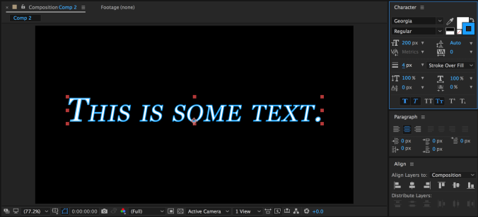
You can create text in a composition either by selecting the text tool (Cmd+T on Mac, Ctrl+T on PC) or choosing Layer>New>Text from the top dropdown menu.  You can either draw a box for the text in the composition window or just click somewhere and start typing.  You can also double-click on the layer in the timeline window to begin editing the text.

The “Character” panel in After Effects contains all the usual options for modifying text, as well as some unique controls.  You can change the typeface, size, fill color, stroke, and style; but you can also adjust the kerning and line spacing, add a faux bold or italics, switch to all-caps or small-caps, put text in sub- or super-script, and more.  You can highlight just part of your text and modify its properties separately.  There is a different “Paragraph” panel for adjusting the justification.
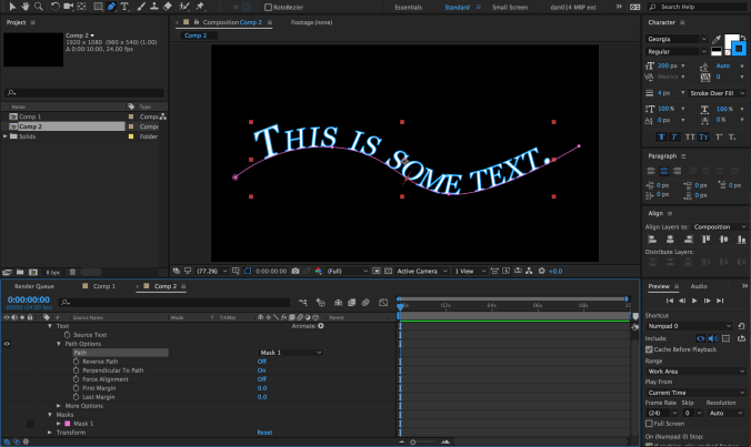
There are two text-related tools in the toolbar: one for horizontal text (this is what you’ll use most of the time) and one for vertical text.  What if you want your text to run along a specific path, however?  This can be achieved using the masking tools.  With your text layer highlighted, choose either the pen tool or a mask tool and draw a mask or path.  If you are using the pen tool (which is what I’d recommend), you do not need to close the path – you can simply create a line for the text to run across.

With your path drawn, click down to the “Text” section of the text layer in the timeline and find the “Path Options” section.  Next to “Path,” you should see a small dropdown menu – it will say “None” by default.  Open that menu and choose the path you’ve drawn – your text will snap to the path.  Some options for adjusting the position of the text on the path will also appear.
Transfer Modes and Track Mattes

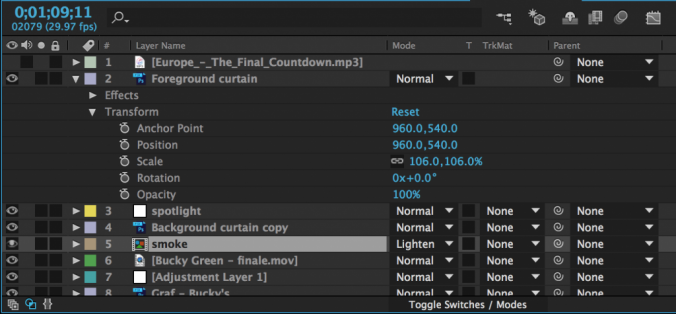
Those of you with Photoshop experience may be familiar with transfer modes.  A layer’s transfer mode affects the way it interacts with the layers below it.  There is a “Mode” section of the timeline where this can be adjusted.  You may need to hit the “Toggle Switches/Modes” button at the bottom of the panel for it to become visible.

By default, the transfer mode should be set to “Normal.”  There are too many options to go through individually, but they are grouped together into sections.  The section with “Darken” at the top uses the dark areas of the layer to affect what is visible; the section with “Add” at the top uses the light areas.  You should experiment with the transfer modes to see how layers affect each other – you can get some really interesting results with them.

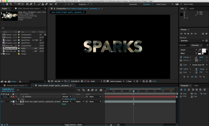
Next to the transfer modes are options for “Track Mattes.”  A track matte tells a layer to look at the layer above it for certain properties.  The “Alpha Matte” and “Alpha Inverted Matte” are particularly useful.  For example, if you put a text layer above a video layer and then set the track matte of the video to Alpha Matte, the video layer will have the shape of the text layer.  Alpha Inverted Matte will cut out the shape of the text.
Animate Text

As you can see, there are many ways of manipulating text in After Effects.  However, there is a whole other category that we haven’t yet discussed: animation presets.  There are actually animation presets for all sorts of things, but the text presets are particularly fun.  To use them, you’ll need to go to the Effects & Presets panel; *Animation Presets is the first option.

Within the Animation Presets category, you’ll see several subcategories.  Go down to Text and open it up.  There, you’ll see many more subcategories such as Animate In and Animate Out, Graphical, Mechanical, Organic, and lots more.  Animate In and Animate Out do just that – they automatically animate the text moving on or off of the screen.

The other categories of animation presets add things like movement, graphical elements, or light effects to text.  For example, the Flicker Exposure effect in the Lights and Optical category makes each character in a text layer randomly flicker.  This is a fairly simple effect, but it would be very tedious to create it manually; the animation presets make it simple.
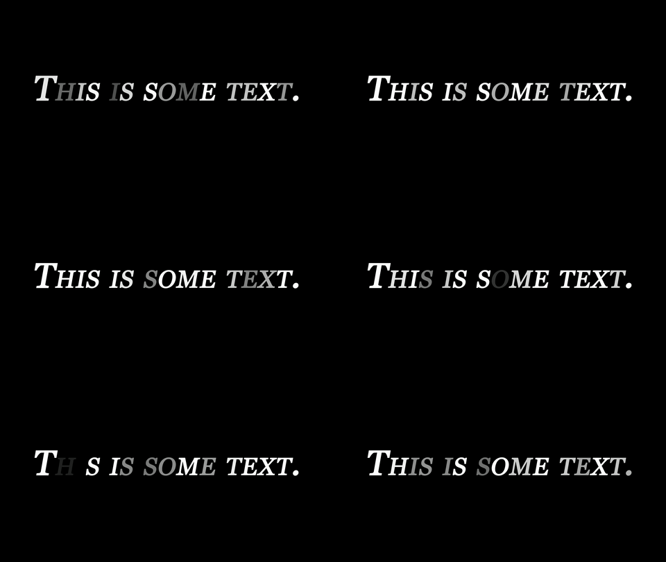
Many animation presets can be manually customized after they are applied.  To do this, go back to the “Text” section of the text layer in the timeline – there should be a new section called “Animator” followed by a brief description.  You can dig through the animator options to alter the animation preset, or highlight and delete it to remove it.

Project 5: Word Mark

By now, you should be able to add media to a composition, keyframe various properties with precision, use masks and transfer modes, and manipulate text.  I’d like you to combine these skills to create an animated “word mark” – essentially, an animated text-based logo.  Think about creating something that you’d like to use to identify your work, like the logos that play at the beginning of movies.

It can be your name, a brand name of your own creation, or any name you’d like to use as a personal identifier – but it must contain text.  If you’d like some media to use, here is some generic slow motion stock footage – although you are welcome to use any footage or other media you like.

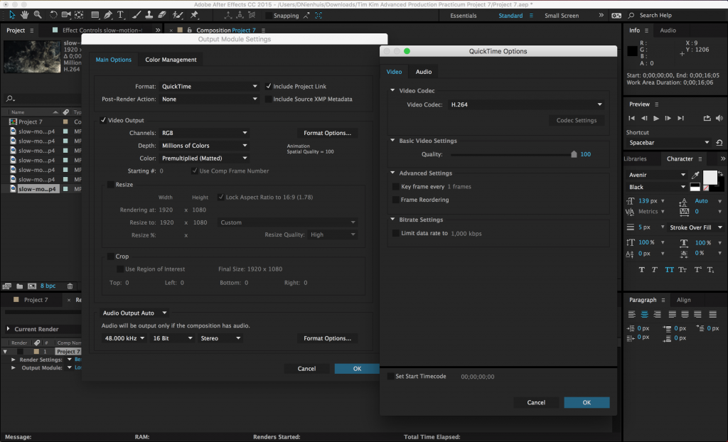
Your finished graphic should be under 10 seconds long, feature some sort of text element, and be rendered as a QuickTime movie using the H.264 codec.  If the resulting file is small enough, email it to me directly – otherwise, upload it to your Google Drive and send me a download link.

Categories
Blog Posts

Art of the Title

Roll Credits

We don’t necessarily think of the design of a film’s title and credits as a crucial part of the production process, but it can completely set the tone for a film.  Many films have become inextricably linked to the design of their titles; think about Star Wars, Indiana Jones, or The Godfather and you immediately think about their iconic title design.

Here are a handful of videos from the excellent blog Art of the Title, where you can find essays, interviews, and videos about hundreds of television, movie, and game title sequences.

Categories
Blog Posts

Pixel Art

What’s Old Is New Again

Pixel art has had a sort of resurgence over the last several years, fueled by a combination of advancing technology and growing nostalgia.  Most often associated with video games, pixel art can also be used in short films for a unique aesthetic.  Here are a few videos that celebrate pixel art, including a tutorial on creating pixel artwork in Photoshop and the highly acclaimed short film Pixels (which inspired the critically reviled feature film Pixels.)

Categories
Weekly Lessons

Week 4: Manipulating Keyframes

Easy-Ease It

This week, we’re going to dig deeper into After Effects – specifically, keyframes.  In the previous lesson, we discussed how to add objects to a composition and keyframe their basic properties, such as position, scale, and rotation.  That lets us do a lot, but to make animation really seem alive, we need to move beyond the basics.  Before we get started, let’s review some of the principles of animation, as explained by Alan Becker.

Slow In, Slow Out

The ability to keyframe and animate properties is probably After Effects’ most powerful feature; however, that animation may look a little stiff and unnatural at first.  For example, if you use two “normal” keyframes to move a shape across a composition, the shape will begin moving abruptly, travel at a constant speed, and then stop abruptly.  Sometimes, this is the desired effect, but it’s not how things usually move in the real world.  Fortunately, After Effects makes it simple to make animation more natural and dynamic.

By default, keyframes in the timeline are diamond-shaped.  This is a standard “linear” keyframe.  If you right-click on a keyframe and move down to the “Keyframe Assistant,” you’ll see three “Easy Ease” options: Easy Ease, Easy Ease In, and Easy Ease Out.  Easy Ease Out “eases out” a property, meaning it will start slowly and then build up speed.  Easy Ease In “eases in” a property, meaning it starts fast and then slows down.  Easy Ease is used for keyframes where you want a property to start fast, slow down, then pick up speed again.  When you choose one of these options, the shape of the keyframe will change: Easy Ease Out is an arrow pointing left, Easy Ease In is an arrow pointing right, and Easy Ease is basically the other two icons combined.

Easy Ease sounds complicated, but it should quickly make sense once you start playing with it.  It’s really an essential tool in After Effects; it makes animated properties – especially movement – seem much more natural.  If you’re having a hard time with it, my general rule is this: use Easy Ease Out on the first keyframe in an animation, Easy Ease In on the last keyframe, and Easy Ease on the keyframes in between.  If you aren’t sure what to use, the regular Easy Ease is probably your best bet.

If you want to switch back to a standard linear keyframe, you can command click on it and its shape will change.  If it turns into a circular shape, command click on it again, until it is back to a diamond.

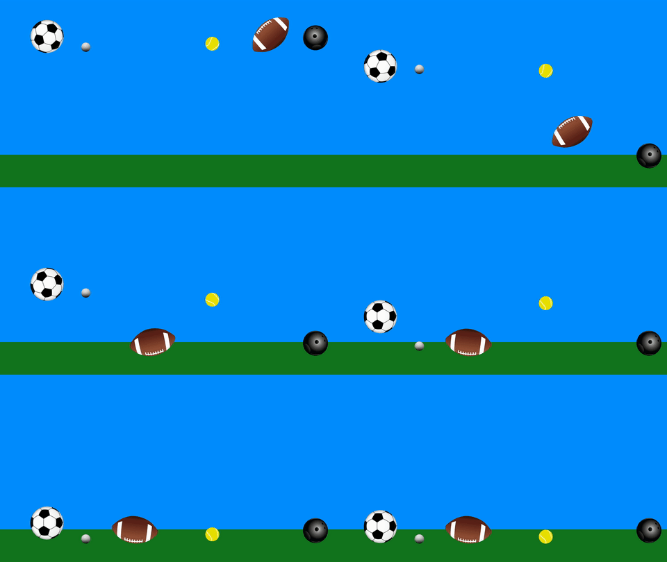
Here is the same piece of animation, first with regular keyframes, then with eased keyframes:

Changing the Position Path

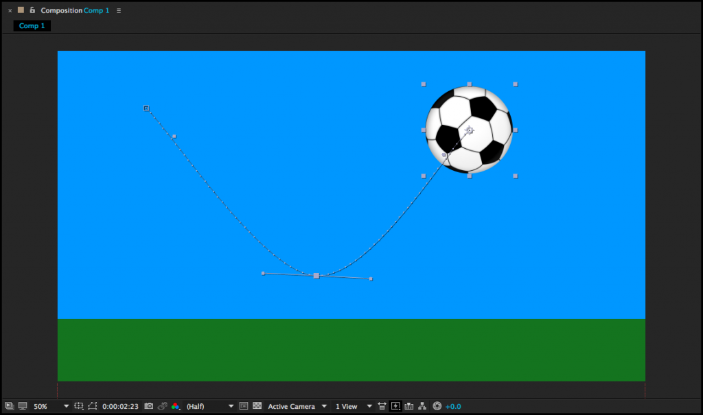
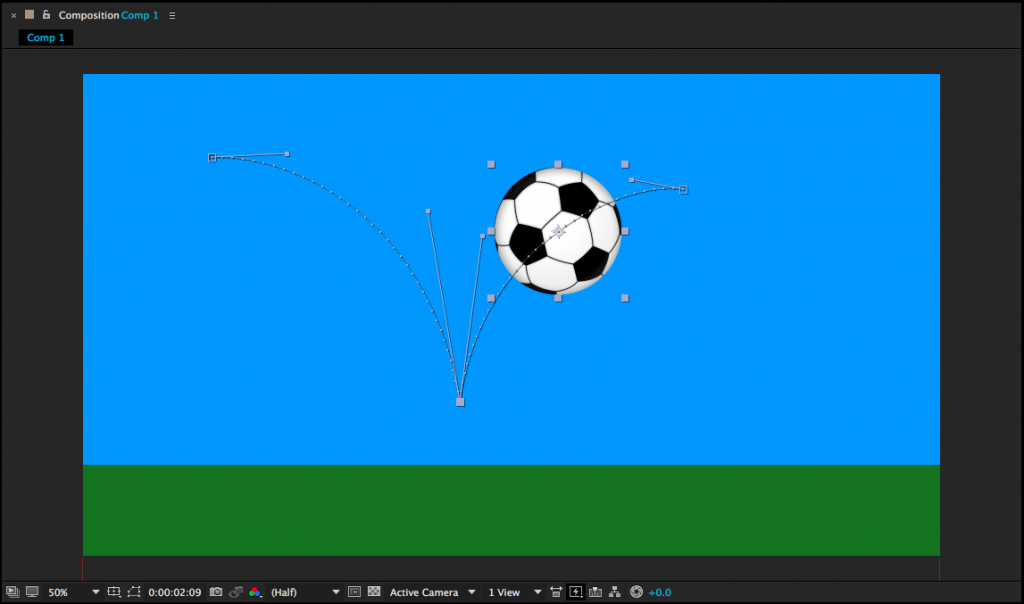
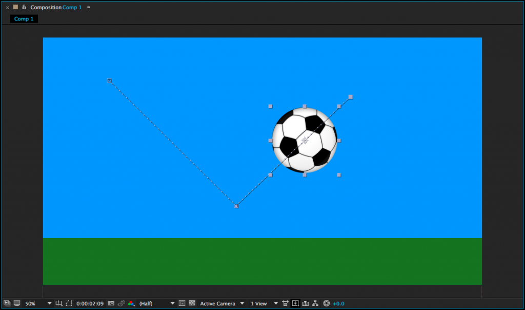
As we discussed last week, many transform properties can be manipulated either in the timeline or within the composition window.  For example, if you animate an object’s position in the timeline, you should see those keyframes appear as a path in the composition window.  The keyframes themselves are little squares and the dots along the path represent individual frames.  You can get a sense of how fast or slow movement is happening based on how close together the dots on the path are.

From within the composition window, position keyframes can be moved just by clicking and dragging.  If you click on a keyframe, you will also see curve controls.  These can also be clicked and dragged to change the position path of a moving object.  If you alt/option click, you can move the curve controls individually.  If you select the pen tool (G) and click on a keyframe, it will remove all curves from that part of the path.

Manipulating keyframes using Easy Ease and curves can help make your animations feel more natural and fluid.  Be sure to experiment with these techniques – and remember to consider the basic principles of animation.

Layer Trimming

One very basic action that we haven’t covered yet is the editing of a layer’s in and out-points.  By default, the entire length of a piece of media is dragged down into a composition and you may have noticed that there is no razor blade tool in the After Effects toolbar.  Instead, to trim the beginning of a layer, move the playhead to the desired in-point and hit option [.  Option ] will set the end point.   (Use alt on a PC.)  You can also click and drag on the ends of layers in a composition.

If you don’t hold down option, the [ and ] keys will move the layer without trimming it.  [ will move a layer so that its in-point is at the playhead location.  ] will move a layer so that it’s out-point is at the playhead.  These shortcuts allow you to adjust the length and position of layers in the timeline very quickly, once you’re accustomed to using them.

When you’re moving or trimming layers, it’s obviously important to have your playhead exactly where you want it in the timeline.  You can use the spacebar to play or move the playhead by clicking and dragging it with the mouse.  For precision, you can use page up and page down to move frame-by-frame forwards and backwards.  This is different from Premiere, which utilizes the arrow keys to move the playhead; in After Effects, the arrow keys adjust the position of the highlighted layer.  If you hold shift and press page up or page down, you will move the playhead ten frames instead of one.

You will also probably need to duplicate layers fairly often in After Effects.  This can be done by copy/pasting, but you can also use the  Cmd+D keyboard shortcut.  You can actually use  Cmd+D to duplicate all sorts of things in After Effects: shapes, text, entire compositions, and even effects.

One last note about layers: if you double click on a layer in the timeline, it will open that layer in a panel over the composition preview window.  This is actually not where you usually want to work, so if you accidentally double click on something, close the layer panel or click back to the composition preview window.

Timeline Length

When you create a new composition, you are asked to define its length.  If you need to change the length of the composition, you can do so by going to Composition>Composition Settings… or using the Cmd+K keyboard shortcut.  Changing the duration in the composition settings window that appears will either add or subtract time from the end of the composition.  However, you can also trim the composition down from within the timeline panel.

At the beginning and end of the timeline, you’ll find blue handles – these define the “work area.”  (There are actually two sets of blue handles – the smaller ones can be used to zoom the view of the timeline in and out.)  You can think of the work area handles as After Effects’ equivalent of an in and out point.  If you drag the work area handles to the section of the timeline you want to keep, then right-click on the lighter area directly between them, you’ll see a few options appear.  Select “Trim Comp to Work Area” to remove everything outside the handles and shorten the length of the composition.

Project 4: The Bouncing Ball

You may have noticed that a bouncing ball is used a lot in lessons about animation.  That’s because it’s  a simple action that clearly and concisely illustrates the basic principles of motion – and animation.

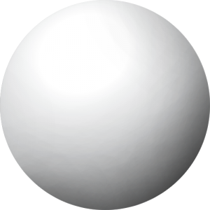
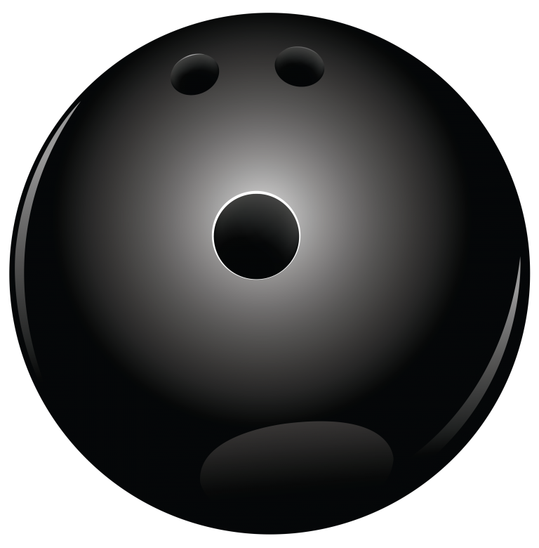
For your next project, download two or more of the graphics below.  Your goal is to create a short animation that shows the properties of the kinds of balls you choose.  A golf ball should bounce higher than a bowling ball; a football will ricochet differently than a tennis ball will; air resistance will affect a beach ball more than a soccer ball – you get the idea.  You can use solids or shape layers to create surfaces for the balls to interact with.

 Here are the specific parameters:

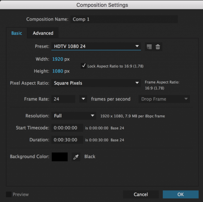
  • Create a composition using the HDTV 1080 24 preset.  It should be between three and five seconds long, although you may go longer if you want to get elaborate.
  • Animate at least two different kinds of balls.  They should interact with their environment in some way, such as bouncing off the floor.
  • Export your finished video as a Quicktime movie, using the H.264 codec.
  • If you finished video is small enough to email, send it to me directly.  Otherwise, you may need to upload it to your Google Drive and send me a download link.

Have fun!

Categories
Projects

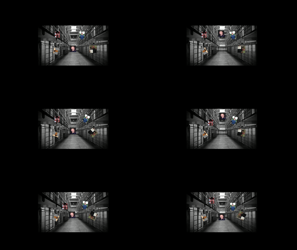
Project 3: Transform Properties

Max

Jen

Jon

Brian

Rebecca

Dante

Categories
Blog Posts

Aamazing Aardman

Cheese, Gromit!

British animation studio Aardman Animations is one of the reasons stop-motion is still a valid cinematic technique today.  Their new film, Early Man is due out next year and is being directed by stop-motion auteur Nick Park.  Park directed all four Wallace and Gromit short films and Creature Comforts, as well as the features Chicken Run and The Curse of the Were-Rabbit.

Sadly, Peter Sallis – the voice actor who gave the character Wallace such personality and life – passed away this year.  Here’s a look back at some of Aardman’s early work, the trailer for the upcoming feature, and a behind-the-scenes chat with some of the studio’s model makers.

Categories
Projects

Project 2: Frame By Frame

Max

Jen

Jon

Brian

Veronica

Mike

Dante


Categories
Weekly Lessons

Week 3: Introducing After Effects

Moving Forward

It’s time to dive into After Effects.  As we explore the program, consider the things we’ve discussed so far – like cartoon representation and the twelve basic principles of animation – and try to incorporate them into your projects.

After Effects is designed around creating media, often using assets created in programs like Illustrator and Photoshop.  After Effects is the perfect application for building animated titles and lower thirds, is a powerful tool for character animation, and can be used for compositing and special effects work.  It is often used in concert with other programs to create sophisticated video content.

After Effects is also deeply customizable.  There are countless plugins and presets available for After Effects that can completely alter the capabilities of the program.  These run the gamut from manipulating 3D models to automated text animation to particle effects and everything in between.  Websites like aescripts and Video Copilot are fantastic resources for adding functionality to the application.  Larger companies like Red Giant and GenArts make more sophisticated  — and often expensive — add-ons for even more advanced professional-grade work.  However, even without external plugins, After Effects is an incredibly powerful platform for media creation.

Setting Up A Project

When you open up After Effects, you’ll likely see a splash graphic with the usual options for starting a new project or opening an existing one.  After Effects does not require you to set a project location or save before you start working.  I’d recommend keeping everything organized in a central folder, sorting your media by type, and saving frequently.

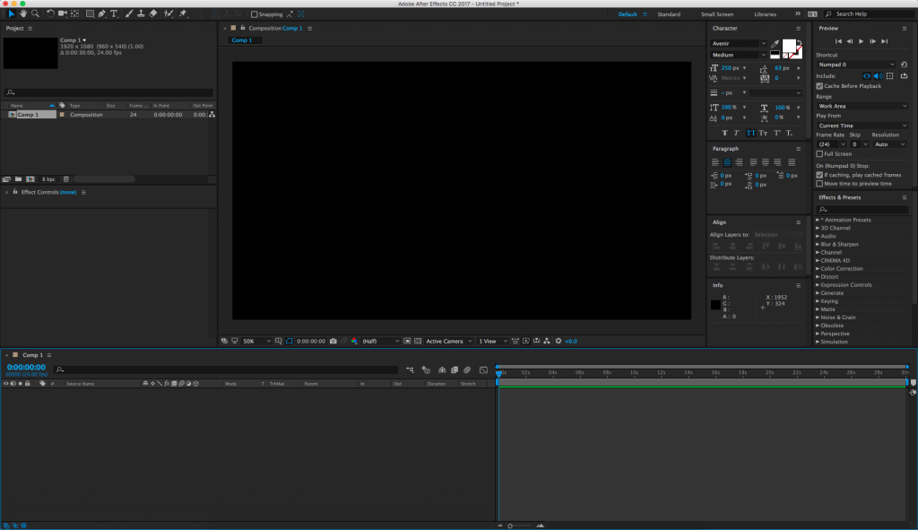
A quick word on the layout of the After Effects workspace: like all current Adobe software, After Effects has a flexible, adaptable layout that you can – and should – modify depending on your current needs.  There are a number of preset layouts, which are accessible under the Window>Workspace dropdown menu.  If you are moving panels around and lose something important, you can always reset the workspace by going to Window>Workspace>Reset to saved layout.  The Window dropdown also contains a list of every available panel, so if you can’t see or can’t find a specific area, you can choose it from that list.  The panels you will probably use the most include the Project, Composition, Timeline, Effect Controls, and Preview panes.  If you are editing text, you may want the Character, Paragraph, and Align panels open.  If you are working with lots of effects, having the searchable Effects & Presets panel up will be helpful.  If you find a layout you like, you can save it under the Window dropdown.  Don’t be afraid to move, resize, open, and close panels – you can always reset them later.

In After Effects, you’ll be working in compositions.  You can create a new composition by hitting Cmd+N, selecting “New Composition” from the Composition dropdown menu, or by clicking the icon that looks like a scene inside a filmstrip at the bottom of the Project panel.  You’ll be greeted with a menu that gives you options for resolution, frame rate, and the duration of the composition.  There are several presets to choose from and they are actually pretty helpful.  For this class, use the HDTV 1080 24 preset.

Hitting “OK” will open up a new blank composition.  You’ll be dragging media into the Timeline and your work will be visible in the Composition panel.  There are no pre-determined audio or video “tracks” in the Timeline window; pieces of media simply stack on top of each other.  Every video or audio clip, still, adjustment layer, text, and shape appears as its own layer in the Timeline.  You can also drag one composition into another or put footage into a “pre-composition”.  You can rename media in either the Timeline or the Project panel by highlighting something and hitting return.

To get media into After Effects, you’ll need to import it.  You can import all kinds of things – stills, video, music, 3D files, even other After Effects projects – by going to File>Import>File… in the top dropdown menu, hitting Cmd+I, or just dragging things from the Finder into the project window.

You can also create pieces of media such as solids and shapes to use within After Effects.  A solid is a simple block of color.  Go to Layer>New>Solid… or hit Cmd+Y to define the color and size of the solid, then hit “OK” to create it.  It will automatically appear in the timeline of whatever composition you are working on.  To create shapes, use the masking tools (discussed below) without selecting a layer in the timeline.  In other words, simply select a mask or pen tool and begin to draw in the composition window.  If do you have a layer selected, that layer will be masked instead of drawing a shape – we’ll go into this in greater detail later.

Tools

If you’re using the “standard” layout, you should see a bar of tools across the top left section of the screen.  These are what we’ll be using to interface with After Effects, so it’s essential to know what they do.

From the left, the first tool is the arrow selection tool.  This is what you’ll be using most of the time.  Its keyboard shortcut is V.

Next is the hand tool, which moves your view around in the composition window.  You can press H to select the hand tool or you can hold the space bar down to switch from your current tool to the hand tool.  This is the quickest way to move around your composition.

Next is the zoom tool, which looks like a magnifying glass.  The zoom tool is pretty self-explanatory: it zooms your view of the composition window in; hold alt/option to zoom out.  This is useful, but a faster way of zooming is by using the scroll wheel on your mouse: scrolling up zooms in and scrolling down zooms out.  There are also zoom controls in the bottom left corner of the composition window.

The circular arrow is the rotation tool, which can be selected using the W key.  This rotates media in the composition window.  Next to the rotation tool is a dropdown menu with several tools related to virtual cameras – we’ll discuss those later in the semester when we go over 3D compositions.

Next to the camera tools is an incredibly useful tool that looks like four arrows in a dashed-line box.  This is the pan behind tool and you can select it using Y.  The pan behind tool is used to change the anchor point of a piece of media without moving the object itself.  This will prove very helpful when we begin to do character animation.

Next to the pan behind tool is a dropdown menu with tools for either creating different kinds of masks or different shapes (Q).  Then there are the pen tools (G) which can also be used to create masks or shapes.  The horizontal and vertical text tools are next (Cmd+T).

We won’t be using the next few tools very often, but they are: the brush tool, the clone stamp tool, and the roto brush tool.  The last tool, which looks like a push pin, is the puppet pin tool (Cmd+P on a Mac, Ctrl+P on a PC), which we’ll use for character animation.

Transform Properties

Let’s manipulate some media in After Effects.  The timeline is where you to modify properties like scale, opacity, and position.  On the left side of each piece of media (or layer) is an arrow that can be tipped down.  Clicking it will reveal three categories of properties that can be adjusted: masks (if any have been added), effects (if any have been added), and a section called “Transform.”  These categories always appear – and are applied – in this specific order: first, masks are applied, then effects, then transform properties.  If your media includes audio, that section will appear last.

Clicking “Transform” will reveal the following properties: anchor point, position, scale, rotation, and opacity.  Most of these are self-explanatory, although “anchor point” can be a little confusing.  The anchor point is basically the central point in an image or video and changing the anchor point changes the way an object rotates and scales.

You will be adjusting the transform properties a lot when using After Effects, so it’s helpful to know their keyboard shortcuts:

A – anchor point
P – position
S – scale
R – rotation
T – opacity

You’ll notice that next to every transform property – in fact, next to almost everything – is a stopwatch icon.  This icon turns keyframes on and off.  Setting keyframes allows you to animate a property over time.  By default, keyframes are switched off – you can tell because the stopwatch icon is greyed-out.  Clicking the icon will turn keyframes on and a new keyframe will be set every time an adjustment is made to that property.

Whenever you add a keyframe to an effect or transform property, that keyframe will appear as a diamond shape on the timeline.  Keyframes can be moved, copied and pasted, or deleted right on the timeline.  A group of keyframes can be scaled up or down by selecting them with the mouse, then holding alt while clicking and dragging a keyframe at the end of the group.  You may need to experiment to see just how this works, but After Effects is designed to make adding and modifying keyframes very easy.  As a result, you can animate properties with very precise control.

To see all the keyframes on a layer, highlight that layer in the timeline and press the U key.  I use this particular shortcut constantly.

Exporting Using the Render Queue

The best way to export in After Effects is using the Render Queue.  The Render Queue exists as a panel in After Effects – it may show up as a tab next to the compositions in the timeline (otherwise, you can always find it under the Window dropdown at the top of the screen).

To add a composition to the Render Queue, open the composition in the timeline, then go to Composition>Add to Render Queue.  The name of the composition should then appear in the Render Queue panel.  Before you hit the “Render” button, you’ll need to set a few parameters.  Unless something has been changed, everything in the Render Settings section should be fine at the default values.  The Output Module is where you actually make changes to the file type and codec, so click on that to bring up a window with lots of options.  For our purposes, just click on “Format Options…” and change the video codec to H.264.  Click OK to close each window.  Finally, set the file’s name and destination by clicking on the text next to “Output To:”.

What’s great about the Render Queue is that, if you are working on multiple compositions, you can add them all, then render them together.  Just repeat the process of adding them to the queue and adjusting their settings, then hit Render.

Project 3: Transform Properties

For this week’s project, I’d like you to go through the process of creating a composition in After Effects, adding keyframes to the transform properties, and rendering the finished video.  Make a new composition using the HDTV 1080 24 preset; it should be between five and ten seconds in length.  Add at least three different pieces of media to the composition and keyframe at least one transform property on each piece of media.  The media you use can include solids, text, or photos and videos that you import into After Effects – if you want to find some images to use with Google, that’s completely fine.

Once you’ve created your short animation, export it using the instructions above.  Export using the QuickTime format and H.264 codec.  For the name of the exported file, use your name and “project 3.”  Email the finished project to me at dan014@bucknell.edu before class next week.

This project is all about getting used to working in After Effects, so don’t worry too much about creating an animated masterpiece.  However, it is important that you pay close attention to your composition and export settings – you’ll lose points if something is in the wrong format.  As always, be creative and have fun!

Categories
Blog Posts

Mysteries and Fan Theories

Digging Deeper

Hidden meanings and conspiracy theories abound in these videos that delve into cartoon mysteries.

Categories
Weekly Lessons

Week 2: How It Works

From Stop-Motion to CG

We know that animation is made up of deliberately composed frames, but how do those frames end up on the screen?  There are currently three basic techniques used for “capturing” animation, with a few outliers and overlaps.

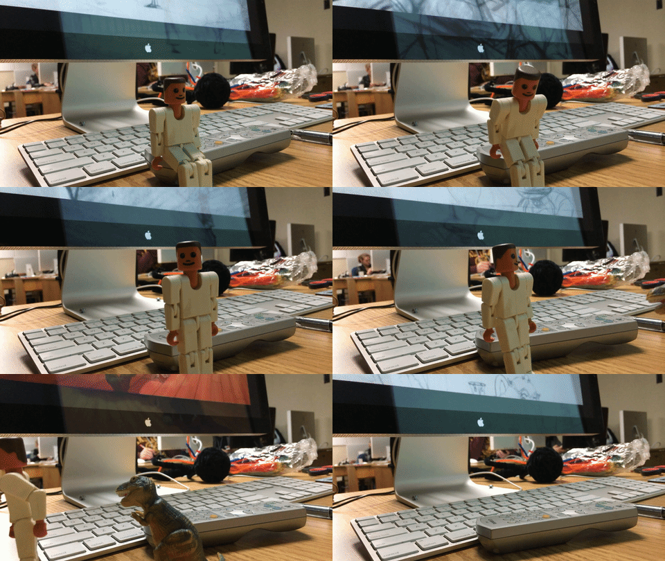
The first technique is frame-by-frame animation.  In frame-by-frame animation, an animator creates each frame individually.  This is the oldest technique and, potentially, the most time-consuming.  Hand-drawn or cel-based animation is a done frame-by-frame, as is stop-motion.  Since each frame is being created, frame-rate is a major consideration for frame-by-frame work.  Animation being done at 24 frames-per-second requires twice as many frames to be created as animation done at 12 frames-per-second.

By its very nature, frame-by-frame animation is the most exacting and precise technique used.  Every aspect of frame-by-frame animation is controlled by the animator.  Hand-drawn animation (such as “classic” Disney films) and stop-motion are the most obvious examples of frame-by-frame animation.  In frame-by-frame animation, the animator has to have a good sense of timing, physics, and movement – and how those factors translate into individual static frames.  In a way, frame-by-frame animators have to operate in two different states of time simultaneously.  The work of animation is done between the frames.

https://youtu.be/EgvfVusJS2k

The second technique is keyframe animation, which evolved from the frame-by-frame technique.  In keyframe animation, an animator defines the “key” moments in a sequence and software fills in the blanks.  If, for example, we were animating a spaceship moving from one side of the frame to another over two seconds, frame-by-frame animation would require us to create up to 48 individual frames (depending on the frame rate being used).  Keyframe animation might only require us to create two frames – the start point and the end point – and animation software would fill in the rest.

That sounds like a huge time savings – and it can be! – but keyframe animation can also be incredibly involved.   Keyframing works well for setting start points and end points, but often animation involved multiple things moving at different rhythms simultaneously.  For example, a person walking is moving almost every part of their body – upper and lower arms, upper and lower legs, hands, head, hips, torso – and all of those parts need to be keyframed separately in a way that appears seamless and natural.

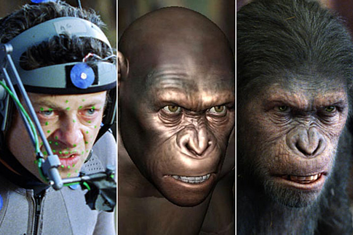
The third technique is motion capture.  This is the newest animation technique and the one that requires the most specialized knowledge and software.  In motion capture, an actor wears a special suit (or make up, for facial motion capture) covered with reflective dots that can be tracked by software.  As the actor moves, a camera interprets the movement of the dots and applies them to the movement of an animated character.  Sometimes this is done after the fact and sometimes it is done instantaneously.

Because motion capture is created using “real world” movement, it can be used to create animation that is realistic and subtle.  Motion capture is often used in the special effects industry, where believability is of the utmost importance.  It is also commonly used to create animation for video games.

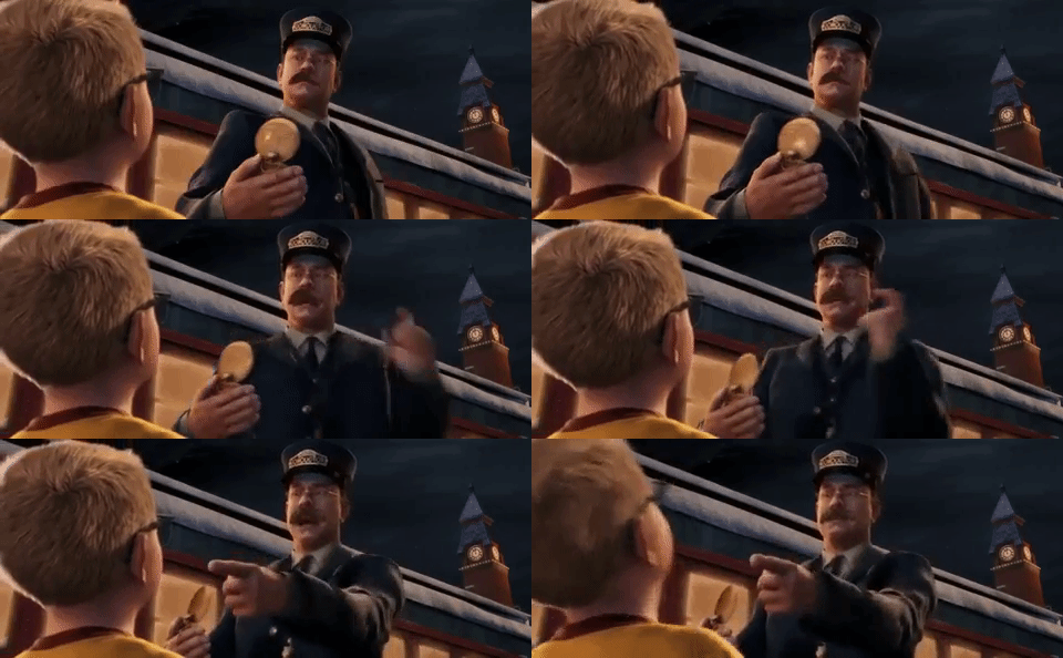
The biggest benefits of motion capture are speed, realism, and the ability to improvise.  A motion capture actor can collaborate in the animation process – keyframe and frame-by-frame techniques rely solely on the animator.  The downside of motion capture is that it can introduce too much realism – or, perhaps, the wrong kind of realism – into the animation process.  When we watch something that we know is animated, we accept (and even anticipate) a certain level of exaggeration and a certain level of simplification.  This relates back to our discussion of “iconic” imagery.  Animation that looks nearly real, but seems just slightly “off” can be incredibly distracting.  The industry term for this phenomenon is the “uncanny valley.”  Animated films like The Polar Express have been criticized for looking too real to be cartoons and too cartoony to be real.  The uncanny valley refers to this disconnect with regard to both visual representation and movement.

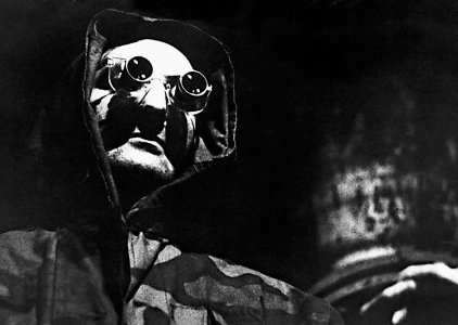
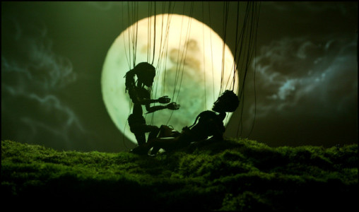
While these three categories of animation might initially seem distinct and clearly defined, they often overlap with each other.  For example, keyframe or frame-by-frame techniques are often used to tweak and refine motion captured animation.  Frame-by-frame animation is often started by a “key” animator, who only draws the keyframes.  This work is then passed off to “in-between” animators, who fill in the gaps, essentially acting like human animation software.  There are also some techniques that defy easy categorization.  Marionette or puppet-based films are not truly animated, but they fit the definition of iconic cartoon representation.  Rotoscoping, a technique wherein live-action photography is covered with cartoon art, falls somewhere motion capture and the other techniques.  There are also still-image-based films (also called “diaporamas”) that are composed of frames in sequence, but do not give the illusion of movement.

The 12 Principles

As mentioned earlier, one reason that the so-called “uncanny valley” is a problem is that we don’t expect animated things to move in a completely realistic way.  Of course, the effectiveness of animation is determined by more than realism.  The best guide for how movement should be animated probably comes from two former Disney animators named Ollie Johnston and Frank Thomas in their book Illusion of Life.  Johnston and Thomas defined twelve “basic principles” that animators should master.  They are as follows:

  1. Squash and Stretch – The idea that the shape of objects and characters is flexible and determined by their movement.  The classic example is of a rubber ball elongating as it falls and squishing down as it hits the ground.
  2. Anticipation –  This is a small action that precedes a larger one, such as when you duck down slightly before jumping.
  3. Staging – This deals with the way a scene is arranged.  Ideally, it should direct the viewer’s attention in a clear way.
  4. Straight Ahead Action andPose To Pose –  Essentially, this is the difference between frame-by-frame (straight ahead) and keyframe (pose to pose) animation.
  5. Follow Through and Overlapping Action –  These two techniques help animation seem more natural.  In follow through, moving objects tend to keep moving past their destination because of inertia; for example, your arm keeps swinging after you throw a baseball.  Overlapping action is the movement of multiple objects or body parts simultaneously, but at different rhythms or speeds.
  6. Slow In and Slow Out: generally, objects in motion don’t move at a steady rate.  Instead, they accelerate or decelerate depending on a number of factors.  Slow in and slow out can tell the viewer a lot about an object’s weight, mass, and speed.
  7. Arc –  Things very rarely move in perfectly straight lines – most action follows an arc trajectory.  A thrown ball will move in a rounder or flatter arc depending on its speed.  Walking is composed of small arcs from step to step.
  8. Secondary Action –  This is a smaller action added by the animator to emphasize a bigger one.  Things like facial expressions and hand gestures are often used as secondary actions.
  9. Timing –  In its simplest terms, timing describes how long animated actions take to occur.  Johnston and Thomas are specifically referring to the number of frames an action takes and how manipulating that number can change the meaning of that action.
  10. Exaggeration –  The amount of exaggeration in animation is largely determined by the level of realism in the work.  Often, exaggeration is used for comedic effect in animation.
  11. Solid Drawing –  In two-dimensional animation, the animator should consider how the character or object would exist in three-dimensional space.  This helps give things mass, weight, and balance.  Without solid drawing, things tend to appear flat and floaty.
  12. Appeal –  This relates to character design.  Animated characters should be pleasing to look at.  This doesn’t necessarily mean that they must by physically attractive, but they should be interesting to the eye.  Exaggerating proportions and playing with shape is a good way to do this.

For an excellent and concise explanation of each of the twelve basic principles, check out Alan Becker’s series on YouTube.

Keep in mind that Johnston and Thomas’s principles are just that – principles, not hard-and-fast rules.  Squash and stretch or exaggeration can be used to varying degrees to make a piece more realistic or more cartoony.  The principle of solid drawing could be ignored to make a piece deliberately surreal.  Whether you follow the principles closely or purposely break them, the most important thing is that you understand and consider them as you move forward with your own animated projects.

Project 2:  Frame By Frame

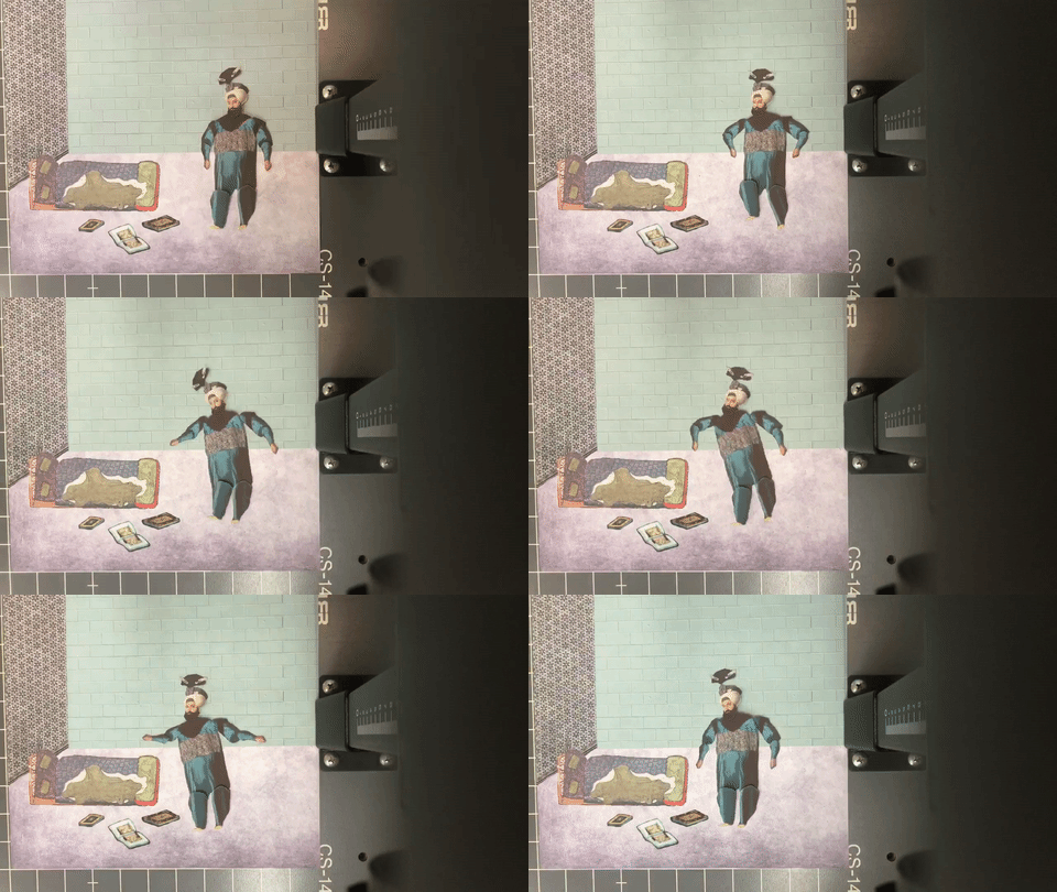
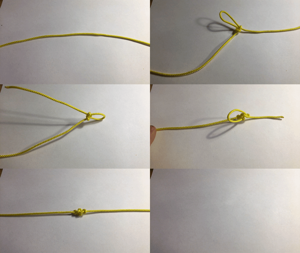
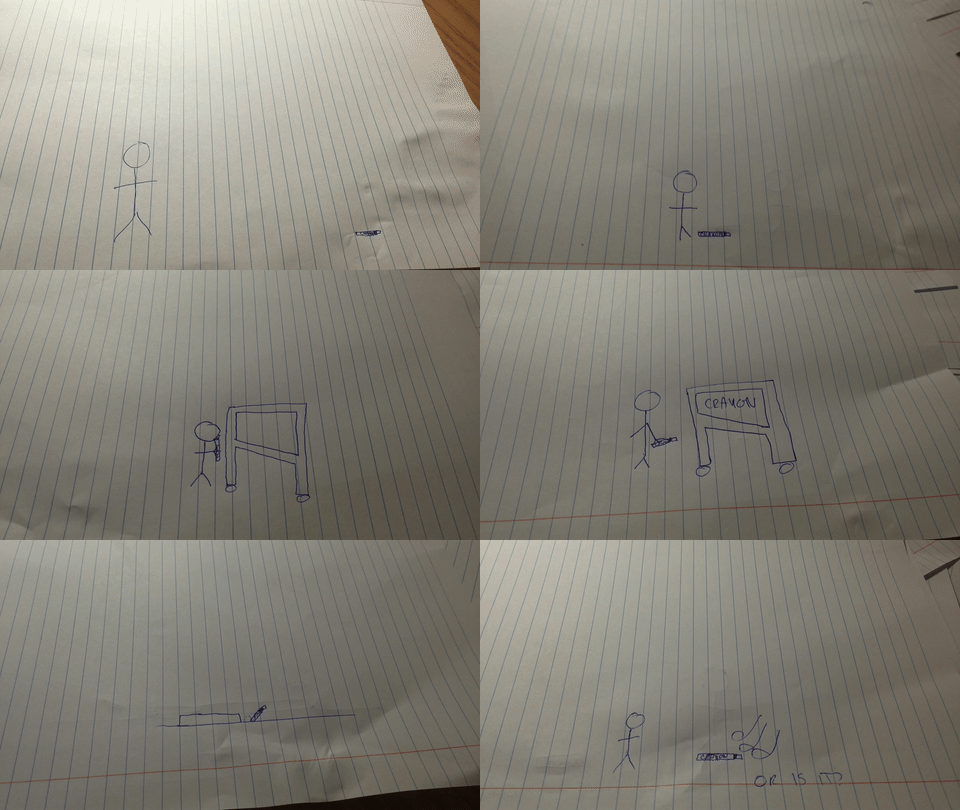
For your first animation assignment, I’d like you to create something without the use of a computer.  It can be done using stop-motion puppetry, paper cut-outs, collage, drawing on paper, drawing with chalk or a white board, or another “hands-on” technique.  Create at least five seconds of animation at a minimum average of 12 frames-per-second (in other words, you must create at least 60 frames).  Plan it out in advance and, as you work, keep the basic principles of animation in mind.

The easiest way to capture your animation is probably using your phone.  There are a number of free apps for creating animation; I’d suggest Stop Motion Studio, which is available for both Android and iPhone.  Stop Motion Studio allows you to take photos within the app and choose the frame rate at which they play back.  If you’d rather hand draw your animation, that’s fine too.  There is a cool app called Animation Desk that allows you to draw frames within the program.  Both apps are fairly intuitive and there are lots of resources online if you get stuck.

If you decide to do stop motion, one challenge is going to be keeping your phone steady as you work.  You may want to consider securing your phone to a stable surface using rubber bands, tape, or clay.  Even just leaning your phone up against something can help a lot.  You will probably have to do some problem-solving and improvising to make things work – have fun and get creative!  There are also a limited number of phone mounts and small tripods in the equipment collection.  The library Equipment Services may have options as well.

Animating frame-by-frame like this is  time-consuming and difficult to master.  Don’t get discouraged!  Seeing animation that you’ve created with your own hands come to life is incredibly rewarding.  The goal here is to get a better understanding of things like motion, speed, and timing.

When your animation is finished, export the video and email it to me at dan014@bucknell.edu.  If your file happens to be too big to email, drop it in your Google Drive storage and send me a link.  Happy animating!
Categories
Projects

Project 1: Watch This

Max

Jon

https://www.youtube.com/watch?v=dWk-VpK4hJo

Jen

Veronica

Rebecca

Dante


Categories
Blog Posts

The Weird, Wonderful World of PES

Guacamole Spaghetti Sandwich

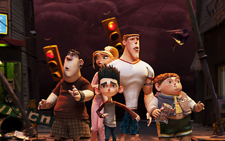
One of the most visually inventive animators I know of is PES, an American animator whose stop-motion films often incorporate everyday objects in clever, unexpected ways.  In addition to short films, PES has also done some very interesting ad work.  Check out the following examples – there are tons more on his YouTube channel as well.
Categories
Blog Posts

Animated Documentary Shorts

Keeping It Real

Animation is often (unfairly) pigeonholed as a medium for children’s fairy tales, but it can be used to tell all kinds of stories.  Here are a few short documentaries that use animation to great effect.

Categories
Weekly Lessons

Week 1: Animation Through The Ages

The Illusion of Movement

To study animation, I believe that it’s important to understand two central aspects of the form: one is technical and the other is aesthetic.  The technical aspect of animation deals with the mechanics of its creation – how animation, in it various forms, is made.  The aesthetic aspect of animation examines the unique qualities of animation as a medium, as opposed to other forms (such as live-action cinema, photography, and literature).  Put simply, these two aspects comprise how animation works and what animation can do as a medium.

To get started, let’s get some very basic definitions out of the way.  At its most basic, animation is the illusion of movement created by viewing a series of images in rapid succession.  The base element of animation – the frame – is not meant to be viewed individually, but as part of a larger whole.  This means that a flip book is animated, since the images therein are viewed sequentially, but a comic book is not, since the panels that make it up are considered individually.

The root of the word “animate” translates roughly to “instill with life” – processes within the brain breathe movement into static images when they are viewed one-after-another at high speed.  This illusion is commonly referred to as “persistence of vision,” which is technically incorrect, but has a nice poetic ring to it.  By definition, all film and video – live action or otherwise – is animated, since all film is made up of individual frames that have the illusion of movement when played together.  To avoid confusion and adhere to the common usage of the word, we’ll limit our definition of the term to works that use representative art instead of photography.

However, it’s vital to appreciate how intertwined “cartoon” animation and live action cinema really are.  While animation is often dismissed as a childish offshoot of “real” film, on a technical level, live-action cinema is actually a subcategory of animation.

The Evolution of Animation

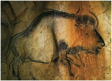
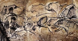
Animation is old.  It can be traced back to the very inception of cinema and beyond – potentially, much further beyond.  With an open mind and a bit of imagination, you can connect animation to the dawn of art and civilization itself.  In the beautifully preserved cave paintings in Chauvet Cave (located in southern France) you can find horses and bison drawn with extra limbs and lions that seem to rush forward.  Some scholars have theorized that prehistoric people would have seen the illusion of movement in these images, watching them through the flickering light of a cave fire.  They are estimated to date between 32,000 and 30,000 B.C.E.

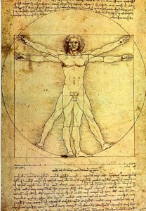
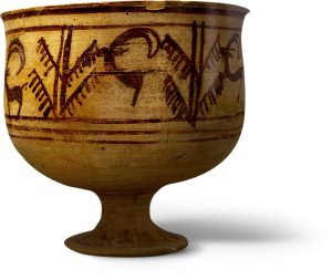
There are several other examples of pre-cinema animation from through human history.  An Iranian bowl dating from around 3,000 B.C.E. shows a goat leaping into a tree in multiple “frames.”  Some Egyptian hieroglyphics show sequential movement and the multiple limbs in DaVinci’s Vitruvian Man imply movement in the same way that the paintings in Chauvet Cave do.

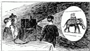
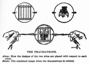
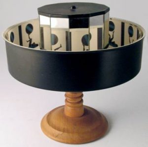
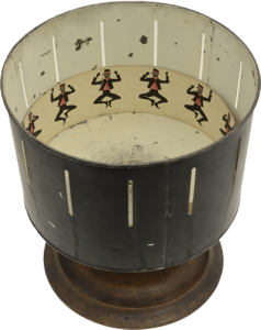
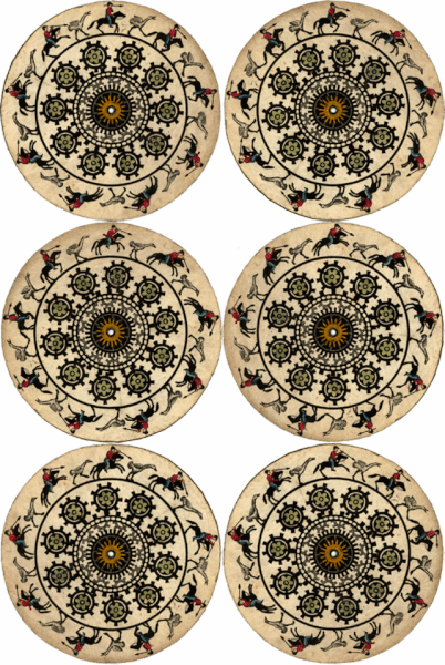
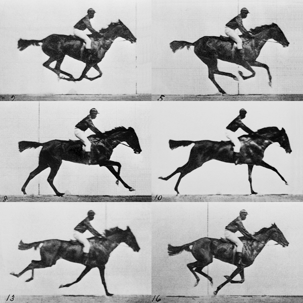
In the roughly 300 years before the birth of cinema, the precursors of animation took the form of toys and curiousities, such as the magic lantern, thaumatrope, zoetrope, flip book, and praxinoscope.  Eadweard Muybridge’s famous photographic studies of galloping horses were another milestone – more explicitly than ever before, they divided fluid movement into static frames.

In 1892, (a year before Edison invented the kinetoscope and two years before the Lumiere brothers invented the cinematograph) Charles-Émile Reynaud debuted the Théâtre Optique in Paris.  Reynaud showed a series of short films, each comprised of 300 to 700 painted frames of animation.  These frames were strung together into what was essentially a filmstrip and projected using a magic lantern.

The development of motion picture cameras brought animation to a state that more closely resembles its current form.  The Humorous Phases of Funny Faces (1906) by J. Stuart Blackton is often cited as one of the earliest examples, although Emile Cohl’s Fantasmagorie (1908) captures animated movement in a much more sophisticated manner.  The brilliant illustrator Winsor McCay debuted his Gertie the Dinosaur cartoons in 1914.  McCay even incorporated himself into the action, interacting with the animated Gertie in a well-timed theatrical performance.

It’s believed that the first feature-length animated film was the 1917 Argentinian political satire El Apóstol, which was tragically lost when fire destroyed the only known print.  The oldest surviving animated feature is the 1922 film The Adventures of Prince Achmed by Lotte Reiniger.  Reiniger painstakingly created the film using intricate paper cutouts.  The resulting film was then hand-tinted, creating a striking aesthetic.

The evolution of animation throughout the twentieth century includes too many milestones to list here.  A few highlights include:

  • The rise of Disney in the late 1920s, with Steamboat Willie
  • The “golden age” of American animation (including the work of Warner Brothers, MGM, Fleischer Studios, and Disney) from the 1930s through the 1950
  • The explosion of animated television programs beginning in the 1960s
  • Pioneers like Ralph Bakshi in the 1970s and 1980s, who pushed animation into more adult territory
  • Pixar’s groundbreaking work in the 1980s and 1990s in the world of computer animation, most significantly with the release of Toy Story in 1995.

For a lovely visual representation of the history on animation, check out this site: https://history-of-animation.webflow.io

Of course this is only a brief – and admittedly U.S.-centric – overview.  Animation has branched out into styles and techniques too varied to cover and you can find fascinating examples from every corner of the globe.  Notably, in Japan, animation has a position of cultural importance that is difficult to overstate – but that goes far beyond the scope of what we can cover here.  There are simply too many rabbit holes to follow.

With that caveat in place, here are a few video essays exploring the work of a few very different animators: Chuck Jones, Brad Bird, John Kricfalusi, and Satoshi Kon.

The Language of Symbols

What do you see below?

: )

A face?  A human face tied to a specific emotion?  Why would something so simple call to mind something as complex as a human being experiencing the concept of happiness?  This is the sort of  question that pertains to all visual art, of course, but something about the illusion of life in animation makes it seem especially relevant.

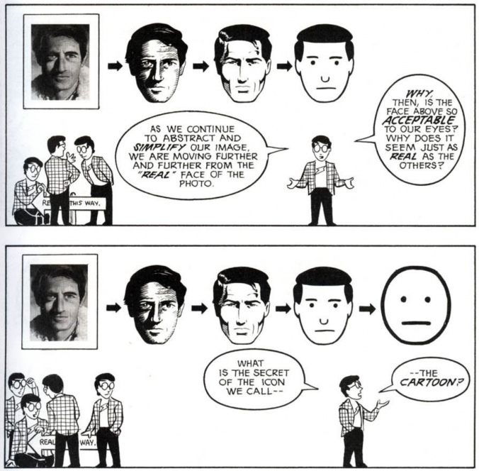
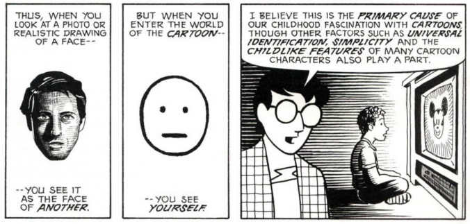
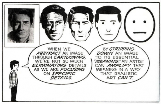
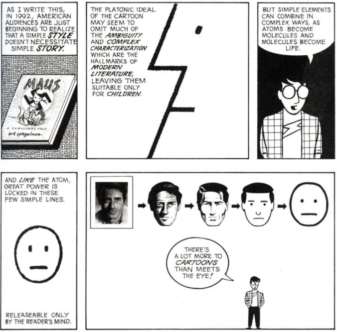
I’m going to borrow pretty heavily from Scott McCloud and his excellent Understanding Comicsfor this discussion.  McCloud is obviously focused on comics, but a lot of what he writes about is applicable to animation as well.  In his chapter “The Vocabulary of Comics,” McCloud spends a lot of time talking about what he calls icons and how the level of visual realism they carry imbues them with different qualities.

McCloud argues that cartoon icons – simplified visual representations of real-world things – contain a unique power.  For one, the generalization present in cartoon representation allows the viewer to project themselves into the character.  McCloud ties this to the fascination that children have with animated characters.

Another power of cartoon representation lies in its ability to magnify certain qualities of the character or thing being shown.  Because cartoons use fewer elements (details, shading, realistic proportions, etc.), the elements that are present become incredibly potent.

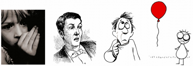
In the following images, the idea of nervousness or fear is shown with decreasing realism.  While the photograph is potent, it’s also complex and specific.  The stick figure (which is from Don Hertzfeldt’s Billy’s Balloon) conveys a similar emotion with far greater economy – and, potentially, more power.  Just as an exercise, consider this: the last time a movie made you really emotional, was it live-action or animated?

To close, here are a few clips from short films by Don Hertzfeldt, one of my favorite animators.  His work appears simple at a glance, but the animation is meticulously drawn and his work manages to be simultaneously absurd, tragic, and hilarious.  I think the Hertzfeldt’s work exemplifies the kind of iconic power that animation possesses.

Project 1: Watch This

I think that it’s really important to watch lots of animation if you’re going to create animation.  For your first assignment, I’d like you to watch an animated short film.  There are lots of channels dedicated to animation on YouTube and Vimeo; you could also try a site like Cartoon Hangover, Cartoon Brew, or Short of the Week.  There are endless options, just find something interesting.  It can be any length, just keep it under 20 minutes.  It must be available to watch (legally) online.

Once you’ve found your short film, write a few sentences about why you think it’s interesting.  How does the animator use imagery and sound?  Are any clever editing techniques being used?  Are the characters iconic or more realistic?  Just write up a brief analysis of the film and email it to me (dan014@bucknell.edu) with a link to the film itself.  Send them to me by next Thursday morning at the latest, so that I can review the films and post them online before class.

Categories
Blog Posts

Previous Student Projects

Hip Hop, Wolves, and Drowned Venice

After Effects might seem overwhelming at first, but once you understand the essentials, you’ll be animating in no time.  Here are a few of the many weird and wonderful projects that previous students have done.

https://youtu.be/Y0IleYo9pu4

Categories
Class Business

Welcome!

Before We Begin…

Welcome to the Spring 2017 edition of the Film/Media Studies Production Practicum!  This course is focused on using Adobe After Effects for the creation of animation.  After Effects is a powerful and versatile program – it can be used for everything from compositing to character animation to special effects to title design and graphics.  We will also use Adobe Photoshop, Adobe Illustrator, and other applications throughout the semester.

There are a few odds and ends we need to take care of before we can really dive into the exciting world of animation.  First, you should make sure that you have this class listed as .5 credit on your schedule.  It defaults to .25 credit, so you may need to change it manually.  If you have trouble with this, please contact Carol Randall at car029@bucknell.edu.

I’ll set up access to the course Moodle page for everyone soon, but I generally only use Moodle for grading.  For weekly lessons, we’ll be using this very blog: fmspracticumspring2017.blogs.bucknell.edu.  This site will contain assignment details, lectures, work created in class, fun videos to check out, and lots more.  It will essentially be your textbook for the course, so be sure to keep it handy!

The only material required for this class is an external hard drive for saving your work.  I would suggest an external hard drive over a small thumb drive because they are faster and have higher storage capacity.  If you don’t have a hard drive already, I’d suggest getting a USB 3.0 drive with at least 500GB of storage.  You can pick up 1TB drives from the Bertrand Library Equipment Services for around $60.  There are also lots of options at Amazon, Target, Best Buy, etc..  Both the Digital Video Editing Lab in the library and the Marts video studio have networked storage systems, but they are (unfortunately) different networked storage systems and such options are not always completely reliable.  Working of an external hard drive allows you to be mobile.  Of course, I would also suggest backing up important work to a different hard drive and/or cloud-based storage, just to be safe.

The course syllabus and schedule are available from the top menu on this website.  Of course, I want this course to meet your needs, so if there is anything in particular you’d like to learn, please let me know!  If you come across any interesting animated videos online, please send them my way as well.

Regarding attendance and assignments, the basic rules of college etiquette apply here.  If you need to miss class, please let me know beforehand if at all possible.  If you can’t do that, please touch base with me afterwards.  Our in-class time is very limited and we have a lot of material to cover, so please be mindful of that.  You will generally be assigned one project per week, which is due before class the next week, unless otherwise specified.  If you need to turn something in late, again, let me know beforehand if you can.  I will accept late work for reduced credit.

In addition to weekly assignments that overview the lesson materials, you will work on a longer animated project throughout the semester.  This project will make up a significant portion of your final grade and serve as a showcase for everything you learned throughout the course.  We’ll discuss this project in more detail over the coming weeks, but it’s never too late to start thinking about what sort of piece you’d like to create!

Finally, if you are struggling with anything in the course, please do reach out to me.  I am more than happy to work with you, but you need to make that initial request.  My office hours this semester are right before class, from 1:30 to 3:00 on Thursdays.  I can also meet with you by appointment if that time doesn’t work for your schedule.